 pennyspages:
Interesting that I caught part of “The Karate Kid” over the weekend and heard Mr. Miyagi’s balance advice to Daniel. This blog offers great advice about post design. But, before I apply it, I better get my own karate kid to class!
 Originally posted on The Daily Post:
Once you’re in a blogging groove and the words begin to flow, you naturally begin to look for ways to enhance the look of your posts.
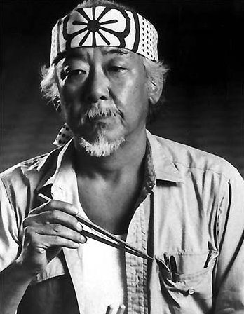
Adding images is a great way to reinforce ideas, emphasize or illustrate a specific point, provide visual breathing space within lengthy text passages, or even inject humor. When using images, take some sage advice from Mr. Miyagi of Karate Kid fame:
Better learn balance. Balance is key.
But this is blogging, not karate

Source: Wikipedia
Ah yes, grasshopper, but did you know that balance is one of the bonafide principles of design?
Balance is embodied in a visually pleasing arrangement of the items on a page. For extra credit, you can read up on the different elements of balance.
Balance dos
While it’s your blog and you can do (almost) anything you want with it, here are some fast…
View original 402 more words


Published on May 28, 2014 17:12
