Don’t Write That! 3 Tips to Avoid Yelling at Your Reader
A woman in one of my writing seminars sent the email below to her teammates:
 She said that she had chosen to use a bold font in 30-point red type to get people’s attention. She did – but not in a good way. Her teammates didn't like that her chosen techniques for emphasis – the large type, use of a bright color, and bold font style – made her appear to be screaming at them. As a result, her boss sent her to my class!
Before computers, when business communicators used typewriters to compose letters, they could emphasize words either by typing in all capital letters or by underlining the words.
Word-processing changed all that. Writers now have a variety of options to highlight words or to visually enhance a document, including bold, italic, underline, different fonts, and color.
Having so many choices can be confusing, or even inhibiting. To be effective, and to make your documents easy to read, follow these three guidelines:
1. Avoid having your documents look like “The Ransom Note Style of Letter.”
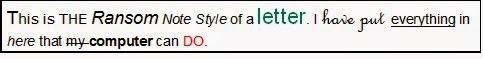 That is, you don’t want your correspondence to look as though you cut words and phrases out of different magazines. Use emphasis techniques sparingly. All of these techniques have a role to play – but not all at once. Generally, bold type is used for headings, subheads, and bullet points in a list. Though italics usually is the preferred choice, both italics and underlining may be used for specific emphasis of a word or phrase, and to denote titles of literary and artistic works. (Check an up-to-date style manual for expanded guidelines.)
2. Choose an easy-to-read font style, type size, and color. Using large type sizes, very small type, and different colors make it difficult for people to read your message quickly. Generally, it is best to use 10- or 12-point type and an easy to read font, such as Arial, Calibri, Times New Roman, Verdana or Georgia. Black or dark blue type color is best for email.
3. Avoid writing text in all capital letters. Using all capital letters is the written equivalent of shouting. What’s more, it is difficult to read. Don’t use all lowercase letters, either; that, too, is hard to read. All caps may be used for headings, or the occasional word for emphasis.
Additional information on effective communication can be found in my new book, The Essentials of Business Etiquette: How to Greet, Eat, and Tweet Your Way to Success.
Pachter & Associates provides training and coaching on communication and business etiquette. Contact Joyce Hoff at joyce@pachter.com or 856.751.6141.
 She said that she had chosen to use a bold font in 30-point red type to get people’s attention. She did – but not in a good way. Her teammates didn't like that her chosen techniques for emphasis – the large type, use of a bright color, and bold font style – made her appear to be screaming at them. As a result, her boss sent her to my class!
 Before computers, when business communicators used typewriters to compose letters, they could emphasize words either by typing in all capital letters or by underlining the words.
Word-processing changed all that. Writers now have a variety of options to highlight words or to visually enhance a document, including bold, italic, underline, different fonts, and color.
Having so many choices can be confusing, or even inhibiting. To be effective, and to make your documents easy to read, follow these three guidelines:
1. Avoid having your documents look like “The Ransom Note Style of Letter.”
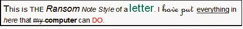 That is, you don’t want your correspondence to look as though you cut words and phrases out of different magazines. Use emphasis techniques sparingly. All of these techniques have a role to play – but not all at once. Generally, bold type is used for headings, subheads, and bullet points in a list. Though italics usually is the preferred choice, both italics and underlining may be used for specific emphasis of a word or phrase, and to denote titles of literary and artistic works. (Check an up-to-date style manual for expanded guidelines.)
 2. Choose an easy-to-read font style, type size, and color. Using large type sizes, very small type, and different colors make it difficult for people to read your message quickly. Generally, it is best to use 10- or 12-point type and an easy to read font, such as Arial, Calibri, Times New Roman, Verdana or Georgia. Black or dark blue type color is best for email.
3. Avoid writing text in all capital letters. Using all capital letters is the written equivalent of shouting. What’s more, it is difficult to read. Don’t use all lowercase letters, either; that, too, is hard to read. All caps may be used for headings, or the occasional word for emphasis.
Additional information on effective communication can be found in my new book, The Essentials of Business Etiquette: How to Greet, Eat, and Tweet Your Way to Success.
Pachter & Associates provides training and coaching on communication and business etiquette. Contact Joyce Hoff at joyce@pachter.com or 856.751.6141.


No comments have been added yet.