
Drumroll Please!!!!
And the new cover for The Absurd Demise of Poulnabrone is...
Dah dahhhh!!!
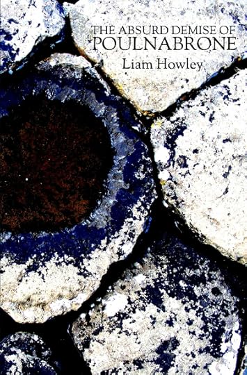
I hope you all like it :)
Liam
Dah dahhhh!!!
I hope you all like it :)
Liam


date newest »
message 1:
by
Jamie
(new)
May 06, 2014 08:26PM
 It looks great!!! LOVE this book!
reply
|
flag
Thanks Henry,
I don't know. I liked the old one too, but... there was something about it that I wasn't sure of. And I definitely prefer the new one. It looks great in print too. A little darker than what you see there, but side by side with the old cover, it wins hands down. I left the cover type the same.
I don't know. I liked the old one too, but... there was something about it that I wasn't sure of. And I definitely prefer the new one. It looks great in print too. A little darker than what you see there, but side by side with the old cover, it wins hands down. I left the cover type the same.
 I'm torn. This one is much more of an eye-grabber, so it's likely better for sales. But the other one is moody and subtle and says "I'm for people who like deeper books." Then again, the current one offers the pleasure of seeming perhaps abstract until readers realize what it's a picture of, which is cool. (view spoiler) Well, unless they happen on your property, in which case they suck (stuff into them).
Very good, very good :) It's actually more like a picture of a puddle taken in a very famous landscape, (I'll leave you to guess where), but you got the effect I intended.
I had thought of just removing the great big font along the side of the cover, and replacing it with more subtle text, kind of like how it's placed in the new cover, and at the same time smoothing it out a bit more by shortening the contrast, but I felt if I was going to change a cover that was already in circulation, I needed to do it wholesale.
(view spoiler)
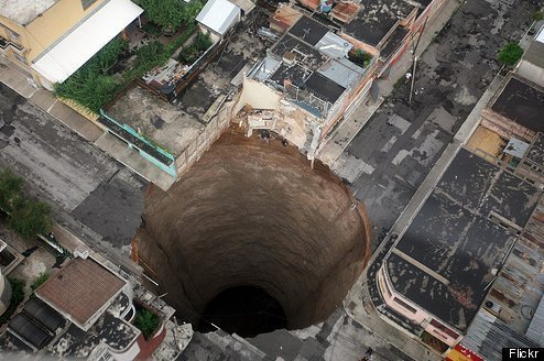
 Liam,this is the cover that I like,not the b& w on the ebook.
It looks like the craters on moon,only there's no water there.
You shd keep this one. It's very mysterious looking.
Where is it taken from exactly?
Mala wrote: "Liam,this is the cover that I like,not the b& w on the ebook.
It looks like the craters on moon,only there's no water there.
You shd keep this one. It's very mysterious looking.
Where is it taken ..."
Oh dear! My first instinct was huh?!? but it appears I've sent you the wrong file. It was the one I was going to use first and was taken from a picture of the ground in the Burren, with two clints making the top and bottom, and a grike in the middle. Nice and appropriately, it was taken from the landscape right beside the Poulnabrone Dolmen. That whole area is one of my favourite places. At times it's completely surreal. Just this weird lunar landscape that runs to the Altantic. And if you're into Botany at all, it's paradise, with plants from all and sundry mixing together in the micro-climates of the grikes, and more than one or two endemic also. But in case you're wondering, the story is not set there. I merely borrowed the name of the Dolmen. One of the translations of Poulnabrone is The Hole of the Sorrows.
The reason I borrowed the name was the similarity it bore to Poulaphouca The Hole of the Puca or The Hole of the Fairies (a fairy is a very different thing in Irish folklore than it is in other countries). Joycean scholars might recognize the name Poulaphouca, but not be aware that the waterfall Joyce referenced was a mere two decades later dammed for both the water-supply and electricity of Dublin. It's a place I've only been to once or twice, but I've known about it since a kid, and the idea has always fascinated me. It's apparently a very, very dangerous place to swim, as to this day the reservoir bed is still not stable and whirlpools can suddenly form and suck you down. But all that aside, it plays a part, or at least a fictional representation does, in the whole background mosaic of what is Poulnabrone.
As for the new cover. (view spoiler)
I'm glad you like it.
This is so fascinating,Liam. So much thought has gone into the conceptualisation of the cover art! And non-writers like myself would think that writing is the only difficult part but srsly both the choices are so integral to the Irish landscape- it's truly a magical place. However,the Finn McCool ref. would make the new cover a winner hands down- nobody can defeat him,right?Thank you for this detailed,thoughtful reply.
You're very kind Mala. It's one of the joys of DIY publishing. You not only get to have a shot at doing it yourself. But you get the last word always. Cover's are not something writers have traditionally had any say about. Some would say that's a good thing. Others differ. I'm agnostic, but I like doing it for my own work. I'm an odd creature anyway. I don't necessarily sit down and think things through in any conceptual sense, but rather, let the process be my guide. At the end of the day if it fits, it will fit in more than one way. And besides, I suppose it's less true for digital copy, but a cover is an important element in a work. It's the aesthetic introduction, the books skin. And in many respects, the more background there is to a story, the more it matters.
With-that-said, and somewhat sadly, Fionn Mac Cumhaill, has nothing to do with this story. Nor does the Giant's Causeway. Actually, I liked the cover, not so much for any tenuous mythological links but for the abstract sense of a pavement coming apart. It fits.
With-that-said, and somewhat sadly, Fionn Mac Cumhaill, has nothing to do with this story. Nor does the Giant's Causeway. Actually, I liked the cover, not so much for any tenuous mythological links but for the abstract sense of a pavement coming apart. It fits.
Liam Howley's Blog

- Liam Howley's profile
- 15 followers
Liam Howley isn't a Goodreads Author
(yet),
but they
do have a blog,
so here are some recent posts imported from
their feed.

