The #1 Thing You Can Do to Improve Mobile UX: Image Optimization
The #1 Thing You Can Do to Improve Mobile UX: Image Optimization was originally published on BruceClay.com, home of expert search engine optimization tips.
Or: So You’ve Got Responsive Design, Now What?
Having a responsive design is the Google-recommended way to deliver content on mobile devices. While other mobile formats are acceptable to Google as well, Google prefers one over the others. The benefits of responsive design are clear, but what happens when responsive web design isn’t good enough? An issue complicating mobile UX for many responsive sites: load time and image heavy sites.
Load Time for Responsive Sites
 Web developer Trilibis recently released a survey on the web performance of sites utilizing responsive web design and found that 69 percent of those sites did not have an acceptable load time.
Part of catering to a seamless mobile user experience means that site performance should be up to par; users aren’t very forgiving of sites that are slow to load. Users don’t like it, so they bounce. Google doesn’t like it, so you rank lower. Desktop sites are viewed in this way; why would the expectation not translate to mobile devices, especially considering the narrower bandwidth?
Perhaps we overlooked user experience and took for granted performance on mobile devices. We thought maybe the relatively fast load times on our desktop sites would translate to responsive design. Our site is content-rich and relevant to user queries. So, what gives?
The single-most contributing factor to slow load times on responsive design mobile sites is images, says the Tribilis survey. Big, fat images. (Tweet this)
Senior VP of Sales at Triliblis, Ted Verani, asserted that the mobile web “is considerably slower than its wireline counterpart. By serving images and pages that are optimized for mobile devices, we see dramatic improvements in page-load time, which translates to a much better overall user experience.”
It’s easy to forget about images and the effect they have on load times, but if, we as an Internet marketing industry, have forgotten images, we have forgotten our mobile users. We must think of mobile as the lowest common denominator, as the key driver of traffic to our sites.
This isn’t news by any means, but clearly, image optimization is something that’s been overlooked considering 32 percent of the mobile sites surveyed loaded in an abysmal 8-48 seconds with page sizes in excess of 1.7MB. Want to know what the average page sizes were for the top-30 online retailers according to the Keynote Mobile Commerce Performance Index? 420KB, with an average load time of 3.7 seconds. (Tweet this)
Optimizing images as a means of decreasing page weight and load times is probably the easiest way to improve site performance, thereby improving mobile user experience by catering to the user’s expectation of delivering here and now.
3-Step SEO Solution to Quick Loading Images
There are two ways to easily optimize images: compression and definition.
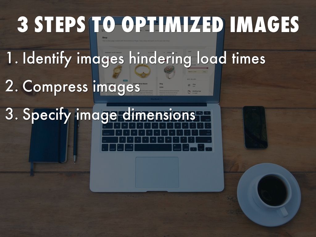
First, use a page speed to tool to identify which images are the culprits. I previously wrote about Mobile UX and using Google’s PageSpeed Insights Tool. Using this tool will point you in the direction of which images to optimize.
Next, compress your images. This can consist of anything from choosing a better, less space-intensive, image format, to determining how images are going to load on the page. Either way, chances are, the size of the images on your site need to come down, and there are many methods and tools that can be employed to accomplish such a goal. HTML5Rocks has an exhaustive article on a number of equally valid ideas on image compression. Check it out — your mobile UX depends on it.
Lastly, image dimensions. This is critically important for both desktop and mobile/responsive sites. Not defining your images means the browser must render the image as it loads the other elements of the page. When dimensions are defined, the browser will pre-render the space in accordance with the dimensions.
In other words, there are no hang ups on loading images. Plus, it can act as a poor man’s version of image compression. It is worth noting that images should be defined proportionate to their original dimensions, otherwise the images will be sized correctly, but the contents will look slightly humorous.
It’s clear employing responsive design isn’t enough. We can’t overlook the simplest elements, not even from a general optimization standpoint, image optimization included.
This may not fix all the ills on all responsive web design sites, but it can go a long way in getting you there. Put these simple tips together and you’ve already gone farther than most in addressing site performance issues, and more importantly, how users interact with your site.