After
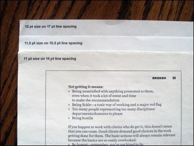
selecting the fonts for my latest book BROKEN—Recovery for headers, Harriet for body copy—one of the next typographic steps was to determine their sizes and line spacing, or leading(1). There was the temptation to rely on how paragraphs looked on screen, since the book was planned to be only made available as a digital publication (PDF, eBook). But not applying fonts and line spacing to prose, on a printed page, would be dismissive.
From his seminal book
The Elements of Typographic Style...
Published on April 16, 2014 21:21
