Text is the New Black: The new face (or lackthereof) of YA book covers
So this is one of my favorite books of last year:
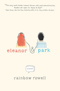
St. Martin’s Griffin, February 2013.
When I first held ELEANOR & PARK by Rainbow Rowell in my hands, as an ARC from St. Martin’s, I remember thinking how simple and different this cover was. Illustrated, a limited palette of colors, and with very unadorned text. I liked it. But I didn’t see this coming:

Can you see the trend?
Certainly this isn’t the first time a trend has swept cover design. Publishing is an industry that, dare I say, depends on trends. But what’s cool about this trend is that it’s taking books that previously looked like this:
Speak, Paperback Edition, March 2011.
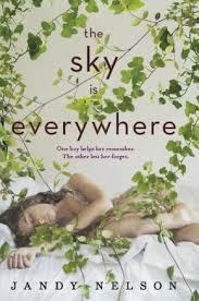
And making them look like this:
Dial, September 2014.
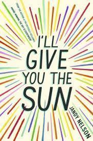
And where the cover for Jandy Nelson‘s previous novel SCREAMS girly romance book, the cover for her forthcoming book, I’LL GIVE YOU THE SUN, is completely gender neutral. Jandy Nelson writes beautiful literary fiction, which would appeal to fans of John Green. But with a cover like the above, it might be hard to entice boy readers. One thing I love about this trend — the trend of simple, more graphic/text-based covers — is that it’s pushing designers toward a marketing style that is less gender-based.
But, you might ask, why is gender-based marketing so bad? Well, to put it simply, people are way more complicated than girls like Barbies and boys like Hotwheels (thanks, McDonald’s, for still using this campaign with your girl/boy happymeals). And to put it less simply, when we put people in boxes like “girlie” or “boyish” it constricts the way we view each other and even the way we view ourselves. It’s bad for everyone. You, me, them, our culture…and on and on. If the story in a book would appeal to a wide variety of readers, the cover should reflect that. The example I often come back to is UGLIES by Scott Westerfeld, which is VERY gender neutral in the story, but has a pretty girl on the cover (or at least it used to, it’s had a few redesigns, which, IMO, still target female readers).
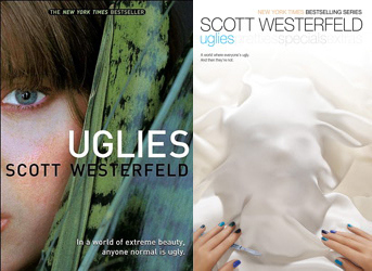
Simon Pulse, June 2005/Simon Pulse, Reissue, May 2011.
I know from talking to youth librarians that guy readers are reluctant to read these unless they are covered in brown paper bag covers. And, yes, many of amazing librarians use tactics like this to neutralize awesome books for shy readers. But what if that didn’t have to be a thing? With this text and illustration (vs photos and models) trend, we’re seeing some fantastic gender-non-specific covers. Here are some examples:

Arthur A. Levine September 2014/Arthur A. Levine March 2013.
Both of these books are by Alaya Dawn Johnson, a female author of literary science fiction. (For the record, I read and enjoyed The Summer Prince.) From the cover of THE SUMMER PRINCE, you can assume the following: the main character is a girl. You might assume: this books is for girls, and about girls, and, in correlation with the title, about princes. Kudos, you CAN tell that this is about a brown girl, not a white girl, but if you’re a teen guy reader (or, heck, maybe even a grown up guy reader), you might think this book isn’t for you. The thing is, THE SUMMER PRINCE is actually a book that, thematically, is very much about defying gender roles. It’s also a thrilling futuristic sci fi read taking place in a futuristic Brazil. But you might not get that if you stop at the (albeit beautiful) cover with a girl on it. The cover from LOVE IS THE DRUG screams sci fi thriller with a possible medical bent. With nobody gender-specific on the cover, there’s a greater chance that a guy might pick this up (if he can get past the word “love” in the title). I know I’m psyched to read this title, because I love Johnson’s other work. But maybe other readers will be psyched to read this title because the cover is powerful while being moderately neutral in regard to gender and ethnicity.

Simon & Schuster Books for Young Readers, March 2013/Simon & Schuster Books for Young Readers, March 2014
Again, here we have two covers of novels by a single female author. Justina Ireland‘s first novel, VENGEANCE BOUND, features a fair-skinned, traditionally pretty, slim girl. It looks like a thriller for female readers. But with the comparisons to Dexter that this book has garnered, don’t you think guy readers would dig it, too? Ireland’s new book, PROMISE OF SHADOWS, however, doesn’t have a character on the cover at all. Using primarily text as the focus point, the book looks mysterious, dark and magical. No hints at an ethnic or gender-based audience are given.

Katherine Tegen Books, May 2013/Katherine Tegen Books April 2014.
Here, we have two books by the same authors. THE DARK SHORE, while showing both a girl and a guy on the cover, is probably more attractive to female readers, with a paranormal romance vibe. The bold colors, simple typography and cable on the cover of EXILE make Kevin Emerson‘s newest book — the design of which throws back to the highly popular NICK AND NORAH’S INFINITE PLAYLIST — infinitely more neutral.
I think we can credit a lot of these covers to the success of ELEANOR AND PARK, and even throw back to THE FAULT IN OUR STARS, which is now a couple years old. Both of these books were successful in their own right, because they are fantastic books by fantastic authors. But both garnered a lot of readership outside of the target demographics, garnering rave reviews and massive outside of YA circles. These authors also share readership with Stephanie Perkins, author of ANNA AND THE FRENCH KISS, LOLA AND THE BOY NEXT DOOR, and the forthcoming ISLA AND THE HAPPILY EVER AFTER. Perkins has seen her books rebranded from photo covers to text/design-based covers, which you can see in the comparison between the hardcover and paperback of both ANNA and LOLA (seen below):
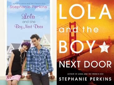
Dutton Juvenile, September 2011/Speak, Paperback Edition, July 2013.
While the initial cover very much reflects Perkins’ whimsical style, the paperback has a more universal appeal. Which is fantastic, because she’s a fantastic writer whose books are not only romantic but also literary and smart and socially aware. The more people who read her books the better.
And it could be argued that even feminine covers have wider appeal when they feature type/illustration rather than photos and models.

These covers might betray gender, but they don’t convey beauty standards.
What’s nice about these covers, especially in the wake of articles like this one about YA heroines all being frail and tiny and slender and beautiful, is that there’s nothing about any of these covers that reveals a single thing about the protagonists’ looks. We’ve had a plague of pretty-girls-in-dresses covers in recent years. Readers have complained that their favorite character would never wear a dress at all, let alone the one she’s wearing on her book cover. Readers have complained that their favorite character is muscular or thick or even chubby, but is portrayed on the cover as svelte. Which of course leads to the problem of teen body image and what we’re portraying with YA covers that feature skinny, traditionally pretty, and (usually) white girls. Nobody will look at the above covers and think, “that girl doesn’t look like me.” Because there’s no girl to look at. But, with typography and design, these covers may very well communicate the personality of the story and the characters within. A reader can definitely connect with that.
And you know what else is cool about these covers? They look a lot like some great adult literary covers, which I suspect was part of the intent when THE FAULT IN OUR STARS was designed. A few comparisons:

Not exactly the same, but you can see similar design strategies here. (All but Green’s novel are adult literary fiction.)
Which is perhaps what has lead to covers that look like this, in YA:

These books would look at home in the adult section.
…which I think is especially cool because it speaks to the diversity of work within YA, and within YA contemporary. I’ve always said that just like in adult fiction, you have candy bar books and meat and potatoes books, and it looks like they’re trying to market YA this way as well. (Note: I enjoy both candy bar books and meat and potatoes books. So, this isn’t at all a slight to one side or the other. But we can all admit that James Patterson is marketed differently from Haruki Murakami, for example.) Which, I think, is going to show further respect for YA readers, who, like adult readers, have a wide range of tastes and often enjoy more sophisticated offerings. (Which, of course, is all interesting in comparison to the opinions of some of the writers on the Internet who keep crying out that books X, Y, and Z are “too good” to be YA. I wonder what they’d think of these titles? And does the art have an impact on these sorts of opinions?)
All in all, I’m excited to see where this trend goes. And I’m interested in thinking about what some of our favorite YA novels would look like with illustrated and text-based covers rather than photos and models. If you have the inclination to re-imagine a book, use your illustrative skills and show me! Who knows, there might be prizes available for my favorites.

PS, here are some links to the books/authors used in the combo graphics, which I didn’t name specifically above:
LOVE, AND OTHER FOREIGN WORDS by Erin McCahan • SAY WHAT YOU WILL by Cammie McGovern • FALLING INTO PLACE by Amy Zhang • TAPE by Steven Camden • GUY IN REAL LIFE by Steve Brezenoff • SIDE EFFECTS MAY VARY by Julie Murphy • LIKE NO OTHER by Una LaMarche • ZAC + MIA by A.J. Betts • ALTHEA & OLIVER by Cristina Moracho • TEASE by Amanda Maciel • VIVIAN DIVINE IS DEAD by Lauren Sabel • LET’S GET LOST by Adi Alsaid • THE SOUND OF LETTING GO by Stasia Ward Kehoe • HOUSE OF IVY AND SORROW by Natalie Whipple • BOYS LIKE YOU by Juliana Stone • THE STRANGE AND BEAUTIFUL SORROWS OF AVA LAVENDER by Leslye Walton • THIS SIDE OF SALVATION by Jeri Smith-Ready • THE ART OF SECRETS by James Klise • RETHINKING NORMAL by Katie Rain Hill • WHEN MR. DOG BITES by Brian Conaghan • DEATH, DICKINSON, AND THE DEMENTED LIFE OF FRENCHIE GARCIA by Jenny Torres Sanchez • WHERE THINGS COME BACK by John Corey Whaley