
NASA reports hottest January-July on record, says that 2010 is "likely" to be warmest year on record and July is "What Global Warming Looks Like" - WMO: "Unprecedented sequence of extreme weather events ... matches IPCC projections of more frequent and mo
Both NASA and the World Meteorological Organization both have excellent posts I'm going to excerpt at length. The first, from NASA's Goddard Institute for Space Studies website, is titled
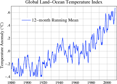
July 2010 — What Global Warming Looks Like
The July 2010 global map of surface temperature anomalies (Figure 1), relative to the average July in the 1951-1980 period of climatology, provides a useful picture of current climate. It was more than 5°C (about 10°F) warmer than climatology in the eastern...


No comments have been added yet.
Joseph J. Romm's Blog

- Joseph J. Romm's profile
- 10 followers
Joseph J. Romm isn't a Goodreads Author
(yet),
but they
do have a blog,
so here are some recent posts imported from
their feed.

