
The Write Way: How Much Control Does an Author Have Over Covers?
Recently I received several emails in response to my last newsletter complaining that my newly reissued romance, The Unmasking, was only available as an e-book and wasn’t in paper–unless a reader can find the original paperback, which is almost a collector’s item.
While I sympathize, and wish I could magically produce books in all formats, this seems like an excellent time to talk about what authors can and can’t do. We write the books, but quite frankly, if we sign a contract with a publisher there are many parts of the process over which we have no control. When we sign, we give them many rights to do as they see fit.
Today’s blog is about covers. Next Tuesday I’ll talk about control over content and production, including new choices now available to authors.
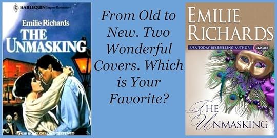
The graphic above is a collage of the two covers to grace The Unmasking. The one of the left is the original, one of my favorite traditional romance covers. Both models actually looked like the characters in my book, and a great deal of attention was paid to making the “feel” of the cover fit the story. Plus the hero of this book was well, gorgeous. This never hurts.
The cover on the right is the new cover, which I also love. I want to distinguish my older romances from my newer women’s fiction books by using a single graphic with a small heart that says “Classic”, which we did here and on my Tales of the Pacific books. The Unmasking has been a lucky book for covers. I’ve had a few that were so bad I hated to admit the books were mine.
So how much control does an author have over what appears on a cover?
We may or may not have the right to give input into the way our story will be portrayed or the general cover style.
We may or may not have the right to refuse a cover we despise
We may or may not be allowed to rewrite cover copy, or give suggestions
We may or may not have a right to approve a title or even, sometimes, the author’s name that will appear on the cover. Some publishers require pen names, although this is less and less common.
What do I mean by “may or may not?” These decisions are usually spelled out in the publishing contract. A writer with “clout” will have more say in his/her cover than a new writer or a midlist author with little support at the publishing house.
And what about me? I’m glad to say I am always asked for input, and my contract says I have the right to refuse a cover and a title. I am always consulted about copy and frequently rewrite it. Finally I have always written as Emilie Richards, which is the honest-to-goodness-name-I-was-born-with.
How much difference does a cover make? Let’s not pretend otherwise. It’s huge!
Have you ever picked up a book just because you loved the cover? Have you ever passed up a wonderful book at first because you disliked the cover?Any favorites? Anything you don’t like to see?
I’m interested in your thoughts, so please feel free to comment. My opinion counts, but let’s face it, yours counts most of all.


 Great comment, Judy. You make such a good case for the importance of covers. I never want to be influenced as a reader, but I know that I am. I'm glad you like the new one. Thanks for taking the time to share good information here.


As an avid reader of 250 books+ a year (at 70 for 2014 YTD), and an online digital marketing consultant and web designer; “COVERS MATTER”, as you know. There are other reasons in addition to the purchase of the book. How they are viewed online on blogger sites and other book websites.
I love the new covers and e-books. (great job on the new cover above-so 2014)! Every “oldie but goodie” book deserves a new face lift. Especially with all the author’s sweat and tears – reap the rewards of a new cover.
There are so many older books which I missed along the way, and would love an opportunity to buy a new e-book with a new and improved cover--I could then add it online as looks like a new book with new cover image.
The cover image is the first item which I look for when choosing a book to read and purchase. Being in the marketing business - do not want to use any low resolution images on any of my sites.
I love the way you have displayed the two covers side by side for comparison; definitely reflects the crisp, high resolution imagery, which is more up to date and one which would draw me in.
As an avid reader, and reader of advanced reading copies for NetGalley, publishers, and an active blogger on many sites, including my own; we like to display our front covers of books we read on numerous websites, boards, and shelves.
Sometimes if I read an old book which does not have a new front cover, I will not upload it on these sites (therefore not receiving the awareness or exposure a new book would bring). From a design aspect, we do not want an old outdated cover with low resolution image, as ruins the look and feel of the overall website, blog, or board when next to the new covers with smart, chic and high resolution images.
Same goes for sites such as social media - Pinterest, Tumblr, ClipZine, Booklikes, Goodreads, Riffle, Facebook, Twitter, and others - New covers stand out and look refreshing. (Old ones do not).
Would go as far as to admit-- even though it is a good book, I would pass on it if a bad cover. Covers set the mood and experience. I even prefer my color e-reader than my whitepaper as something about stunning sharp covers, as own both.
I vote for NEW covers and hats off to the new one above! Go for it. Thanks, Judy