Using Interactive Infographics to Boost Social Sharing

Infographics are one of the most effective ways to engage an audience and generate valuable social shares and links. As the trend for infographics grows, so do the options available when it comes to creating them. Interactive elements, or even entirely interactive data visualisations, have proven to be both popular and effective at building natural links online.
With the recent shift in the power of guest blogging, many SEO’s have turned to making genuinely compelling content in the form of data visualisations. This move towards interactive content also stems from the fact that as more companies create infographics, the more saturated their platforms become.
The ever increasing consumption of online resources through tablets and other mobile devices also means a change in the way users want to receive data. Interactive content is a step in the right direction to keep up with this.
Creating Compelling Infographics
“The more useful content you have, the greater the chances someone else will find that content valuable to their readers and link to it” is wise advice from Google Webmaster Tools. It boils down to the simple idea that if you create something interesting and and market it well, people are more likely to share it.
With interactive infographics, engagement is much easier to achieve since the viewer must perform an action such as scrolling a mouse or clicking for content to appear. Here’s a look at what brands and agencies are doing right now and why it’s working for them:
Map of the Dead
Maps are one of the most popular styles of interactive data visualisations and they often allow the user to personalise their experience by picking a location they know. Map of the Dead allows users to enter their own postcode to see which locations would have resources to help them survive a zombie apocalypse. There is even a game that can be downloaded too! This fun and stylish piece of content has racked up over 13K of shares.
Cyclemon
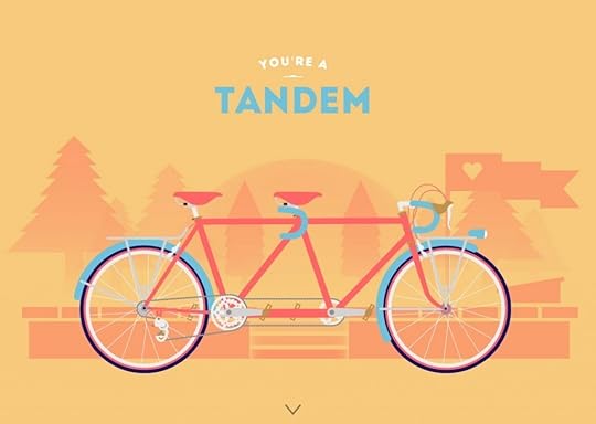
Whilst the aim of interactive data visualisations is often to provide information, some creators have utilised fantastic design to make compelling pieces without including any data at all. Cyclemon is a perfect example of this, with its fun vector scrolling infographic. Even a simple design like this has created over 6K of Facebook shares and hundreds of tweets.
The History of Formula 1
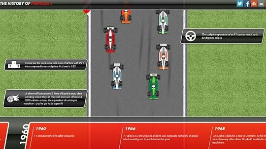
The History of Formula 1 created by Toolorders is a wonderful example of a scrolling infographic. This is a great way to include a large volume of data without overwhelming the reader or overcrowding the layout. Game and cartoon style pieces like this are enhanced dramatically by the option to include animation, making them appear even more like the real thing.
The Enlightened Happy Hour
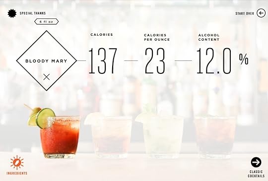
The Enlightened Happy Hour from Column Five combines photographic images with data for a great in-depth look at the contents of cocktails. A brilliant example of an infographic where the user controls what information they see. Showing variations of the same data (in this case it’s the calorific content of different drinks) can also look repetitive and uninteresting in a static infographic. Displaying the data in this way breaks it up nicely.
[image error]


