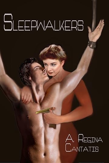
I hereby humbly request your input...on art
 First, let me give another thank-you to everyone who encouraged me to get into e-publishing. I'm having a lot of fun with it, and I appreciate the little cushion it adds to each month's income. Now, I don't have the energy to do much marketing; but one thing I can do, and which I enjoy doing, is to make better cover art. That's why I'm asking for your input.
 I've found all kinds of great tips on the MC Forum's e-publishing board (If you're publishing e-books, I encourage you to get involved there), and recently it gave me some advice on making better covers. I had thought I was doing pretty well, but that thread made me realize I'd overestimated myself. Using that advice, I went back and retouched the covers to two of my worst sellers, "Love in a Silver Socket" and "Mirrored in Your Eyes"; and I was rewarded almost instantly with a new sale ("A" new sale doesn't sound like much, but since these books were hardly moving at all, that one new sale means something).
So now I'm hoping to redo the Sleepwalkers cover yet again. My heartfelt wish is not to spend another week on it and then come up with another "meh" image like what you see in this post. But I think I'll do better this time, in part because I've improved my Gimp skills, and in part because I won't be starting from scratch. I plan to keep the models from the newer cover but reposition them so that they look more natural - and yeah, maybe start over with Hawthorne's body. Again. *sigh*. I also need to start over with her hypospray gun and use a typeface that's easier to see in thumbnail size. Basically, everything just needs to pop more.
So I'm turning to you for advice. It doesn't matter whether you're an artist or not, or how much you even know about art. I'd just like some honest (but kind!) advice about how I can improve the Sleepwalkers cover. What does and doesn't work about the current version? Do you think it would it help to add in some of the background elements from the older cover, or would that just make it look busy? What about the color scheme? I'm thinking about making the new typeface the same greenish-yellow as the gun, but I'm afraid that might look ugly instead of eye-catching. I'm also thinking of making the gun more obviously phallic, but I don't know if that would turn potential readers off instead of on. How would you feel about a gun that looked like a dildo, especially when a woman is holding it against a man?
I really, sincerely, want some honest opinions on this. Remember, I've configured my blog to let anyone leave comments in complete anonymity, and I won't delete anything that isn't spam or trolling. So please tell me what you think.
Published on March 09, 2014 16:13
No comments have been added yet.


