
Borderless Buttons and Dee Count
After iOS 7 changed the default appearance of buttons to text-only, I noticed some users have more trouble tapping the intended button at the normal button spacing. Borderless buttons seem to imply larger strike areas for some—or reduce coordination—so that buttons in close proximity, such as those usually found on a menu, become overlapping targets. For missed taps, the interface tries to guess the closest button, but without borders the between-tapper may need to work harder.
My fix in Dee Count includes more spacing between menu buttons—spacing beyond the guidelines for the buttons you don’t want to tap by accident. Such as the plus (+) button, which we may not want to instantly launch a new location to begin working on.
Below are screenshots of the top third screen showing spacing of buttons on menu in latest version of Dee Count. The second screenshot shows current version as seen in iOS 5. Previously, the menu buttons on the top bar had been closer together. With or without borders, the buttons with increased spacing look cleaner and are less prone to miss-taps.
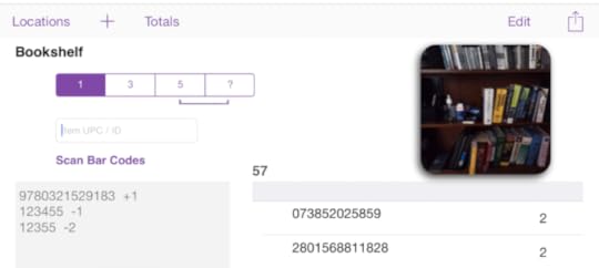
Screenshot of top third of Dee Count in iOS 7.
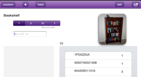
Screenshot of top of current version of Dee Count as seen in iOS 5 or 6.
Comparing both versions, iOS 7 certainly appears cleaner. However, a subdued-barely-there button border would also be appealing.
Other Dee Count improvements for v1.65 include full-screen photo preview and minor changes.


David G. Shrock's Blog

- David G. Shrock's profile
- 3 followers

