
Here's To Not Lookin' at Ya
It's cover conference time again; this week "they" will be getting together to brainstorm the cover for the tenth Sebastian book, Who Buries the Dead, due to be released in March 2015.
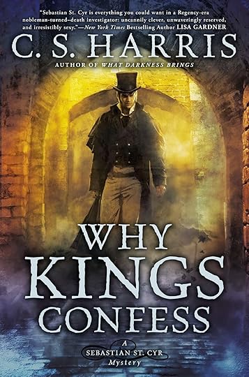
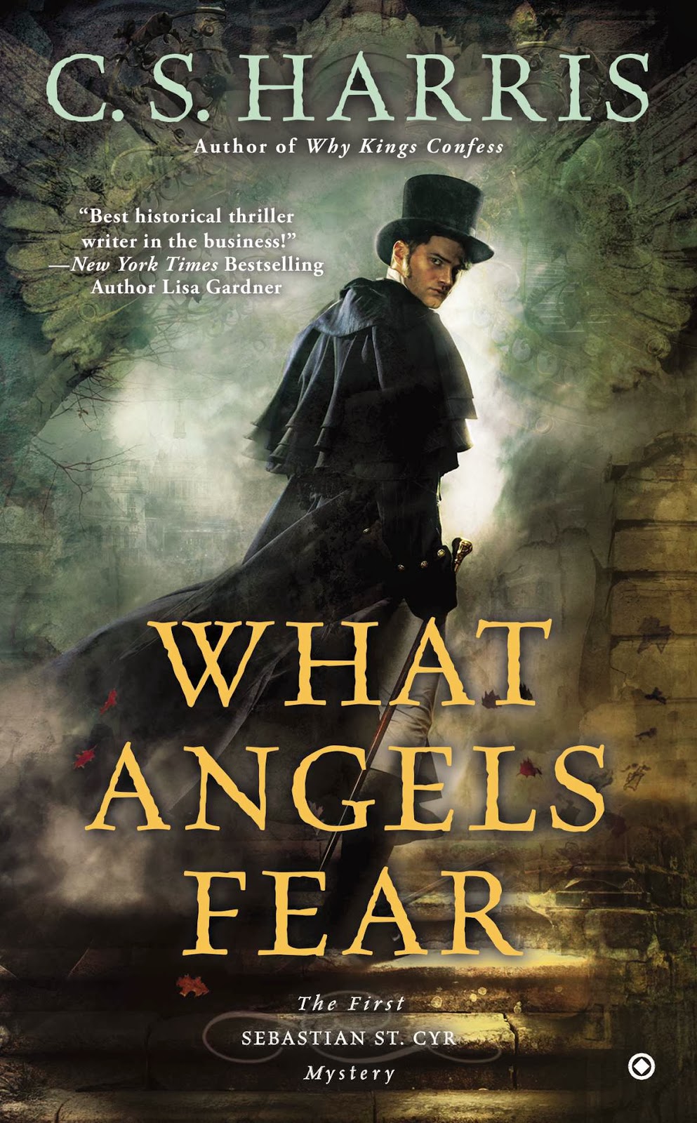
The reactions to the cover of Why Kings Confess have been so positive that my publishers are planning to create a unified look for the series, using this cover artist. To that end they have redone the cover of What Angels Fear. Personally, I liked the Kings cover; I love the way it captures Sebastian's energy and edginess and aura of danger. And while I felt the model's face was not as refined as I've always envisioned Sebastian, I do find him sexy in a sort of Sean-Bean-as-Sharpe way. I'm not as happy with the Angels cover; I think the design is great but the male figure just doesn't say "Sebastian" to me at all.

I told my publishers that a lot of readers like the look of the new covers but think it would be better if Sebastian's face wasn't so visible. And, believe it or not, they listened. So now they want suggestions for ways to achieve that. About the only thing I came up with was having his head tipped downward so that his face is shadowed by his hat. I tried going to Le Google for images of other ideas, but I wasn't successful.
So I'm throwing it open to y'all. Suggestions for dynamic poses that hide the face, anyone? Links to images that show possible poses would be appreciated.
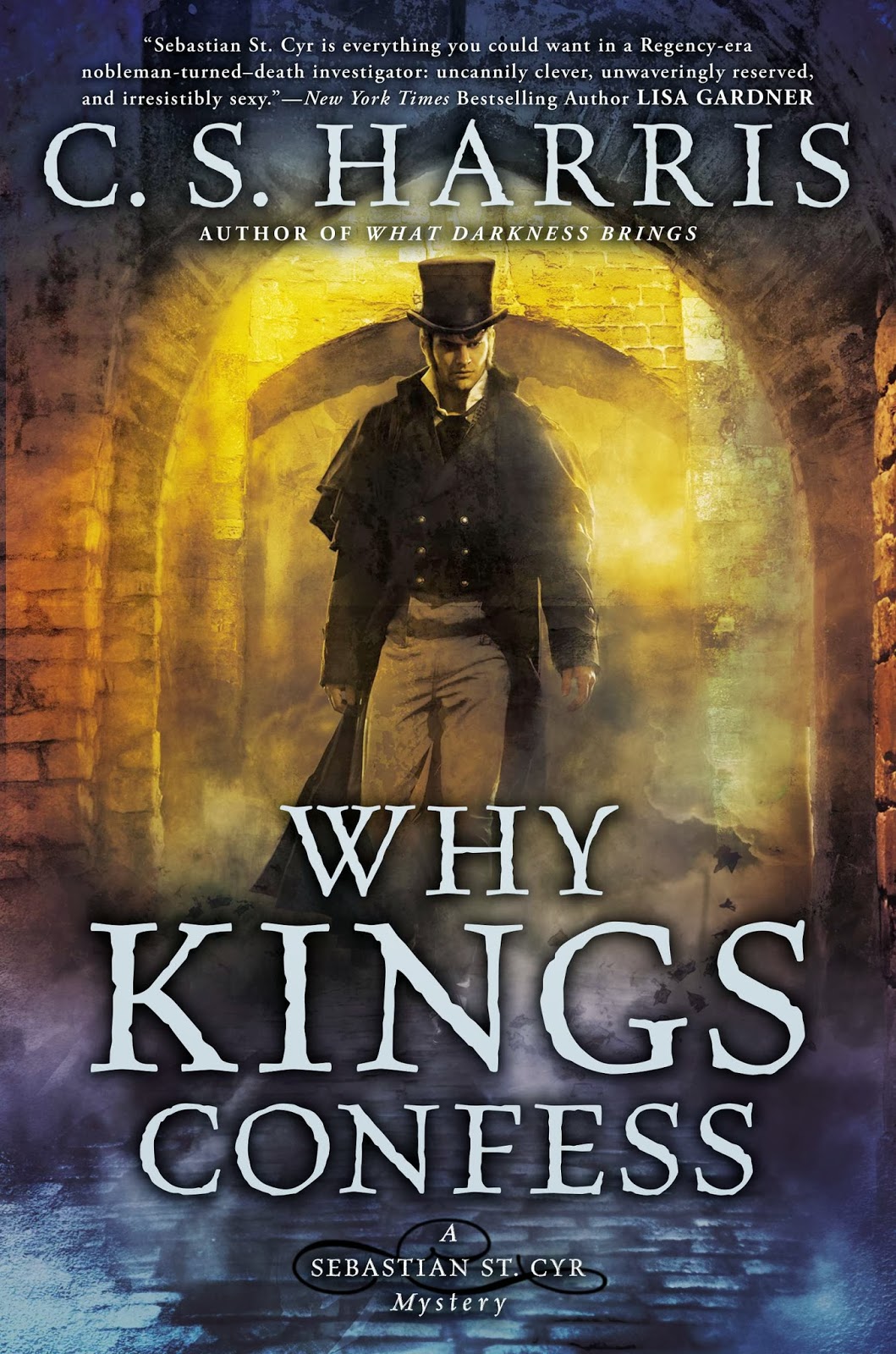
The reactions to the cover of Why Kings Confess have been so positive that my publishers are planning to create a unified look for the series, using this cover artist. To that end they have redone the cover of What Angels Fear. Personally, I liked the Kings cover; I love the way it captures Sebastian's energy and edginess and aura of danger. And while I felt the model's face was not as refined as I've always envisioned Sebastian, I do find him sexy in a sort of Sean-Bean-as-Sharpe way. I'm not as happy with the Angels cover; I think the design is great but the male figure just doesn't say "Sebastian" to me at all.
I told my publishers that a lot of readers like the look of the new covers but think it would be better if Sebastian's face wasn't so visible. And, believe it or not, they listened. So now they want suggestions for ways to achieve that. About the only thing I came up with was having his head tipped downward so that his face is shadowed by his hat. I tried going to Le Google for images of other ideas, but I wasn't successful.
So I'm throwing it open to y'all. Suggestions for dynamic poses that hide the face, anyone? Links to images that show possible poses would be appreciated.


date newest »
 I love the malevolent, moody atmosphere in the revamped cover of Angels! I agree, though, that is NOT Sebastian. I liked the old cover designs, honestly, but if there's going to be a change at least we can try and help make it a good one. Kudos to the creativity team in actually listening to the author on this one! :-)
A pose suggestion: Have Sebastian's back completely to us with his head turned to look at something. Have the light hit the side of his face so that we know it's him, but (again) don't get the full reveal of a face not everyone will ever agree on. Kind of similar to the Angels & Demons movie poster:
http://www4.images.coolspotters.com/w...
 Indiana, funny, I never would have thought of looking at Captain America for inspiration, but that's a very good idea!
Sarah, that's a good idea, too; thanks!
 Did you really mean to write that Who Buries the Dead will be out in March 2014? I hope that is correct, but I have my doubts. [LOL]
Looking forward to reading Why Kings Confess next month,
Kay
Kay Webb wrote: "Did you really mean to write that Who Buries the Dead will be out in March 2014?"Oops! You're right; it's 2015. I can't believe you're the first person to catch that. Thanks!
You are very welcome. Retired high school teacher here.Kay
 Great ideas so far. I planned to suggest Sarah's idea. Changing settings to match stories, mood, and positions of Sebastian with not quite a full face profile. Like others, I have always envisioned Sebastian with a more refined but still masculine face and body. It will challenge the artist to create signature covers that represent the stories with a protag's face always partially hidden.
Lin wrote: "Changing settings to match stories, mood, and positions of Sebastian with not quite a full face profile...."
Great ideas so far. I planned to suggest Sarah's idea. Changing settings to match stories, mood, and positions of Sebastian with not quite a full face profile. Like others, I have always envisioned Sebastian with a more refined but still masculine face and body. It will challenge the artist to create signature covers that represent the stories with a protag's face always partially hidden.
Lin wrote: "Changing settings to match stories, mood, and positions of Sebastian with not quite a full face profile...."Yes, it's going to be tricky, isn't it, to make the covers different enough for each one to be memorably distinct.
A cliche, but having him trying to mount a horse that is agitated (not rearing)would have a reason his face is facing away but still imparts action and strength.
JoAnn wrote: "A cliche, but having him trying to mount a horse that is agitated (not rearing)would have a reason his face is facing away but still imparts action and strength."JoAnn, it may be a cliche but I hadn't thought of it. Thanks! That might work very well for book #11.


Just refreshing my memory by looking at the earlier covers in the series, I like how the figure wasn't so clearly depicted on the cover of "Where Serpents Sleep" or even "What Darkness Brings" where its more clear but he is looking away from the reader so you don't see the front.
I'll look at home and see if any possible examples jump out.
ETA: Maybe look at some of the superhero posters that are out there. This one from Captain America perhaps is going in the right direction:
http://wac.450f.edgecastcdn.net/80450...
Or even just looking completely away from the reader like Batman in this poster:
http://4.bp.blogspot.com/-8LM-wPSHmQ4...