
Is Your Font Easy on the Eyes?
If you're like me, a lot of thought goes into the font you use for email, your blog, on your website, etc. Marian Manseau shared this tip with me. It's one her website designer shared with her. I wanted to share it with you.
Typography (fonts)
Serif fonts: A serif is a terminating mark at the end of a letter stroke.
Sans-Serif fonts: Fonts without terminating marks.
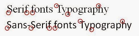
Studies in perception indicate that when blocks of text are used, serif fonts work best for the printed page and sans-serif are best for computer monitors and projection.
You can bet I rushed off to my blog and my website to see if I followed this rule. I'm good on my blog and will be making a few changes on my website.
Tell the truth, will you be checking your sites?
I interviewed Marian a couple of years ago, when her book Merely Dee was released. You can read the interview by clicking here.


No comments have been added yet.


