
Tell Me What "Average Is Over" Looks Like , by Bryan Caplan
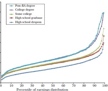
Here are two graphs of lifetime male income distribution broken down by educational attainment. One is for 1978, the other from 2008. I deliberately redact the years and dollar values to preserve the mystery.
Graph #1:
Graph #2:
Now you tell me: Without cheating by looking at the year, in which graph is "average over" - and why?
(3 COMMENTS)
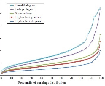
Graph #1:
Graph #2:
Now you tell me: Without cheating by looking at the year, in which graph is "average over" - and why?
(3 COMMENTS)


No comments have been added yet.
Bryan Caplan's Blog

- Bryan Caplan's profile
- 374 followers
Bryan Caplan isn't a Goodreads Author
(yet),
but they
do have a blog,
so here are some recent posts imported from
their feed.

