
Holy Cow, iOS 7 Has Some Really Horrible Design
Nikon D4 + Nikkor 24mm f/1.4 — 1/50 sec, f/5, ISO 110 —
map & image data — nearby photos
Timeless
Simple, elegant design is timeless
(the Seifuso Villa (清風荘), Kyoto Japan)
Desktop-Background Versions
1280×800 · 1680×1050 · 1920×1200 · 2560×1600 · 2880×1800
“I hate it beyond words.”
“Worse than horrid.”
“I just really like the revamped UI.”
“This is horrible! Can I go back?”
“iOS 7 blows. Big time.”
— My friends' and family's reaction to
Apple's
latest interface for its phones and tablets.
“Beauty is in the eye of the
beholder” is perhaps most true when a well-established convention
undergoes a radical change. Not only is it then judged on its merits, but
also by how it differs to what came before.
The user-interface (UI) design of iOS 7 seems
to be of the radical variety. Not quite as radical as the initial iPhone
was to the cell-phone world at the time, but also not as universally
lauded. A lot of people really hate iOS 7.
Nikon D4 + Nikkor 24mm f/1.4 — 1/800 sec, f/1.4, ISO 100 —
map & image data — nearby photos
Spoiling My Shot
the geiko and her patron walked into what had been a clear shot of the temple
at the Kurodani Temple (金戒光明寺), Kyoto Japan
Desktop-Background Versions
1280×800 · 1680×1050 · 1920×1200 · 2560×1600 · 2880×1800
(Except the first, the photos on this page have nothing to do with the text; they're just random photos I've taken recently.)
Until recently I'd never actually used iOS 7,
but from seeing it in news and advertisements over the last few months, I knew I didn't like the new look. The same aesthetic that I like so much
about Apple hardware — a clean, ultra minimal, uncluttered look
— seems to me in the software of iOS 7 to
be flat, dead, lifeless. Soulless. It looks like Microsoft
designed it. It would fit right in with the new Windows® logo.
To be clear, the look may not be my cup of tea, but that certainly
doesn't mean it's a bad design, it's just one that I don't
personally care for.
However, I'll go ahead and say that for reasons I'll describe below,
iOS 7's design is bad.
Nikon D4 + Nikkor 85mm f/1.4 — 1/200 sec, f/4.5, ISO 1000 —
map & image data — nearby photos
“No Parking”
“Vehicles pass even at night”
at the Saginomori Shrine (鷺森神社), Kyoto Japan
Vertical Desktop-Background Versions
1050×1680 · 1200×1920 · 1600×2560
Having had the chance to actually play with iOS 7 recently while setting
up a new phone for my wife, I
was shocked that Apple could introduce such gimmickry at the
expense of function.
The visual change in iOS 7 that got the most press is the dropping of
many of the gratuitous skeuomorphs, such as
the “stitched leather” decoration of the calendar app. Some skeuomorphs
make a lot of sense, tapping into the accumulated
experience users have developed in life so that basic things don't have to
be learned from scratch. That's why interactive buttons in computer
applications, for example, have long looked like real-world buttons: the
look instantly explains what kind of control it is and how to interact with
it. Others are just cutesy design embellishments, and Apple has gotten rid
of most of those now.
Nikon D4 + Nikkor 24-70mm f/2.8 @ 42mm — 1/100 sec, f/2.8, ISO 5600 —
map & image data — nearby photos
Waiting
to enter an evening lightup event
at the Chion'in Temple (知恩院), Kyoto Japan
Desktop-Background Versions
1280×800 · 1680×1050 · 1920×1200 · 2560×1600 · 2880×1800
Another iOS 7 visual change that got a lot of
press was the “simplifying” of the look. Someone who likes the new look might
describe it as “clean” and “uncluttered”.
Someone who doesn't might say “uninspired”, “monotonous”, “flat”, and “dull”. (An engineer
would say “vectorizable”, but that's just a
back-end implementation optimization.)
But these design decisions are mostly a matter of taste and not of
“good” or “bad” design. Personally I find the new app icons to be a bit too
visually indistinct to recognize as easily as the old ones, therefore
requiring more conscious brain power to recognize. This is not a good
thing, but perhaps time and experience will remedy that.
Nikon D4 + Nikkor 24mm f/1.4 — 1/200 sec, f/1.4, ISO 100 —
map & image data — nearby photos
Diving into Shadow
at the Sento Imperial Palace (仙洞御所), Kyoto Japan
Desktop-Background Versions
1280×800 · 1680×1050 · 1920×1200 · 2560×1600 · 2880×1800
The quantitatively worst aspect of iOS 7's design that I've noticed is
the incessant use of transparency for zero practically-useful effect. It's a visual gimmick that can be done now because the hardware has enough
horsepower to support it, but “because we can” has never been a good design
principle. There are times where transparency in one window (allowing you to
see what's both in it and behind it at the same time) is useful, but
I didn't notice such an instance on iOS 7's: every
time transpiring was used, the result was a less-clear UI.
Here's an example from Apple's own marketing:
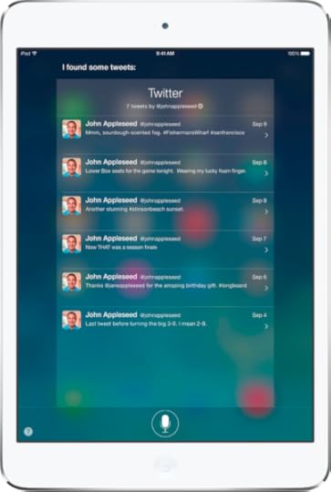
What leaks from behind is the field of app icons and the background
image behind them. There is absolutely no benefit to seeing that
information at this point in the user's interaction, so at best it can be
“not a distraction”, but at least to me the blobs of color are a horrible
distraction, and the text is more difficult to read where the blobs are
bright white. And this is the example they chose for product marketing...
it could be much, much worse, depending on what happens to be in use for
the icon-screen background.
In other areas of iOS 7, the transparency had different levels of impact,
but in every case I noticed, it was a detriment. Transparency seems to be
to iOS 7 as a curved screen is to
a cell phone: worse than before.
Nikon D4 + Nikkor 24mm f/1.4 — 1/50 sec, f/11, ISO 1800 —
map & image data — nearby photos
Outside Hallway
at the Seiryoji Temple (清涼時), Kyoto Japan
Vertical Desktop-Background Versions
1050×1680 · 1200×1920 · 1600×2560
Another bad design chose of iOS 7 is that in its drive to remove as many
design elements as possible (“more clean, less cluttered!”), important
visual clues that helped direct the eye were removed, such as visual clues
to isolate individual items in a list. Lists of friends in the Find my
Friends app used to be clear and obvious, now became jumbled masses of
pixels that one must spend neurons on to decipher.
Feature wise, the theme of iOS 7 seems “more features; harder to
discover”. Discoverability is normally a big part of interface design...
great features mean nothing if users don't even notice that they're
available.
Prior to iOS 7, one could access the whole-device search feature by
moving to the zeroth screen of app icons, advertised by the standard
“search” magnifying-glass icon at the left of the line of dots that
represent each screen of app icons. Even if you somehow missed the search
icon, in normal use of the device you'd sometimes overrun the home page
while swiping around and quickly learn how to get to the search screen.
Now in iOS 7, the search screen simply seems to be gone, at least until
you get frustrated enough to do a web search to learn where it went. Once
you learn it, it's quite useful, but completely non-intuitive and hidden
until you do.
Nikon D4 + Nikkor 85mm f/1.4 — 1/2500 sec, f/1.4, ISO 100 —
map & image data — nearby photos
Consultation on the Go
at the Nishi Hongwanji Temple (西本願寺), Kyoto Japan
Desktop-Background Versions
1280×800 · 1680×1050 · 1920×1200 · 2560×1600 · 2880×1800
It used to be before iOS 7 that you could get to the “notification
center” (list of alerts like new messages and email) by swiping from the
top of the screen down. This wasn't easily discovered unless your finger
happened to bump the top area of the screen, in which case a skeuomorphic
set of “grip ridges” would show up letting you know that there was
something to pull down. It's worse in iOS 7 in
that what you get when you swipe down like that depends on where you start.
(If you have iOS 7, give it a try: swipe down
from the very top, and from some place that's not the top. Also, for a
great feature, try swiping from the bottom of the screen.)
Another gimmicky bend to iOS 7 is the use of meaningless “because we
can” animation. Many animations are actually useful, such as the
“disappearing genie” effect in OS X when you hide
a window, because it shows you where the window has gone, which in turn
teaches you how to get it back. The animations in iOS
7 that I noticed are not of that variety: they add no information,
merely frustration.
Nikon D4 + Nikkor 24mm f/1.4 — 1/100 sec, f/9, ISO 100 —
map & image data — nearby photos
Sundrenched Rice Paddies
at the Shugakuin Imperial Villa (修学院離宮), Kyoto Japan
Desktop-Background Versions
1280×800 · 1680×1050 · 1920×1200 · 2560×1600 · 2880×1800
“Change” is neither necessarily good nor bad... only the result should
really matter. I only suggest that if you're going to change something well
established, be sure to have a good reason. It seems to me that many of the
UI changes to iOS were not done for a good reason.
(I should point out that for the most part I, like the iOS 7 team, am bad at design... heck, just look at my
blog's visual design. But you don't have to be an opera singer to recognize
when someone else can't carry a tune.)
Nikon D4 + Nikkor 85mm f/1.4 — 1/200 sec, f/1.4, ISO 2200 —
map & image data — nearby photos
Pure Enjoyment
my friend Kataoka-san enjoying his teeny tiny baby-cup of espresso
at Restaurant La Verveine, Kyoto Japan


Jeffrey E.F. Friedl's Blog

- Jeffrey E.F. Friedl's profile
- 13 followers

