
Pulled From My Files #16: MUSINGS
 Logo images © Steve Tice and Todd Klein.
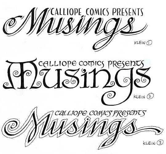
In 1993 I was asked to design the logo for a fanzine created by Steve Tice. The content was to lean heavily toward SANDMAN and the work of Neil Gaiman. I loved the name, and came up with these three sketches. The center one was chosen for the final logo. The curlicues were inspired by the art of Frank C. Papé, in his illustrations for “The Cream of the Jest” by James Branch Cabell, a book and author Neil and I both liked. Papé often gave his delightful pen and ink illustrations handsome hand-lettered captions. Here’s an example:
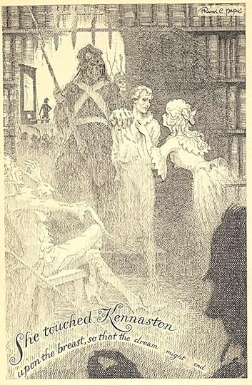
If you don’t know the work of these gentlemen, it’s worth seeking out. I don’t think Papé illustrated a lot of Cabell’s books, but the ones he did are greatly enhanced by his work, which seems largely forgotten now.
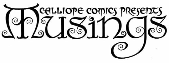
Here’s the final logo, one of my favorites. The magazine only lasted a few issues, but they were good ones.


Todd Klein's Blog

- Todd Klein's profile
- 28 followers

