The Year Without Pants Cover: how it was designed
I’ve previously written about how covers should be designed (See How To Design A Great Cover).
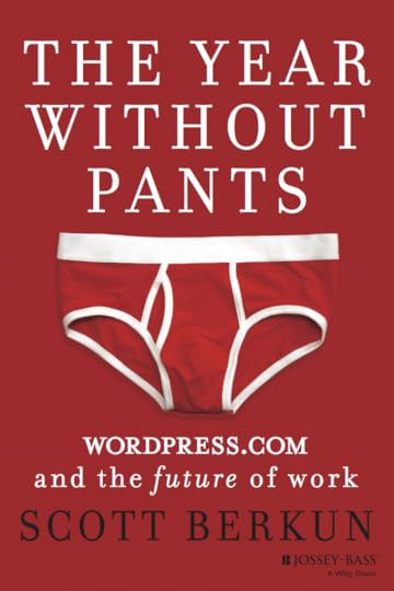
My fifth book, The Year Without Pants: WordPress.com and The Future of Work, has the most polarizing cover of all my books. Many people love it and many hate it. Here’s the behind the scenes story of how it was designed.
Round 1
The design of a book cover naturally follows the title of the book itself. The odds of a a strong cover rise when you have a strong title to work with (See The Truth About Book Titles for my approach to choosing book titles). Stronger titles are simple, clear, short and attract attention.
Most publishers, and not authors themselves, lead the the cover design process. It’s a surprise to most readers, but often authors have little say about the covers their books get. I’m always very involved and it’s something I’ve earned with four popular books and a design background: I always make sure the publisher knows, before I sign, that I’ll be centrally involved.
From How To Design A Great Cover, I reused the four principles in the cover design discussions:
Bet big on one visual concept
Title should be readable in online thumbnail / 10 feet away
Simplicity wins
Be bold: it’s better to have some people love it and some hate it than be bland and have no one care at all
Once the title was chosen I made four quick and deliberately rough mock-ups to get the design conversation started.
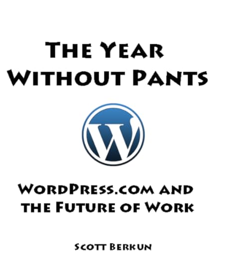
The first one has an image from No Pants Day, an annual event around the world. The last two use an amazing photo by Paul Zollo, who was kind enough to let me use it in chapter one of Confessions of a Public Speaker. I wanted a design that was playful and put nudity or the notion of being naked in a funny and social context, rather than in a sexual one.



Round 2
Adrian Morgan was the lead designer from Jossey-Bass, and he generated most of these mockups and did the final version of the design. He did an excellent job of exploring widely different directions, which is the only way to arrive at something strong. The biggest mistake in the early rounds is only considering a narrow range of similar options.
One challenge the titled created was it was about the absence of something: The Year Without Pants. The challenge, as fun as it was, was to figure out how to show the absence of something. Here’s the first round of mockups with brief commentary from me.
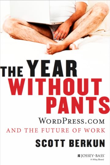
This was good, until you notice where that left hand is.
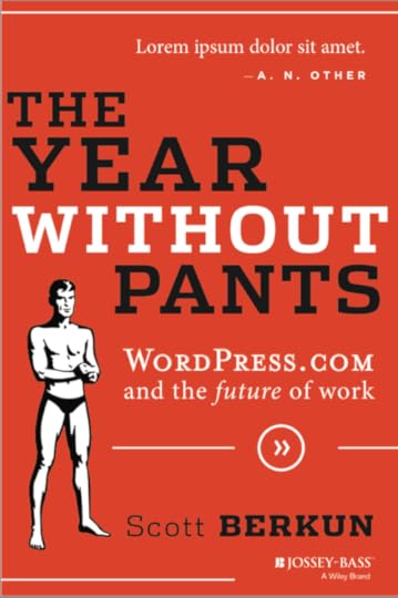
We liked this, and eventually made many variations of it, but there was always something creepy about the figure. We tried to do something more like the cover of Naked Statistics, going for cute rather than creepy, but it never quite worked.
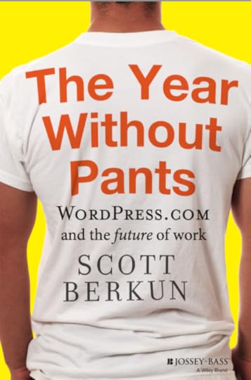
This was interesting, but had little to do with pants or any other concept really (why is this on the back of a shirt, other than it looks interesting?) It didn’t take enough advantage of the opportunities for fun or surprise that the title provided.
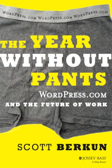
The grey, yellow, white palette is strong, and surprising in a positive way for a business book. This was a strong candidate. It did hint at the smell of old gym shorts, but since the underwear was a background element, rather than in the foreground, it worked.
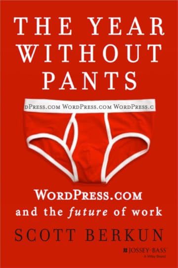
This one made me laugh the first time I saw it. And it still does. What kind of mad man wears bright red underwear? (I’d learn later you you can buy them here). It’s provocative, simple, bold, polarizing and raises questions, all things the book itself does.
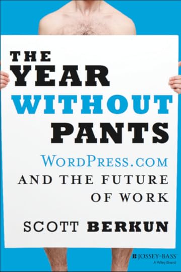
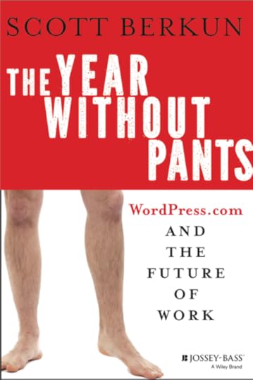
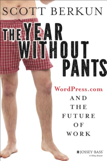
Round 2 Voting
I often invite readers to vote on big decisions. It’s useful even if I don’t end up going with the most voted choice, as you folks always offer thoughtful comments and help me think about what I’m trying to do.
This time I picked 5 of the options with my editors at Jossey-Bass and let people vote. 367 people voted and the red briefs came in first by a small margin.
Round 3 (WordPress logo)
One direction we wanted to explore was incorporating the WordPress logo into the design. Since the book is about working at WordPress.com it was natural to try. We experimented with a few options, including swapping the red briefs, which I knew some people hated, for the safer option of blue boxers. I pitched it to Matt Mullenweg, but he made clear the logo was a trademark and basically impossible to use in a context like this.
Forgetting the book for a moment, I think WordPress boxers would be a big hit in the WordPress swag store, don’t you?
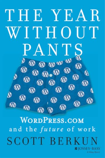
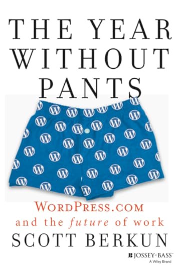
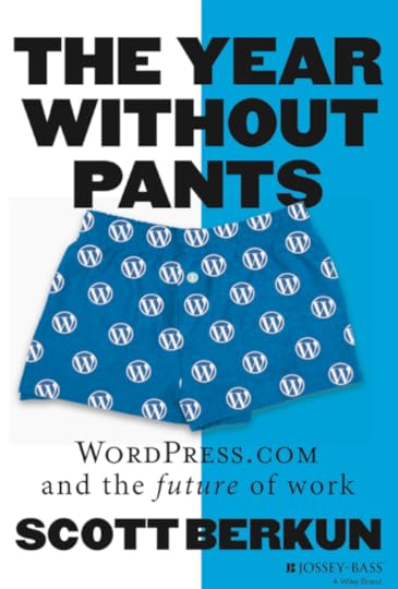
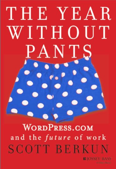
This last design was far too July 4th (red, white and blue) but it was a worthy experiment, and then very worthy of killing.
Round 4 (Refinement)
With the logo out of the running, we returned to the red briefs and refined the details.
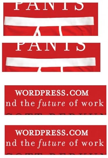
We abandoned putting “WordPress.com” in the waistband as the design was cleaner and stronger without it: the white waistband almost underlines the title. We cleaned up various leading, kerning and spacing bits (Matt Thomas, Creative Director at Automattic at the time, gratefully lent me his eyes) and made the main title heavier, with tighter spacing.
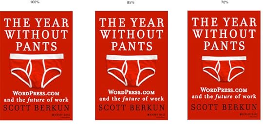
I also mocked up different sizes which made clear a smaller object in the center worked better (We went with the middle version).
Round 5 – Final
And here is the final design.
Impact: The cover contributed to the movie
I’d planned to do a movie trailer for the book and the cover design gave us plenty to work with (watch to the end):
Impact: General
If you have a theory of what a good cover is, you’ll be disappointed at how little impact covers seem to have on the success of books. Go look at the top selling books on Amazon.com - you won’t find any consistent cover design theory at work here. Many books with bad covers sell well, and many books with great covers don’t. We love to argue about cover designs, but in reality we buy books because of our trust in who recommended it to us more than anything else.
But of course I do think design matters. These behind the scenes posts take time to put together, and more importantly they illustrate how much effort I put into thinking about the book covers themselves. It’s a singular image that will be reused thousands of times to represent the book.
By using the design four principles:
Bet big on one visual concept
Title should be readable in online thumbnail / 10 feet away
Simplicity wins
Be bold: it’s better to have some love it and some hate it than be bland and have everyone not care at all
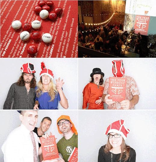
It has been much easier to have fun with branding and promoting this book than any of my others. Even at the book launch party it was easy to invite friends and fans to have some fun, and reuse the briefs, the colors and the ideas from the book in all sorts of crazy and entertaining ways and I expect that to continue.
I’ve had people tell me they’re afraid to read the book at work, or give it to coworkers, because of the cover, which is fascinating. It’s just a pair of ridiculous underwear! We are all wearing underwear right now (one hopes) in all workplaces across the globe. If your organization can’t handle a bright red book, or is terrified of the existence of undergarments, I doubt the challenging stories and ideas about management, work culture and creativity in the book itself will go over well either, which perhaps suggests the cover is doing its job of representing what the book is and who it might be for. But it’s hard to know: what do you think?
