
Pulled From My Files #15: Marvel Logos
Images © Marvel Characters, Inc.
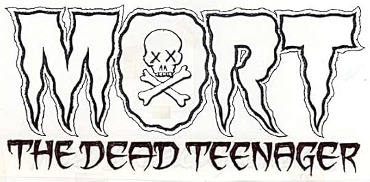
My usual method of designing logos is to work out some ideas in small thumbnail quick sketches, then create full-size marker sketches, like the one above. This is the only sketch I saved for the assignment, so I’m not sure how many I did, but it was usually three to begin with, more if needed.
The finished logo is very close to the sketch, with the most obvious difference being the bottom line has thicker letters.
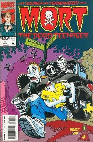
Here’s the printed book, which I never read. Was Mort a ghost or a zombie?
Occasionally I would work out a finished sketch in pencil rather than markers, especially when it required careful measurement like this one. You can see the curved guidelines that kept everything spaced properly horizontally, and the focal point of the perspective lines at the bottom.
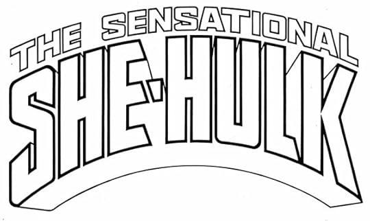
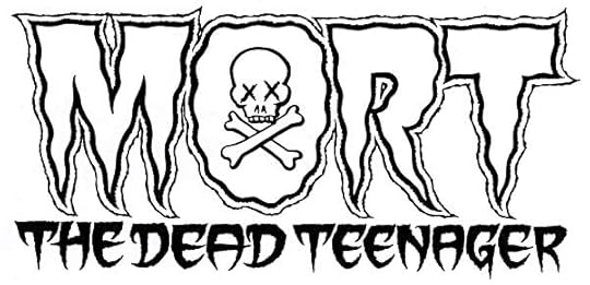
The finished logo was made on a piece of Denril plastic vellum laid over the pencils and inked with my Castell TG-1 technical drawing pens. Corners could be made sharp, and any extra ink removed by scratching away the dried ink with an exacto knife.
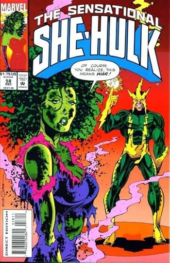
Most issues had at least part of this very tall logo covered by art. Here’s one that’s nearly complete.


Todd Klein's Blog

- Todd Klein's profile
- 28 followers

