
The "Easy" Social Security Fix, Ctd
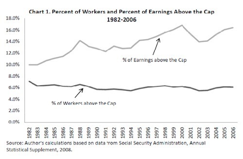
Yglesias says this chart is reason to lift the Social Security cap:
The quantity of a given person's income that's subject to Social
Security taxes is "capped." What's less well understood is the fact
highlighted by this chart from John Irons' recent testimony (PDF),
namely that trends in the US income distribution have meant that a
higher and higher share of national income is escaping the Social
Security system.
Andrew Biggs counters. I'm not wedded to this. What the Dish is wedded to are ...


No comments have been added yet.
Andrew Sullivan's Blog

- Andrew Sullivan's profile
- 153 followers
Andrew Sullivan isn't a Goodreads Author
(yet),
but they
do have a blog,
so here are some recent posts imported from
their feed.

