
Pulled From My Files #13: INFINITY INC.
Images © DC Comics, Inc.
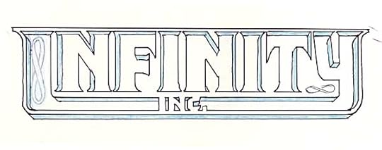
When I was on my game designing logos in the 1980s, I would sometimes hit a design I liked on the first sketch. INFINITY INC. of 1983 was one of those. I don’t think I did any other sketches, I just brought this one in and they gave the nod to go ahead. I was trying to work in an infinity symbol, the large one on the left was tried, then covered with white paint, but the marker has since bled through. The small one on the right would have worked okay, but was apparently rejected.
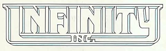
Here’s the finished logo drawn in ink on Denril plastic vellum with technical drawing pens. As in the sketch, I added some light blue pencil to show where the shading should go, as the logo was a little unclear without that. Some of the perspective lines were adjusted, and in fact faked a little to give each vertical stroke at least some shading. The original idea was to have the centers of the letters be open, allowing art to show through.
In practice, this was very hard to read, and only tried a few times, not very successfully.
Instead a solid color usually filled the open letters, as here. Worked fine, and was much easier to read. Colorists often got the shading wrong on the INC, though, as here. The section inside the C and below the diagonal of the N should be the shade color, in this case blue. Not a big deal, and probably noticed only by me.


Todd Klein's Blog

- Todd Klein's profile
- 28 followers

