How to Avoid the Self-Published Look - Part 1
Appearance Is Everything
This chapter helps you avoid publishing a book that looks cheesy, vain, and amateurish. Steve Jobs taught me that little details separate the mediocre from the excellent. The way to avoid the "self-published" look is simple, and it increases the attractiveness, professionalism, and marketability of your book.

The first outward sign that your book is self-published is a crappy cover design. This topic merits a long discussion, so we'll address it in the next chapter.
The first internal sign that your book is self-published is crappy writing, but our writing and editing tips will help you avoid this. Sue Grafton notwithstanding (she did retract her statement http://louisvilleky.com/2012/08/more-from-sue-grafton-on-publishing-indie-writers/ in the epigraph above, but S for Self-Publishing is out of the question), the stigma of self-publishing has diminished. But it still exists, and there's no reason why you can't make your book look like it's professionally published; remember, the goal is artisanal books.
Front Matter
Beyond the cover, the first sign of a self-published printed book is the lack of traditional front matter on the first few pages of your book. We recommend referring to The Chicago Manual of Style http://www.amazon.com/Chicago-Manual-Style-16th-Edition/dp/0226104206 to ensure that your front matter is correct. This thousand-page tome also covers what you need to know about grammar, punctuation, and the mechanics of publishing.
Power tip: You should buy a copy of The Chicago Manual of Style because having one around makes you feel like a real writer, and it impresses people when they see it on your shelf. And you should not hire a copyeditor who doesn't own one.
Ebook Front Matter
When it comes to ebooks, there is a tradeoff between the credibility of traditional front matter and the marketing benefits of facilitating people's ability to "look inside" books on Amazon.
People can see approximately 10 percent of a book this way. Let's say your book is two hundred pages long; people will be able to read the first twenty pages. Do you want to use up your twenty pages on typical front matter? Even if you don't care about the wasted pages, there is no reason to force customers to click five to ten times to get to the good stuff.
This is like a pharmaceutical company running pages of FDA-required warnings and disclaimers ("In the event of an erection lasting more than four hours, seek immediate medical help to avoid long-term injury") before advertising the drug itself. For marketing purposes, a better order for ebook front matter, tradition be damned, is:
* Cover
* Blurbs (more on blurbs below)
* Table of contents
* Foreword or preface (but not both, and neither for fiction)
* Chapter 1
You can stick everything else in the back because most of it doesn't matter to most people. This structure means that prospective readers can garner more information in less time to make a buying decision-which is the goal, after all. Remember: with a physical book, people can skip ahead pages at a time, so you can stick with The Chicago Manual of Style's recommendations. On a website, too many clicks spoil the preview. (Hat-tip: I got this idea from Michael Alvear in his book Make a Killing on Kindle.)
Organization Name
The second sign of self-publishing is that you've named the publishing company after yourself. One hundred years after their start-long after the founders died-names like Alfred A. Knopf, John Wiley, and G. P. Putnam sound prestigious and cool, but the name of your organization needs to sound prestigious and cool before you die.
For example, The Schmoe Way by Joe Schmoe from Schmoe Press doesn't cut it. Using your last name as the publisher's name screams "self-published" and, even worse, "I lack imagination." Pick a street name, a pet's name, a geographical landmark, or your favorite Pokémon character. Then Google your idea to ensure that no one else already uses it.
Anything is better than your last name for your company's name. Nononina Press, the publisher of APE, is the first two letters of my four kids' names.
Blurb Overload
The third sign of self-publishing is an excessive number of testimonial quotes (known as blurbs in the publishing business). Good blurbs are short, sweet, and limited to six. They answer the question "Why should I buy this book?"
A book with more than six blurbs means that the author doth promote too much. This is like PowerPoint slides that try to overwhelm you with text. A better goal is to establish a reputation that is so well known and a topic that is so timely that no blurbs are necessary at all.
We recommend including blurbs in the front matter of your book for two reasons: first, they reinforce the wisdom of purchasing your book. You can never reduce cognitive dissonance too much-even for a $0.99 purchase.
Second, bloggers will often grab blurbs and use them in their review. We recommend putting blurbs on page i or ii to ensure that people see them. This requires pushing everything else back a page, but page count in ebooks is irrelevant, so it isn't a problem.
Blurbs on the thumbnail of the cover are too small to read, and there is no back cover. However, if you publish your book with Kindle Direct Publishing, you can include your blurbs in the online listing of your book.
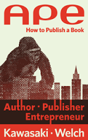
Guy Kawasaki has written 12 books, 10 of which were traditionally published. His newest book is APE: Author, Publisher, Entrepreneur - How to Publish a Book, which helps people understand how and why to self-publish.
APE: Author, Publisher, Entrepreneur - How to Publish a Book, by Guy Kawasaki and Shawn Welch, is available as an eBook ($9.99) and in paperback ($24.99). Visit http://apethebook.com/


Published on September 29, 2013 20:23
No comments have been added yet.


