
Pulled At Random From My Files #10
Images © DC Comics, Inc.
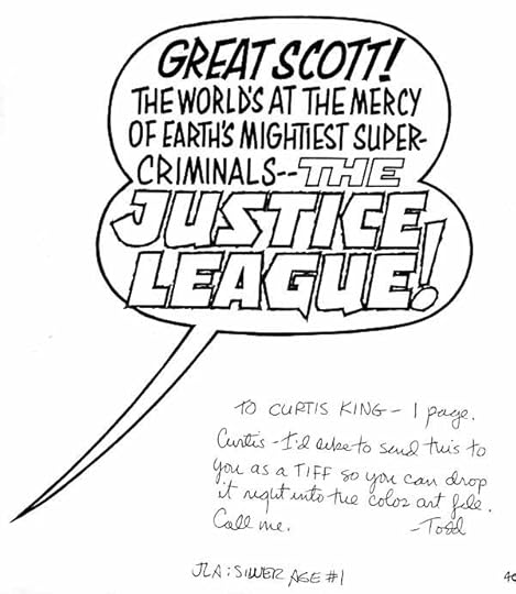
In 2000 DC put out a Silver Age series whose covers were meant to recapture the look of that era, the mid 1950s into the early 1970s (a much debated time frame). I had been doing all my cover lettering for DC on my Mac computer since about 1995, but when asked, I was happy to supply this cover balloon for the JLA first issue. What cover designer Curtis King wanted was the look of Gaspar Saladino’s classic display lettering style. That was no problem for me, I’d been imitating it more or less since I started doing DC covers in 1978 or so, Gaspar being my lettering role model.
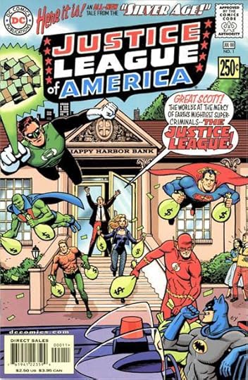
Here’s how it looked on the cover, which did a fairly good job of capturing the period I think. the other cover lettering above the logo is in the style of Ira Schnapp, Gaspar’s predecessor as the main DC cover lettering man. Having the two styles on the same cover is a little odd, but it works for me. Fun stuff.


Todd Klein's Blog

- Todd Klein's profile
- 28 followers

