A Good Cover... and the Importance of Branding!
When I self published my first novel in June of 2010, I jumped into the deep end of the pool with no floaties on and I had no idea how to swim. It wasn't the best idea, but somehow I survived.
A Chance for Charity (The Immortal Ones) was released to the eBook world with a crappy cover, which produced a barely audible whisper. I didn't know much - I just knew that after sitting on my computer for a year, it was time for Charity to get out there. Thank goodness for the Amazon Kindle Forum. Somehow I stumbled upon the numerous threads and landed in the right one... no... the best one! The other authors and the readers I met in the forum taught me how to swim.
I think one of the most important lesson I learned was that I wasn't just writing a series of novels, I was creating a BRAND.
THE EVOLUTION OF A CHANCE FOR CHARITY...
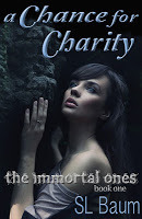
 JUNE 2010 - Cover number one. I will start off by saying that I absolutely LOVE the photograph that I used on the cover of this first one. My husband took it during one of our many trips to Telluride. But I can look back now and admit that there is NOTHING about it that says it is a YA Paranormal book. It doesn't speak to anyone. The design looks childish and very few copies were sold with this cover. But this first cover lead me to my next one - which was only slightly better...
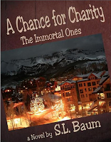
 AUGUST 2010 - Cover number two was designed to look like the one that I created using the Cover Designer at CreateSpace (the Print on Demand website that I use for the paperback copies of my novels). It is a slightly different font than the one I created there... but the design is the same. I still used the photograph of Telluride, because, like I said, I love it. This cover was more successful for me but only slightly. It didn't take me long to realize that it had to go. I needed to appeal to the Young Adult audience.
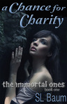
 JANUARY 2011 - Cover number three came about because I knew a change had to happen or I would never reach the audience I was striving for. Charity was steadily increasing in sales, but as I worked on the sequel and experimented with covers for Book#2, I just couldn't see the "Setting Photographs" working toward a brand. I searched stock photo websites and decided that this faceless girl reminded me of Charity. So I went with it. I designed it on my own, getting many opinions as I experimented, and ended up with this one. It worked well and sales continued to rise.
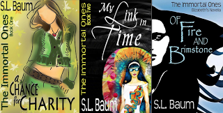
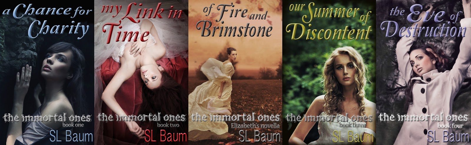
 MARCH 2012 - Cover number four is a result of learning that a series must be branded. The 3rd cover did a great job - it grew the fan base of The Immortal Ones. But as subsequent books were released, I wasn't happy, they just didn't feel cohesive to me. You must have a uniform look when marketing a series of books. I attempted to stick with the illustrated covers and released 2 novels and a novella with illustrations... but they just never felt quite right. It was while I was in Telluride during a ski-trip with my family that inspiration hit me once again and I went in search of a recognizable brand. This is the final cover I created for Charity...
People do judge a book by its cover... it took me six months to realize that I was putting out a product that didn't appeal to my intended market. That was a bad idea. And while my first attempt to design covers specifically for the YA audience was more successful than my covers with a photograph of Telluride, I still wasn't hitting my mark.
It took me almost two years to realize that creating a consistent and recognizable brand was exactly what I needed for readers to immediately know that the product they were looking at belonged to me...
SL Baum.
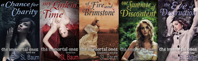
My unsuccessful attempt at branding...
This is why I needed a change. The covers were not consistent... they were not a BRAND.
 THE
THE
IMMORTAL
ONES
a clearly recognizable brand.
A Chance for Charity (The Immortal Ones) was released to the eBook world with a crappy cover, which produced a barely audible whisper. I didn't know much - I just knew that after sitting on my computer for a year, it was time for Charity to get out there. Thank goodness for the Amazon Kindle Forum. Somehow I stumbled upon the numerous threads and landed in the right one... no... the best one! The other authors and the readers I met in the forum taught me how to swim.
I think one of the most important lesson I learned was that I wasn't just writing a series of novels, I was creating a BRAND.
THE EVOLUTION OF A CHANCE FOR CHARITY...
 JUNE 2010 - Cover number one. I will start off by saying that I absolutely LOVE the photograph that I used on the cover of this first one. My husband took it during one of our many trips to Telluride. But I can look back now and admit that there is NOTHING about it that says it is a YA Paranormal book. It doesn't speak to anyone. The design looks childish and very few copies were sold with this cover. But this first cover lead me to my next one - which was only slightly better...
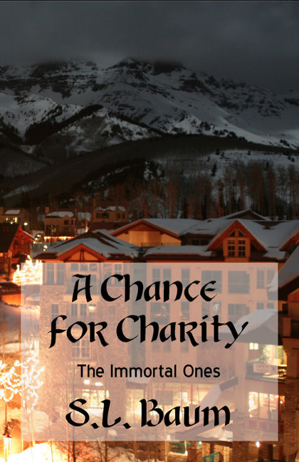 AUGUST 2010 - Cover number two was designed to look like the one that I created using the Cover Designer at CreateSpace (the Print on Demand website that I use for the paperback copies of my novels). It is a slightly different font than the one I created there... but the design is the same. I still used the photograph of Telluride, because, like I said, I love it. This cover was more successful for me but only slightly. It didn't take me long to realize that it had to go. I needed to appeal to the Young Adult audience.
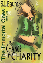 JANUARY 2011 - Cover number three came about because I knew a change had to happen or I would never reach the audience I was striving for. Charity was steadily increasing in sales, but as I worked on the sequel and experimented with covers for Book#2, I just couldn't see the "Setting Photographs" working toward a brand. I searched stock photo websites and decided that this faceless girl reminded me of Charity. So I went with it. I designed it on my own, getting many opinions as I experimented, and ended up with this one. It worked well and sales continued to rise.
 MARCH 2012 - Cover number four is a result of learning that a series must be branded. The 3rd cover did a great job - it grew the fan base of The Immortal Ones. But as subsequent books were released, I wasn't happy, they just didn't feel cohesive to me. You must have a uniform look when marketing a series of books. I attempted to stick with the illustrated covers and released 2 novels and a novella with illustrations... but they just never felt quite right. It was while I was in Telluride during a ski-trip with my family that inspiration hit me once again and I went in search of a recognizable brand. This is the final cover I created for Charity...
People do judge a book by its cover... it took me six months to realize that I was putting out a product that didn't appeal to my intended market. That was a bad idea. And while my first attempt to design covers specifically for the YA audience was more successful than my covers with a photograph of Telluride, I still wasn't hitting my mark.
It took me almost two years to realize that creating a consistent and recognizable brand was exactly what I needed for readers to immediately know that the product they were looking at belonged to me...
SL Baum.

My unsuccessful attempt at branding...
This is why I needed a change. The covers were not consistent... they were not a BRAND.
 THE
THEIMMORTAL
ONES
a clearly recognizable brand.


No comments have been added yet.