Notes from The Literary Consultancy's conference 2013 - Writing in a Digital Age: 5 Key Stages of Self-Publishing - Part II

Part I of this segment of the series can be found here: http://www.goodreads.com/author_blog_...

Those of you who follow my blog will know that I have been writing a series of posts about what I learned at the recent "Writing in a Digital Age" conference. The staff at The Literary Consultancy have collated various press reports and write-ups on their website. Check it out here: http://www.literaryconsultancy.co.uk/...

My blog posts are included!

Now on to part 2 of this topic. Today I'll tell you what was said about the importance of book design.

There was a very interesting presentation about how book design (the cover and interior) can be an effective marketing tool for writers.

Lots of market research goes into creating covers that sell books. This is one area that I found quite eye-opening. I've always thought that little or no imagination goes into the book covers created by the big publishers, but there is a method in their madness. They know which covers sell, so why bother spending lots on a cover? They have researched the elements that have to be included on a cover for the book to stand a chance of selling to a target market, and they make sure that their covers have those.

Kristen Harrison, found of The Curved House, said that the covers of commercial books 'speak' to the target market.

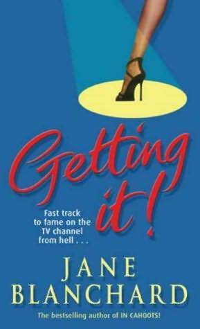
An example given was that for chick-lit books, typically marketed at 30-40 year old professional women, the usual key requirements are:

1. The colour pink included somewhere on the cover
2. A font that looks like handwriting
3. A woman's legs from the knee down
4. A pencil skirt

Yes, weird, but true... Some covers were shown at the conference and it really was obvious that most of the chick-lit books had followed this winning formula to some extent using one or more of these elements.

Here are some covers I found that kind of prove the theory:


Lots of pink, and legs, and handwriting font there...

Another important point brought up at the conference was about brand identity and how that can help to attract readers and sell books. We see it with the bestselling authors, where they have many books with similar book covers that identify them as the author. For example, they may always use the same font type for their name, or maybe a similar picture on each cover.

The example given at the conference was Rachel Hore. If you take a look at her website, you can see how similar all her book covers are: http://rachelhore.co.uk/

Many indie authors (myself included) do not set out with a marketing plan when designing a cover; they will just choose a cover they feel suits the story and the book. There is a subjective feel to many indie authors' covers. However, from a marketing point of view this is probably not the best strategy.

Some indie authors are aware of the need for brand identity. A couple of authors that spring to mind are Terry Tyler and Susan Buchanan. If you take a look at their book covers, you'll see what I mean:

Susan's books: The Dating Game by Susan Buchanan Sign of the Times by Susan Buchanan


Terry's books: You Wish... by Terry Tyler Nobody's Fault by Terry Tyler The Other Side by Terry Tyler


(click on the book covers to see larger images).

It definitely gives a more professional image when you have these types of 'brand image' covers.

******

It's not only the outside of your book that will influence what readers think of it; you have to think about the inside as well.

The type of font you choose is important.

The standard type fonts used by most independent authors are Times New Roman, Helvetica, Arial. At the conference, we were told that these types of fonts may put readers off as they are associated in their minds with office documents, and the look of the book will be 'home-made'. To elevate your book to a more professional status, it was advised that writers should move away from using the standard fonts available with MS Word.

Suggested fonts for use inside a book are benbo and garamond. But it was also mentioned that sometimes publishers will state which font is used at the start of the book on the book information/copyright page. If you read a book by a large publisher and like the font, you can try looking there to see which font it is. Most professional fonts can be bought. A few websites mentioned where you can buy fonts: 1001fonts.com, dafont.com, fontgrill.com, Google

Apparently, readers like the tried and tested book interiors. For example, it's usual in traditionally published books to start the first few pages by numbering in roman numerals, e.g. i, ii, iii, and then when the actual book starts you go onto normal page numbers.

Chapter drops are usually about one third of the page. It was advised that authors stick to this when publishing. The idea is to make readers feel at home, and to associate your book with traditionally published books.

This design strategy does not stop with your book cover. It was advised that things like the fonts used and the colours used on your covers should become your identity online also, for example on your website or your Facebook Page.

Make your website look interesting, add images and videos.

It was also advised that you should use good quality images on your website and other networking sites.

There are some great websites that provide free photos for book covers under the creative commons licence, i.e. you can use the photo for free and just have to credit the photographer. One example given was Flickr: http://www.flickr.com/creativecommons/

I've also found a good site http://www.morguefile.com


Another tip given was that you should complete fully your profiles on Facebook, LinkedIn, and other such sites. Often they are left incomplete. Make sure you add an image to your profile pages and a bio.

Wordpress.com was recommended as a good site for creating a website/blog as it has good quality images.

Something that was mentioned was how big publishers often have different designs for covers depending on where they are selling the book. Different markets around the world respond to books covers in different ways. The point was made, however, that indie authors do not really have the option of designing different covers for different countries because the way we can publish is limited. One book design goes all around the world with independently published books.

There is a website, that I had never heard of before, called Fixabook.com where you can get opinions on book covers, which could prove quite useful: http://www.fixabook.com/


********


Well, I think that is quite enough information for you to get your heads around today. I was going to write up this part of the series in two parts, but I will add a Part III. In the next part of this section of the series, I will pass on some tips from an author who switched from traditional to self-publishing.

**********************************************************************************

6 likes ·   •  13 comments  •  flag
Share on Twitter
Comments Showing 1-13 of 13 (13 new)    post a comment »
dateUp arrow    newest »

message 1: by Susan (new)

Susan Buchanan thanks Maria for including me as part of your post. I confess to not having read the first part, but having read this post, I will definitely be reading it now. Lots of info there I knew, but so much that I didn't. I once heard one of the big supermarkets will only take books which have blue covers! I very much believe in brand presence, and as you may recall, I re-did my cover for Sign of the Times, courtesy of my fab designer, Brad Covey, late last year. On another note, I didn't know that about the fonts and indeed, haven't even heard of some of them! Flickr/creativecommons will be useful too. Great post! Sooz


message 2: by Maria (new)

Maria Thanks, Sooz! It was a very informative and interesting conference. I didn't know that about the fonts either!!
Yeah, I'll probably be making use of that creative commons page on Flickr!

Can't believe the supermarket would only take books with blue covers!! Makes you wonder what type of shoppers they have there LOL


message 3: by W. (new)

W. The fixabook.com link is invaluable. Thanks.


message 4: by Maria (new)

Maria Yes, it certainly seems like a useful resource, Wendell :)


message 5: by James (new)

James Jr. Thanks for sharing, Maria. *waves* How are you? Busy, right? Everybody's crazy busy these days. :) I'm glad to see that much of what you shared are things that I already knew. That means I'm not behind on the curve of this stuff. *laughs* There's so much to think about in this business, isn't there?
Take care of yourself, my friend.

-Jimmy


message 6: by Maria (new)

Maria Hi Jimmy! Thanks for reading! You are ahead of me in this marketing game if you already knew these things... much of it came as news to me LOL I've never been very good at marketing. It was good to get some tips from this conference (I need them!).
Yes, I am very busy, editing 2 books, writing another, running 2 blogs and a forum, as well as reading and reviewing and trying to keep up with the networking sites, and my overly full e-mail inbox... Oh... and that little thing of working full time and "real life". It's a wonder us independent authors manage to ever get any books published, isn't it?
I hope your writing is going well, Jimmy! x


message 7: by Julie (new)

Julie Powell Very interesting. When I designed the cover for Misadventures Of Fatwoman, the real focus was on the scales and the word 'help' - although there is pink and the font is light and fun. I'd not thought of the story as chick-lit, although it deals with women and how they feel about their bodies.

I think the cover highlights the humour but also demonstrates the weaknesses of the heart.

http://www.goodreads.com/book/show/12...


message 8: by Darcia (new)

Darcia Helle Fascinating information, Maria. I fully admit to having no brand or coherent marketing strategy.

The book cover thing struck me after I published Killing Instinct. Being the third book in the series, I was trying to market them all together and I realized the covers have absolutely nothing in common. Perhaps this is my brand? Absolute incoherence. (Like my personality!) :)


message 9: by Maria (new)

Maria Darcia wrote: "Fascinating information, Maria. I fully admit to having no brand or coherent marketing strategy.

The book cover thing struck me after I published Killing Instinct. Being the third book in the ser..."


LOL, I think we share the 'absolute incoherence' problem. My covers are all completely different. This is proof I have no clue about marketing. I suppose it makes sense to have a brand identity.


message 10: by Maria (new)

Maria Julie wrote: "Very interesting. When I designed the cover for Misadventures Of Fatwoman, the real focus was on the scales and the word 'help' - although there is pink and the font is light and fun. I'd not tho..."

Julie, that cover is great, and definitely fits in with the chick-lit market. I'm sure all women could find something to relate to in that book :)


message 11: by Julie (new)

Julie Powell Thanks, Maria.


message 12: by Lisette (new)

Lisette Brodey Terrific blog, Maria. Lots of super valuable information. Thanks for posting.


message 13: by Maria (new)

Maria Thanks, Lisette... you've just reminded me, I have some more notes from this conference that I need to post! Where does the time go?? LOL


back to top