
Infamous Mistakes on Websites – Are You Making Them?
 Fact: Anyone can build a website. WordPress has made that into a reality. Even if you have no professional experience with web design or coding, you can still get a reasonable and good website by using WordPress.
Still, if you approach website building for the first time, you should consider a few guidelines that first-timers are not always aware of. In a previous article I wrote about the top 5 mistakes your website should NOT have.
However, the more I look at websites the more it becomes evident that certain concepts are not clear for those that built that site.
Let’s start with common mistakes you probably want to avoid:
 Annoying Navigation
In the old economy the mantra was “Location, location, location” In the new Economy the mantra is “traffic, traffic, traffic”. If you want to make sure that those that get to your site will not leave it after the average 3 seconds, make sure that once they get to your site they are able to find what they are looking for immediately.
When visitors come to your site and don’t know where or how to find the information they need, they will leave and will never come back. Avoid links that are hard to find, buttons that are not visible or placed in the wrong spot.
There needs to be logic, do not base it on your intuition make it logic for any person to find it. You want your users to be able to find what they need in as few clicks as possible. Keep header, footer and navigation bar consistent on each page. Make sure your visitors can easily access all the pages.
Too Much Clutter on the Homepage
Less is more in websites today. You can actually offer tons of great content on your site but display it in as simple and organized way as possible. Don’t use too much text, and if you want to use multiple images, go for a sliding gallery that depicts just one photo at a time.
Remember the homepage is your first impression and you can never have a second impression if they leave you on the first one. Make sure you make your homepage as simple and as attractive as possible – attractive to what YOUR CUSTOMERS are looking for.
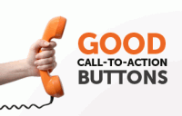 No Call to Action
On your Homepage you MUST have a “Call to Action”. This is a request from your site visitors to act, usually represented by buttons and links. Your site’s Call to Action depends on its purpose. Do you want people to download/ register/ subscribe/ view/ share/ follow or what not? Use a Call to Action to make it crystal clear.
While humor and wit are generally a good thing in online content, with the Call to Action you want to keep it as simple and straightforward as possible. Remember, the goal here is to get them to take action!
AND… above all remember – you are not trying to SELL them anything at this stage. You just want to get to know them. It’s your “first date” you don’t ask them to merry you on it, just to check you out so they would learn to trust you.
Out-of-Date Content
Don’t give the impression that you tossed up a site and left it there. Show the world that you are open for business and active! People want to know that if they contact you through the site, you’ll actually answer them and give them immediate attention. They won’t bother to get in touch if your site seems abandoned.
You need to show the world that you are an expert at what you are doing and that you are all the time on top of things and ahead of all the others. Therefore make sure you have constant fresh material on your website.
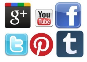 Not investing in social media
The New Economy is based on social media. If you don’t have a link on your website that allows people to share you on the different social media channels you are missing the most powerful instrument of marketing.
Make you sure that on each page you have a possibility for visitors to share it on the 3 most popular social media channels that are relevant to you. I use Facebook, LinkedIn, Twitter and Google+. You check what your target audience is using most and share it on all your webpages.
And now it’s your turn…
What is your experience? What worked for you on your website and what didn’t?
Give us your tips, suggestion or advice on how to make your website perform better.
Share with us your tips, ideas and solutions in staying on track in the comment box below.
If you find this article inspiring, please SHARE it on Facebook, LinkedIn or retweet it, by pushing the button on the left, for the right channel, so more women could benefit from it.
Please share this article with your:
- LinkedIn connections
and blog readers...
Have a magical week! Vered


