The New Cover: How It’s Done (It’s Not Magic)
Hi everyone! Trish here. As you all know, the release of the second installment is only days away, and as a special feature before the release I’ve put together a blog post on how I illustrate!
Basically, this post will guide you through how I create a piece from start to finish. I hope you like it!
I start with a discussion with Robbie on what he’s looking for in the piece and what sort of things he wants me to incorporate into it. Robbie happens to have a very pro-artist vision, which essentially means he’s fine with me doing whatever I want as long as it integrates the elements he asked for (this is a wonderful thing, trust me).
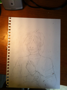
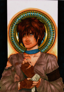
For the cover of the second installment, Robbie and I agreed on a portrait of Pan, a character you’ll learn about quite soon! Robbie gave me the basic elements of Pan himself: olive skin, hazel or green eyes, unkempt hair, and “open” features. From there, I created a sketch in pencil of what the cover would look like:
I didn’t include eyes or any background details because those are the sort of things I add later when I’m inking the piece. It’s not normal but hey, it’s how my art works!
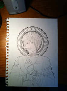
Here’s the cover after I inked it with micron pens. Note how Pan looks remarkably odd and alien-like! This is an effect of the inking. It will be remedied!
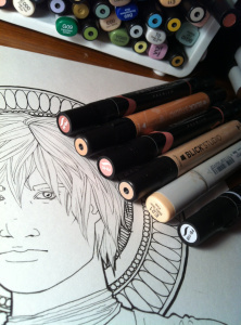
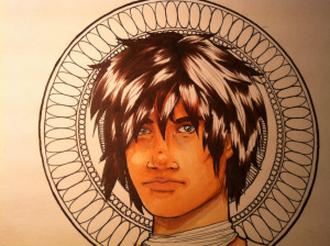
Here’s just an artsy shot of the markers I used to color Pan’s olive skin. The purple-grey color was used for shadows and the dark circles under Pan’s eyes. I wanted to make him look gentle but also really tired and worn down (his life ain’t easy).
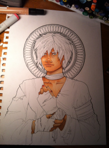
Skin almost done! I think he looks remarkably less alien-like now, which is always a plus. Next comes hair!
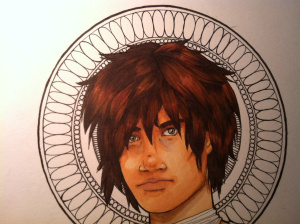
I used dull browns to make his hair look really scruffy and rough-cut because of a lack of proper haircuts.
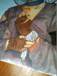
Next, I colored his clothes. Given the circumstances of Pan’s life, there really aren’t many opportunities for finding nice new clothes. To make Pan’s clothes look really tattered and worn, I again used a multitude of browns to simulate patches and stains.
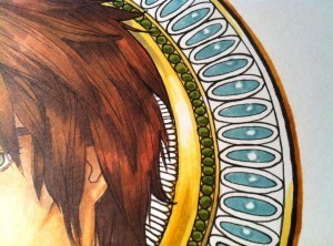
Almost done! Next came the coloring of the medallion behind Pan’s head. Metal is pretty hard to color so it involved a lot of patience, occasional swearing if the effect wasn’t quite right, and concentrated lip-biting.
After that came the background (minor smudges of color), and black framing with a sharpie. And we’re done!
After scanning the picture, I played with the contrast in iPhoto (I’m poor and can’t afford anything but free software) to make the colors richer since a lot was lost during scanning.
Here’s the finished piece!
I hope you enjoyed this super-special blog post on my artistic process. Feel free to post in the Facebook page if you have any comments or questions (just start the post with “Trish,” so I know it’s for me). Also, feel free to check out some of my other stuff at my deviant art account: trishtal.deviantart.com. If you want more pictures from the process or have really detailed questions about anything, you can also email me at pvosburg@student.umass.edu.
Thanks so much for your continued interest in The Eighth City and for being a part of this project! We appreciate every single one of our readers.
Love,
Trish


The Eighth City Blog
Follow the full blog at: http:/ A place to hear about upcoming Eighth City information and stories, engage with the creative team, and hear more about what the creative and publishing process is about!
Follow the full blog at: http://the8thcity.wordpress.com/ ...more
- R.C. Champagne's profile
- 2 followers


