IHOR Overhaul
Looking back on a lot of my work I’m starting to feel that my designs are a little bit (or a lot a bit) safe… and in the words of RuPaul:
Safe is a word I have come to loathe…
Safe isn’t the Cult of Racewood way and it certainly isn’t what I want to be known for. So here are some new design ideas and concepts that I’m working on that I think we can agree aren’t exactly ‘safe’.
Starting with…
Logo:
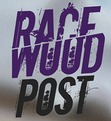
Original logo
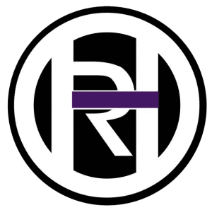
I realized sometime in the last year or so that there was just something a little not quite me about this logo. It had two problems, the first of which was that it had a sort of jail cell look about it in the way the letter H covered the R, the purple bar that was meant to represent the i actually only managed to further cement this point as making it look extra doubly locked.

2012 version of IHOR logo
In late 2012 I created a redesign which with the subtraction of the extra white and black circles did seem to lose a bit of the original prison problem the first logo had, I still wasn’t feeling it. I needed something different. Naturally typography struck me first, but through a bit of trial and error I realized there was a lot I missed about the 2012 logo. So… I decided to combine my latest creation with the 2012 logo. This is the result.
 It also comes with more artistic options in:

T-Shirts Before and After:
Trend Setter before

Trend Setter after:
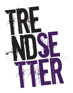 One thing that was important to me from the outset throughout the redesign process of a lot of my designs was that they be able to tell a story. They should be interesting and artistic in their own right but more importantly they say something both in the words themselves and how it’s designed. The idea behind trendsetter in particular was that it should be something atypical, particularly from the original design and preferably something that could be used on a wide variety of places from t-shirts to cellphone cases and more (all to come).
Write, defiant before
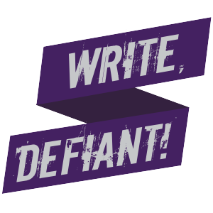
write, defiant after:
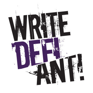
This redesign is arguably one of my favorites in the group because I feel like out of all of them it makes the most profound statement. If a picture is worth a thousand words then this may actually be a visual representation for exactly what the Cult of Racewood is all about.