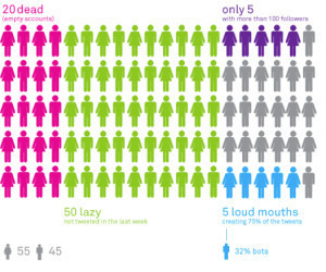
I’m knee-deep into research for the new book and there’s no shortage of fascinating examples of data visualizations. Here’s one of several neat infographics on Twitter from 2009.


So far, the most interesting visualizations are the interactive ones. While early, it’s clear to me that there are myriad ways to make data tell a story. To paraphrase Hans Rosling, “Let the dataset change your mindset.”
Published on June 17, 2013 08:41
