Pulled At Random From My Files #9: IN COLD BLOOD
Images © DC Comics, Inc.
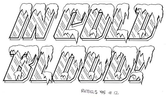
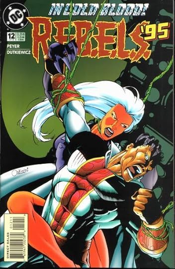
One example of hundreds (maybe thousands) of hand-drawn cover lettering I did for DC comics, this one appeared on R.E.B.E.L.S. ’95 issue 12. The cover copy has two words in it which are visual: COLD and BLOOD. In this case I used the COLD part as my visual reference point, since the expression “in cold blood” refers to someone committing an act of violence coldly, without emotion, so using BLOOD as the visual theme didn’t seem right. And the cover editor may have been consulted to confirm this was the better idea.
So, block letters with shine marks to denote ice, and snow caps on all the top edges. Over the top, perhaps, but it is visually interesting, and anything that attracts the eye to a cover is good, as long as it’s not distracting from the art. Notice the snow has a heavier outline on the right side to give it a little thickness. The drop shadow behind the open letters was a standard device to allow a second color, but in this case, it should have been connected or telescoped to make the ice seem thicker. Oh, well.
Here’s the largest image I can find of the cover. The lettering looks good to me, even at this size. Guess I knew what I was doing…! That’s my logo, too, though I never liked it.
Todd Klein's Blog
- Todd Klein's profile
- 28 followers


