
Pulled At Random From My Files #8
Images © DC Comics, Inc.
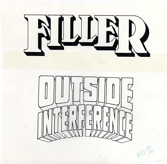
Here are two more letter-column heading logos, for when most comics had actual printed letter columns.

Often the request was to have these titles follow the style of the cover logo, and both of these do. FILLER mimics my own logo for the comic THRILLER…
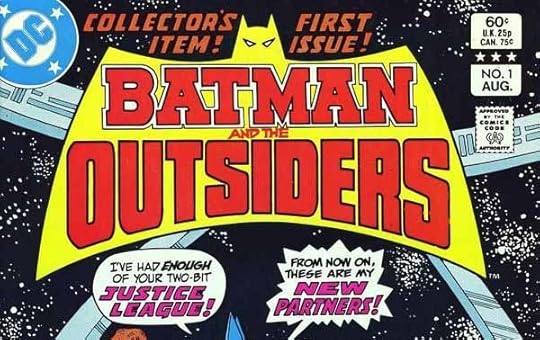
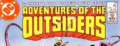
…while OUTSIDE INTERFERENCE uses the style of my logo for ADVENTURES OF THE OUTSIDERS, which itself used Gaspar Saladino’s original OUTSIDERS logo as a starting point, then added telescoping. Gaspar’s logo is the better one here, in my opinion! Letter-column logos were fun to do because the hard work of coming up with an original style was usually not required, you were simply adapting something already created.


No comments have been added yet.
Todd Klein's Blog

- Todd Klein's profile
- 28 followers
Todd Klein isn't a Goodreads Author
(yet),
but they
do have a blog,
so here are some recent posts imported from
their feed.

