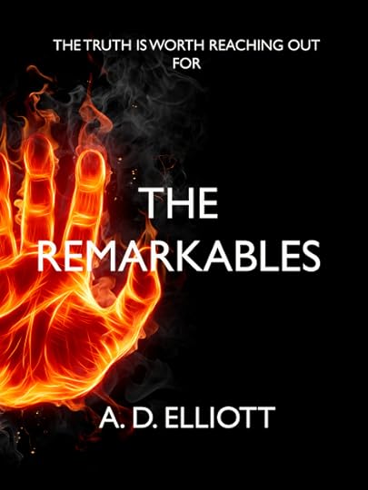
I’ve rejigged the cover for The Remarkables. I was never 100% happy with the over stylized font, so have gone for something far simpler (I do love Gill Sans, even if it’s creator turned out to be rather unpleasant). It’ll also fit in nicely with the sequel I’m working on.
Let me know what you think!


Published on May 14, 2013 07:29
