A Peek Between the Covers
I aim to make my books a work of art, inside and out. My artistic covers have won several contests. And when you open them, you can see how carefully I have considered every detail inside. This includes the choice of font, the size of different fields of text, the white space around blocks of text, the indentation of the first paragraph in the story as compared to the indentation of following paragraphs--all of which create a balance; a black-and white environment for you to sail away into the story.
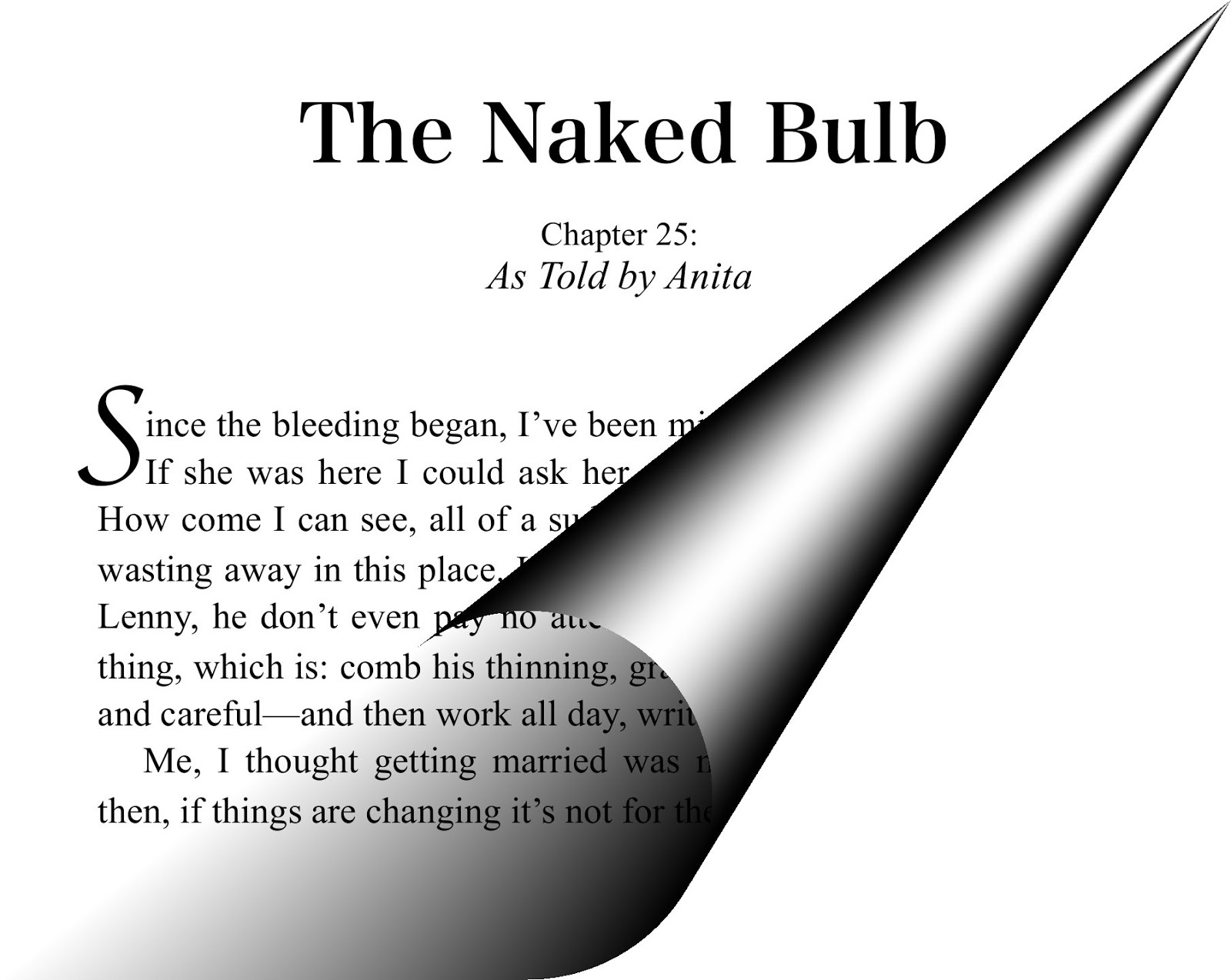
In the case of my novel, Apart From Love, I have focused on several design details. For example, the first letter of each chapter in the book is unique, in the traditional manner of illuminated manuscripts. This special attention to the first letter signifies a beginning of a new thought, and an invitation to the reader to pause before delving in.

I chose a fancy font for the first letter, called Kokonor. Furthermore, I placed it carefully, like a piece of art, in relation to the following letters. This can not be done simply by typing the letters and selecting different fonts--but rather by adding a 'text box' and carefully placing it on the page, letting the text rearrange itself around it.
Here, in Anita's voice, is the text for the opening of the chapter shown above:
"Since the bleeding began, I’ve been missing my ma more and more. If she was here I could ask her, like, How come I feel so alone. How come I can see, all of a sudden I can now see how my youth is wasting away in this place. Like, I have no air, I’m wilting here. And Lenny, he don’t even pay no attention, ‘cause he’s back to his usual thing, which is: comb his thinning, gray hair—sleek it back, real slow and careful—and then work all day, write all night, either out or away.
Me, I thought getting married was meant to change things—but then, if things are changing it’s not for the better."
Treat yourself to a gift! Get the highly acclaimed novel with 48 eloquent reviewsDubbed "A literary symphony"
An artistically designed print edition
Apart From Love
Audiobook coming soon!
In the case of my novel, Apart From Love, I have focused on several design details. For example, the first letter of each chapter in the book is unique, in the traditional manner of illuminated manuscripts. This special attention to the first letter signifies a beginning of a new thought, and an invitation to the reader to pause before delving in.
I chose a fancy font for the first letter, called Kokonor. Furthermore, I placed it carefully, like a piece of art, in relation to the following letters. This can not be done simply by typing the letters and selecting different fonts--but rather by adding a 'text box' and carefully placing it on the page, letting the text rearrange itself around it.
Here, in Anita's voice, is the text for the opening of the chapter shown above:
"Since the bleeding began, I’ve been missing my ma more and more. If she was here I could ask her, like, How come I feel so alone. How come I can see, all of a sudden I can now see how my youth is wasting away in this place. Like, I have no air, I’m wilting here. And Lenny, he don’t even pay no attention, ‘cause he’s back to his usual thing, which is: comb his thinning, gray hair—sleek it back, real slow and careful—and then work all day, write all night, either out or away.
Me, I thought getting married was meant to change things—but then, if things are changing it’s not for the better."
Treat yourself to a gift! Get the highly acclaimed novel with 48 eloquent reviewsDubbed "A literary symphony"
An artistically designed print edition
Apart From Love
Audiobook coming soon!


No comments have been added yet.