
Fair’s Fair: An Interview with Neil Freeman
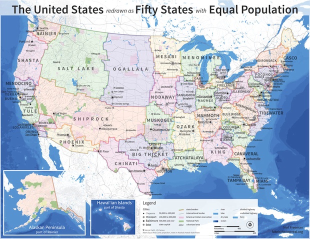
Way back in 2004, the artist Neil Freeman debuted a novel idea on his Web site, Fake is the New Real: a map of the United States, redrawn so that each state has a more or less equal population. This, Freeman proffered, would correct the current problem with our electoral college system, in which sparsely populated states wield tremendous political influence for no real justifiable reason.
He remade the map in 2010 to reflect current census data, but took the idea to its most exhaustive and visually impressive heights in December 2012. Since the country had just survived yet another election where Ohio and Florida were agreed to be the only states of any import; since the governments of certain conservative-leaning states went out of their way to make voting a nearly constitution-violating ordeal for many minority populations; and since the last few years have seen many congressional districts gerrymandered out of political contention, I was touched by Freeman’s effort to envision an American political process that was, to put it plainly, more fair.
“The states of the United States are too disparate in size and influence,” he introduced the 2012 map. “The largest state is sixty-six times as populous as the smallest and has eighteen times as many electoral votes.” I e-mailed Freeman to discuss his problem with that reality, and how his map could theoretically change it.
You’re pretty vague in the artist’s statement to this piece, saying only “reforms are needed.” What compelled you in 2004 to start this project? What do you ultimately think it says about our politics?
The project grew out of two goals, which have tended to get braided and knotted over time. The first is to visualize the population distribution of the country in a novel way. The second is to critique the electoral college.
The roots of the project go back to the early days of the 2004 presidential campaign. The 2000 election made the limitations of the electoral college painfully obvious. Not only does the system make the popular vote irrelevant, but the college gives different levels of influence and power to citizens of different states based on competitiveness and House apportionment.
There was a fair degree of momentum to reform the electoral college after the 2000 election, and nothing happened. The electoral college is deeply naturalized into our political narrative, and rational discourse seems to have little ability to dislodge it. I hope that a more creative approach to the electoral college helps to lay bare its shortcomings and the possibility of effective reform.
Presidential campaigns are also a moment when everyone pays close attention to maps of states, and the weaknesses of state maps as a visual tool become apparent. After the 2000 and 2004 election, a county-by-county map that showed that the country as a mostly red country with little blue bits on the coast began showing up as a proof of the irrelevance of the Democratic vote. This is downright silly, and it really saddens me that people confuse geographical space with population density. If—when—we get rid of the electoral college, one of the benefits will be the irrelevance of geographical state-by-state maps for illustrating campaign trends.
To tie that up—by redrawing the political map, I hope to draw attention to the limitations of our political system, and the ways that we commonly represent it. Read More »


The Paris Review's Blog
- The Paris Review's profile
- 305 followers

