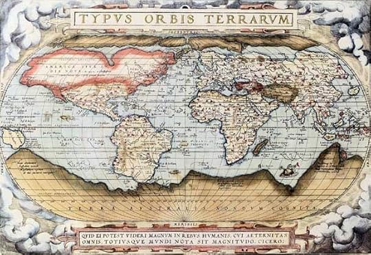
Historical map of the world by Ortelius, 1570 A.D. (Photo credit: Wikipedia)
WordPress is great at providing statistics. I can see how many visitors I’ve had today, last week, on any previous month, or even for all time. What I love most, though, is the world map, with its spectrum of color. Like some hungry Napoleon, I survey my geographic reach: 124 countries to date. Countries with the most viewers show up deep red; those with the next largest contingents appear bright orange, and those wit...
Published on March 20, 2013 10:53
