
Pulled At Random From My Files #3
Images © DC Comics, Inc.
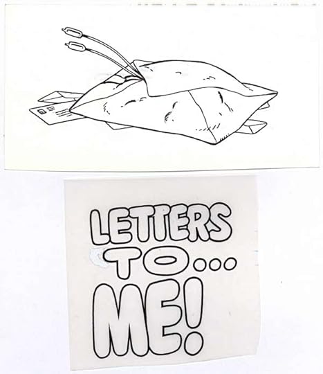
Letter columns are something that most comics had when I was a kid, and while on staff at DC from 1977-87 they were still doing them. That meant each new title needed a letter column header, including lettering for a title—usually some kind of play on words involving the book’s name or main character—and a small bit of art to put next to it. Here’s the lettering by me and art by Keith Giffen for AMBUSH BUG, probably for the 1985 four-issue series, and perhaps also used on the SON OF AMBUSH BUG six-issue series that followed it. I’m not sure why I still have the art, it should have been returned to Giffen long ago, but it got stuck in my files instead. I doubt Keith misses it. The lettering is in the style of the logo I designed for the title.
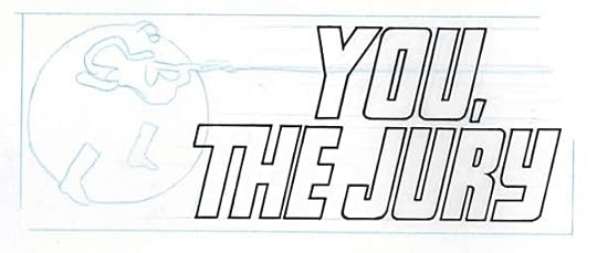
Here’s another, just the lettering I did for the VIGILANTE letter column heading. The art must have been done, as I’ve made a loose placement sketch of it in blue pencil. The block lettering style is similar to one used by Gaspar Saladino, but notice where the indented point is on the right side of the R, about halfway down the central horizontal stroke. Gaspar would have put it at the bottom of the horizontal stroke, one easy way to tell my block lettering from his, other than, you know, his being a lot better!


Todd Klein's Blog

- Todd Klein's profile
- 28 followers

