How to design a great book cover (Behind the scenes)
Next Wednesday the 1.1 edition of Mindfire: Big Ideas for Curious Minds, a collection of my best essays, will be officially released. More than 100 corrections, typo-fixes and little fit and finish improvements were made. Amazon is already selling 1.1, but Wednesday 3/20 9am PST is the official launch and I’ll be giving away the e-book editions free for 48 hours.
Meanwhile I’ll share behind the scenes reports on how the book was made. First, how the cover was designed.
After vetting more than 30 designers who applied, I hired Tim Kordik. And I’m glad I did. I wanted not just a graphic designer, but someone who was interested in helping define the book end to end, from the interior design, to the title, the content and of course, the cover.
I wrote up a short design brief that’s good for any book cover:
Bet big on one visual concept
Title should be readable in thumbnail / 10 feet away
Simplicity wins
Be bold
We brainstormed for an hour and Kordik went off and put some early sketches together. I made clear I was comfortable working low-fidelity so we could try things quickly and throw aways ideas without sunk cost feelings. He was all for it.
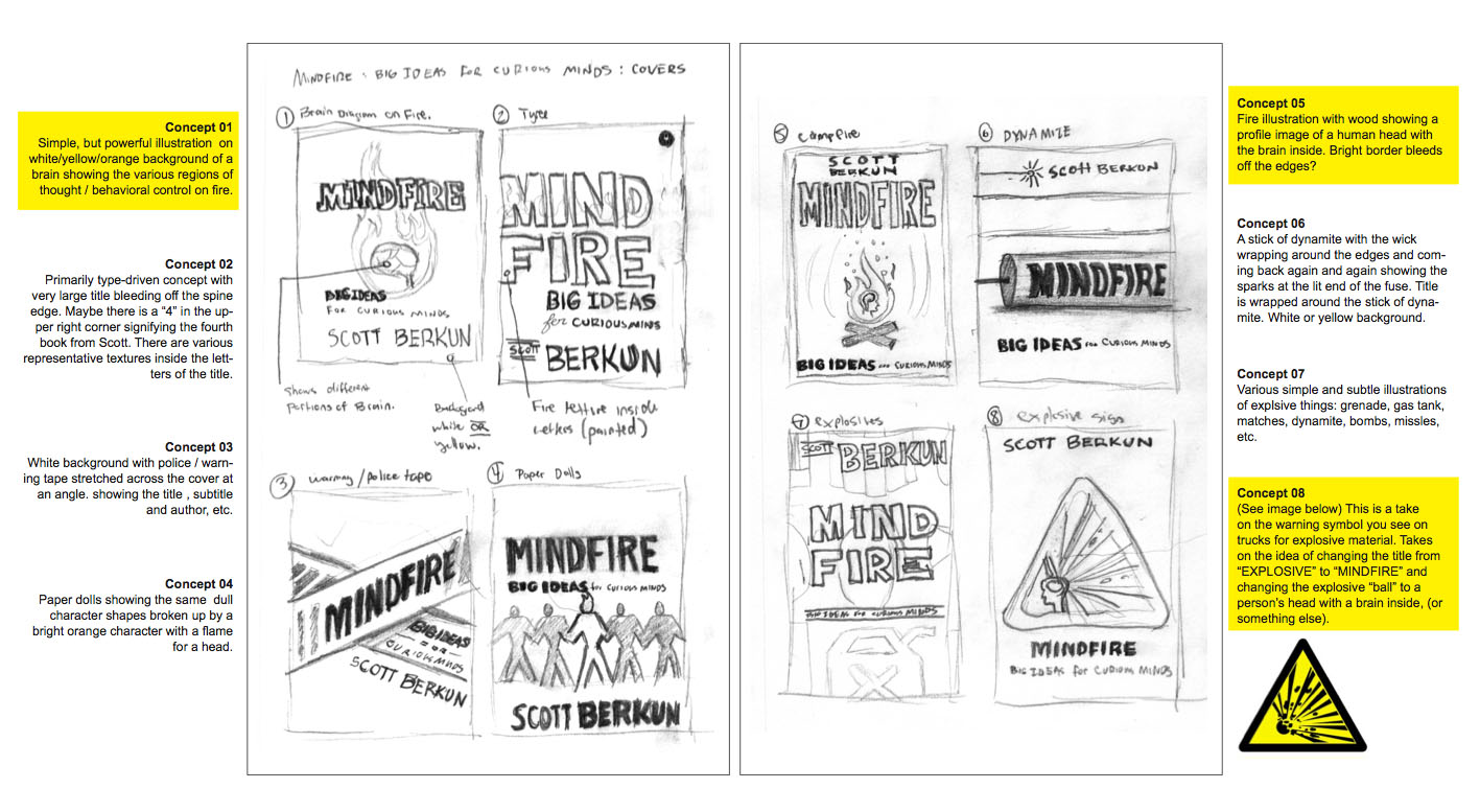
Round one
Here was the first round of concept sketches:
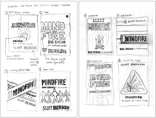
Tim paired each sketch with a brief description to help explain the idea, in case I missed it.
Round two
We discussed which directions we thought were strongest, and he did a second round. We killed some concepts and added a couple of new ones. The entire round was higher fidelity than last time:


We picked three of these concepts and let blog readers vote: over 300 people participated.
The vote was used to inform our thinking, but not to drive it. Many of the comments people left were useful and Kordik and I discussed them. We didn’t agree with some of it, but it did help us step back and look and what we’d done differently.
Round Three
We narrowed the field to one concept. We did a couple of one-off last attempts at other concepts, but they didn’t pan out so we killed those paths.
I loved the idea of a book’s central image being a warning label of some kind. But round three revealed the challenges of the triangle for the central element. It left too much trapped whitespace, and the top angle of the triangle always felt strange.
But I loved how playful Kordik was in trying out different options. It let us look at alternatives instead of trying to imagine them.


Round four
Moving to a circle, the simplest shape, made sense and we ran with it. Tim came up with the bullseye grey/white effect which is powerful and striking.
We moved on to the next level of detail down: the fire and the objects coming out of the fire. Kordik tried many different sets of images. We tried at first to pull images that matched the essays (life, death, time, inspiration, etc.), but it was hard to arrange them without it feeling cluttered. Kordik tried many variations and probably wanted to strangle me.


During one meeting, Kordik thought using my profile for the cover might work. I resisted at first: I hate books with pictures of authors in them. Why should readers care what the author looks like? But I figured I had nothing to lose by letting him take the photo.
Kordik did a great job, making it subtle enough that few would notice (I love books with secrets). It worked great and all future mockups had my profile as the silhouette. Here’s the picture the profile is from. He gratefully edited our the WordPress beard I had.

Round 5:
We did a final round of blog reader voting, and 300 people let their opinion be known. It came down to the details for the fire.
As much as I had pushed for all of the icons in the belief those little details mattered, the simple bubbles were cleaner, simpler and stronger, and gave more whitespace to the design.


We were close enough that Kordik finished up the full jacket design.

The blurb:
Blurbs are silly things (see the secret life of blurbs). Since I was self-publishing I decided to be honest and have some fun.

Final cover for First Edition:
After months of work, and dozens of itterations, we arrived at the final cover design. I loved it. It’s the strongest cover design of all of my books, and I’m convinced it’s because of Kordik’s willingness to experiment and not fear exploring alternatives.

Final cover for 1.1 Edition:
For the upcoming 1.1 edition we made the book size smaller, down from 9×6 to 8×5. We simplified the cover by dropping the black/white strips on top and bottom.

Hope you found this behind the scenes post interesting. To get all the photos together took hours. Leave a comment to let us know it was worth it.
If you want to know what I learned by self-publishing here’s my rundown.
If you can’t wait, you can buy the 1.1 edition now, or put a reminder on your calendar to come back Wednesday and get it for free.