Second Proof/Making Choices
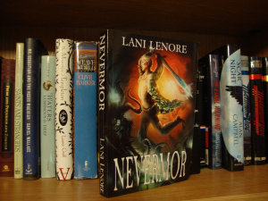 Alright! I got the second proof and now I’m just going to have a look through it. I don’t plan on reading it again because I’m pretty sure that it’s correct. I’m just going to be checking the formatting and then I’ll approve it for production.
The cover looks better this time. It’s not overlapping as much on the back and the text on the spine is centered better. The back cover is lighter, but it doesn’t look exactly like I hoped. Still I think it’s good enough.
Yay!
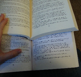
All is going well! I just need you to help me make an important decision about the way the book is going to look. I’ve got everything else like I want it, but I can’t decide which kind of paper I like better, so I was hoping you’d help me!
Here are your choices: white or cream.
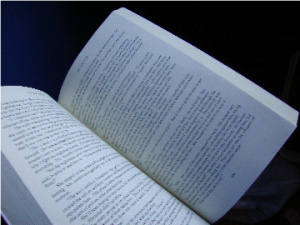
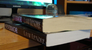 White: When I first saw it, it just didn’t look like a real book to me. It was too white, like printer paper. As I was reading through it, however, the color grew on me and I started not to notice. The book looks new, crisp and clear. I’m not sure if the color will change over time or not. The main thing that bothers me is that when any light reflects off it, you’re pretty much blinded.
-
Cream: This color is much easier on the eyes, 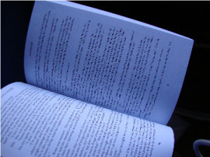 especially in natural light, but it also has this old look around the edges. That may not bother you but it does sort of annoy me a little bit. Still, it looks more realistic to me.
-
Both types of paper are thick and of good quality.
-
(white, in natural light)
-
-
-
(cream, in natural light)
-
-
-
So, which one do you think is better?
Take Our Poll


