First, the Shadow... Then the Thing that Casts It...
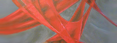
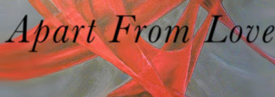
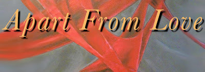
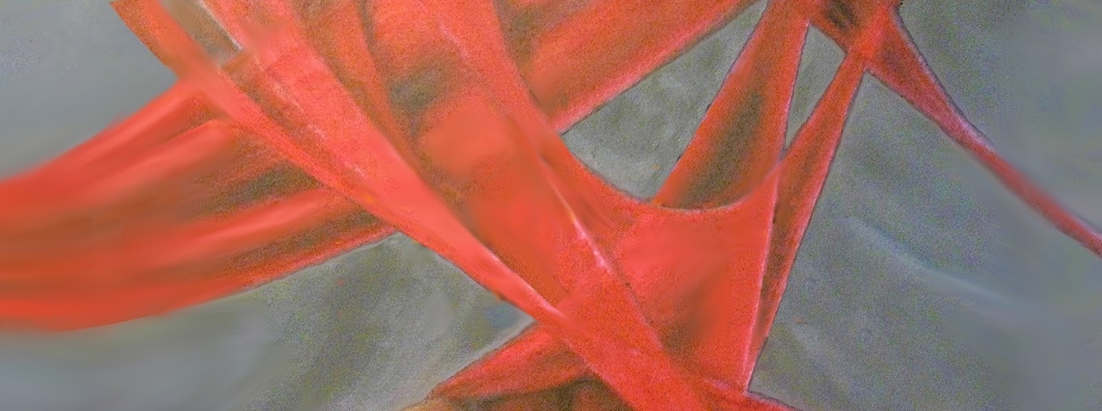
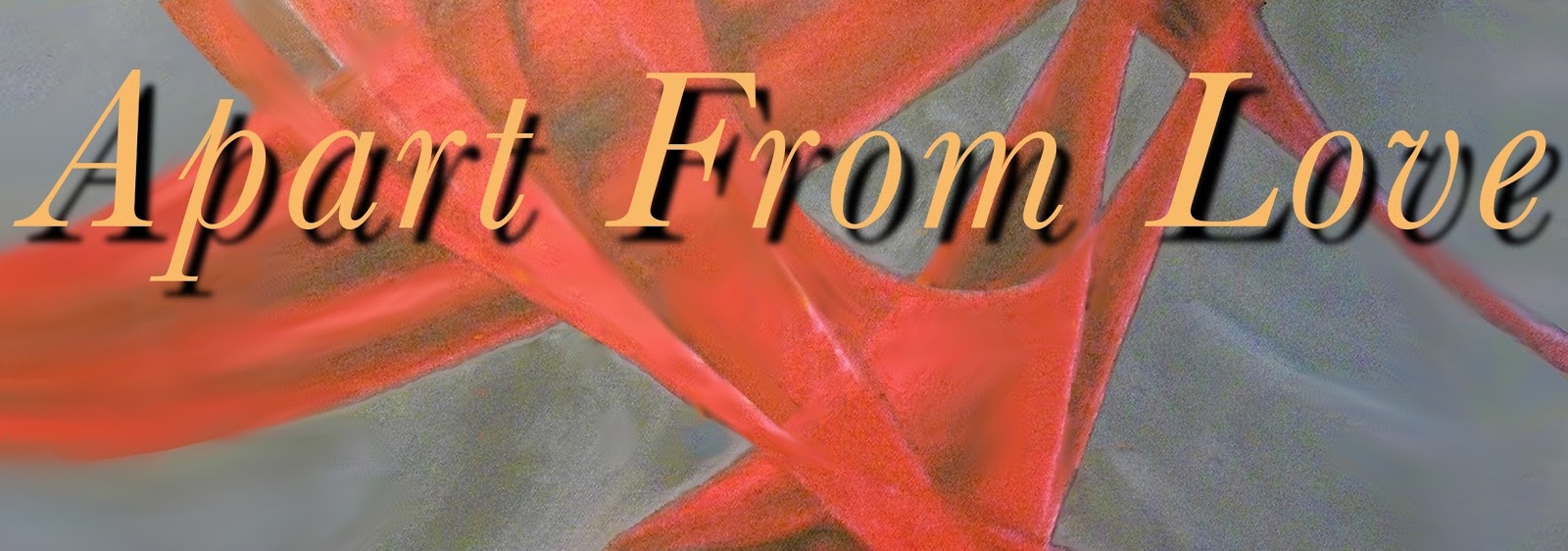
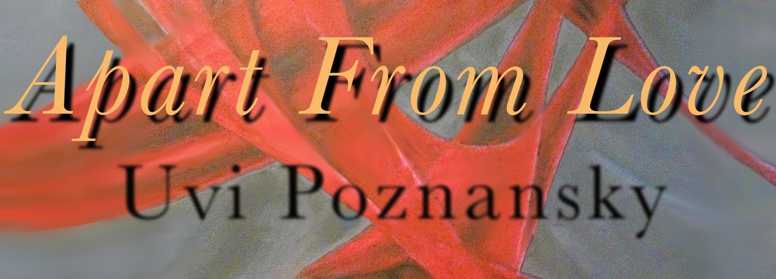
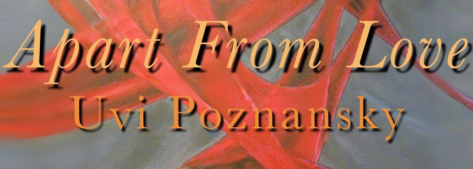
Apart From Love is now in production to become an audiobook. So, in the design of the cover image for it, I start with an attractive underlying image (in this case, my oil painting called Untangled.) Then, for the text: I select the color black, and type the title. Before I commit it to the paper, I make it 'fuzzy'--by applying a 'blur' function. This way I get a 'soft' shadow. Then I select a gold color, type the title, and position it above the shadow I have created. This time I do not blur it, so the edges of each glyph are sharply defined. Then I repeat the process with the author name.
There is a relationship between the title and the author name. The title is more pronounced, both because of its larger font size, and because its color is a brighter gold against the background color. It glitters... In addition, the gap between the title and its shadow is larger than the author name and its shadow, as if it floats closer to us. You can almost brush your finger behind the title, in that gap.


On a different note:Temporary Insanity Sale: $0.99 Home: US & India, UK, France, Germany, Italy, Spain. Apart From Love:US & India, UK, France, Germany, Italy, Spain.A Favorite Son: US & India, UK, France, Germany, Italy, Spain(No Kindle? No Problem! Amazon gives you a free Kindle app)
There is a relationship between the title and the author name. The title is more pronounced, both because of its larger font size, and because its color is a brighter gold against the background color. It glitters... In addition, the gap between the title and its shadow is larger than the author name and its shadow, as if it floats closer to us. You can almost brush your finger behind the title, in that gap.

On a different note:Temporary Insanity Sale: $0.99 Home: US & India, UK, France, Germany, Italy, Spain. Apart From Love:US & India, UK, France, Germany, Italy, Spain.A Favorite Son: US & India, UK, France, Germany, Italy, Spain(No Kindle? No Problem! Amazon gives you a free Kindle app)


No comments have been added yet.