
The Indie Experiment: Defining my brand
 Facebook friends and fans of mine will know I've been playing around with my banner images. I attended Indie ReCon this week and there were a lot of great posts. I especially appreciated Ali Cross's post on building an author brand, and after I read it I set out to create a brand for my own self.
Ali uses a little red haired ninja in all of her branding materials and has it on her blog, Facebook, Twitter, email signature, etc. I thought, okay, I'd like an avatar and I'd like it to be slightly more sophisticated, but only slightly. It occurred to me to make a semi-self portrait in the chick lit illustration style, so I got a bunch of images off Shutter Stock and created this:
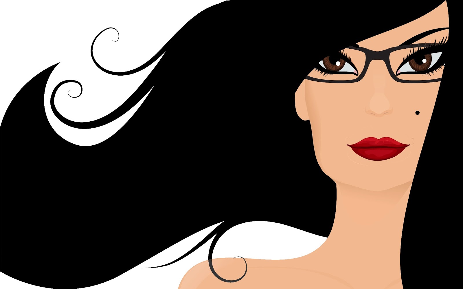
People left comments about how it did kind of look like me and a lot of people liked it, but when I asked a friend of mine who is a graphic designer, she suggested we get together and talk, which I immediately knew meant that she would tell me, nicely, that I was going in the wrong direction in some way.
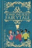
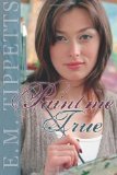
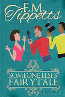
When I visited her today, she explained that I needed to stay consistent in my branding and all kinds of other things I thought I knew. When I explained that I wanted to make an avatar just to use for my online presence, she pressed me to establish a brand that would stay consistent in all my book covers too. At this point I felt a little hopeless. I only started selling novels as an indie author last year, and writing-wise I was still in "throw everything against the wall and see what sticks" mode, which means Paint Me True , Someone Else's Fairytale , and Castles on the Sand are three very different books. Given Fairytale is what has sold best, I found myself in the position of having figure out a way to expand that franchise, and so I wrote Nobody's Damsel, which is less romance and more mystery, as a way to expand that concept into a series.
In other words, I'm quite aware that I'm all over the place, and I expect this to be a continued problem until I have enough books out that were of a consistent type to build up a brand. I couldn't think of one cover style that would work for all of them. My friend told me there are three elements to a cover (well, I did know this, and I'm sure you do too): the title, the image, and the author name. One of those has to be most prominent. They shouldn't fight with each other. So we looked at my book covers and I started to feel a little bit of despair. Again, I couldn't see a style that would work for all of my novels.
 Until my ah-ha moment. She started pulling up other books on Amazon and telling me to look like my "competition" (which doesn't really exist in writing, as readers are generous and will buy from everyone who writes what they want). And then it hit me, the top selling authors are their brand. On their covers, their names are what are most prominent, often dwarfing the title. I had a little bit of branding in my name, always making it vertical, but that didn't convey much about the kind of books that I write. Also, I felt it was a little early to be making my name billboard sized on my novels so hadn't really thought about it much beyond that.
But here's the thing. The reason why I felt like it was too early was because I was in a traditional publishing frame of mind. If you sell books through a publisher, when you are early career, you get whatever cover they slap on it. Only after time and commercial success will they enlarge the font size on your name and make you the main attraction.
I don't have a publisher, and thus I already am my brand. Hence it's very silly of me to think of cover design the traditional way. As the old adage goes, dress for the job that you want, not the one that you have. In cover design/writing, brand yourself the way you want other people to see you, not based on where your sales and marketing are at right now. How often do I look at a book with the author name most prominent and have no idea who that author is? All the time. What do I think when I see it? "That's an author who's a success. They are their own brand."
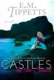
 When you're independent, you can't be any other brand than yourself. Soooo, I took a good look at my vertical name style, which you can see here on
Castles on the Sand
, and while there are things that I like about it, not the least of which is that it's prominent, it doesn't say anything about the book inside. This name style was developed by the wonderfully talented Jenn Reese. My alter ego, Emily Mah, is a science fiction writer and that's how I met Jenn, also a writer and a cover designer. Without knowing anything about me, she set up this branding that was distinctive, and given she knew nothing about my chick lit/women's fiction/YA writing, this was a great way to just make me different.
When you're independent, you can't be any other brand than yourself. Soooo, I took a good look at my vertical name style, which you can see here on
Castles on the Sand
, and while there are things that I like about it, not the least of which is that it's prominent, it doesn't say anything about the book inside. This name style was developed by the wonderfully talented Jenn Reese. My alter ego, Emily Mah, is a science fiction writer and that's how I met Jenn, also a writer and a cover designer. Without knowing anything about me, she set up this branding that was distinctive, and given she knew nothing about my chick lit/women's fiction/YA writing, this was a great way to just make me different.My task now, though, is to look like a prominent romance subgenre writer, so I went and pulled a ton of book covers of people who are way more successful than I am. What did I discover? Well, very much to my surprise, I found that the names were big, but not necessarily distinctive in any other way. Quite a few were just large and in a Trajan Pro type style. Now if I were with it, I'd post images, but I'm trying to type this before my kids act up again, so I don't dare take the time to grab any. A quick surf on Amazon, though, and you'll find much the same thing that I did. Even authors who had quirky names on some books didn't have them on all. It was the actual name, not the styling of the name, that made the brand.
Well, I'm indie. I want to style my name, so I got to playing around in Photoshop and discovered some very cool things about E.M. Tippetts. One is that the "E.M." can nest above the p's and e in "Tippetts". The last name nicely frames my initials. Another is that you can place the "E.M." in a way that the dot in the i of "Tippetts" and the periods line up. In randomly taking my married name and first initials, I actually got something that has some cool design potential.
In an exercise for myself, then, I tried to make a newly branded cover of one of my books. I have all the design materials for Fairytale , because I designed that cover. So I played around with it and did this:
My friend had told me to take out most of the gold curly-q's and things and, while I understand that they make the cover busy, I wanted it to look like a modernized leatherbound tome. Going with her advice, I made a chick lit cover with some leatherbound tome touches and my name front and center. Now, I'm not immediately going to run out and redo the covers of my series in this style. I need to play around more with my name and really think about what kind of brand I want, but I now feel like I've grasped something important. This looks more like a book from an author who's "made it" it in the traditional publishing world.
In indie writing, you have to be your brand. There's no point giving yourself covers that look like you're a midlister. You need to give yourself covers like you're the top earning author at your publisher, because you are. Your work is all you've got.
Over the next several weeks you'll see me start to alter this website accordingly as I pull together one consistent look and brand to be known by online. And I'll work on writing more of the type of books my readers want, but I don't need to wait until I'm done with my plot-style evolution before I start telling everyone with my typography and name style what kind of writer I want people to think I am. In fact, I have to start now. Most people have never heard of me, so I need to give them more than a name. Also, if I come up with a name style, that's only one annoying thing to give the cover designers I hire. I can therefore not be neurotic about every other aspect of the cover, only about the way my name looks, and I think that'll be better for everyone involved.
But don't worry, I'm still writing my next book as I figure all of this out ;-)


No comments have been added yet.


