Color Theory of Fun images


 So, I have been working on the process to color all the cartoons in the revised Theory of Fun edition. I thought I might share some samples of the way it is looking so far.
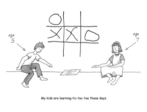
The original cartoons were done very quickly, which is why they were in such a rough, naif sort of style. They were also done with ink on paper, rather than digitally. I am trying to have the coloring be in keeping with that… I want something that feels fairly organic, even though I am doing all the coloring on the computer.
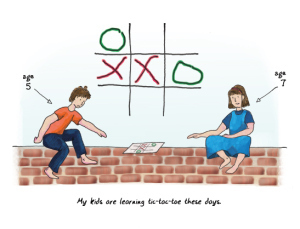
So I tried out doing plain flat shading, and gradients, and that sort of thing… but ended up using a custom brush to get a bit more of a painted look with more color variation.
In the process, I am also replacing the Comic Sans with my own handwriting font, like I used in the 10 Years Later presentation.
There are well over a hundred of these to do, of course. I am on pace to do multiple a day right now, although the flu has gotten in the way a bit.
In other news, though, the contract still isn’t finalized, so I am a bit ahead of myself anyway.  But that’s OK.
See a before and after comparison:

 So here’s the first cartoon from the book. The one thing that I haven’t settled just yet is whether everything will indeed be this saturated, in the end, or whether I’ll lighten everything up and give it a softer, more pastel look. I suspect that I’ll get a better sense of that as I progress through more of the images.


