
A List Apart's Redesign
Other people will write more insightful things about A List Apart’s latest redesign. I generally like it, but I will note one thing: having your site look like it’s cut off above the fold is a bad idea in a world where most devices don’t show scrollbars anymore.
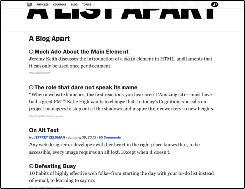
Nope, can’t scroll up further than that. That’s what the site looks like all the way scrolled up. When I saw the redesigned site for the first time, I automatically tried to scroll up.1 When it didn’t work, my immediate reaction was that something was broken.
Granted, the cut-off logo looks pretty cool. Still, this is usually not the kind of reaction you want to evoke in your users.
In fact, designing layouts so elements will be cut off is something designers often do intentionally to indicate scrollable areas. 
If you require a short url to link to this article, please use http://ignco.de/511


Lukas Mathis's Blog

- Lukas Mathis's profile
- 2 followers

