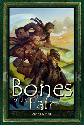
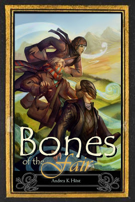
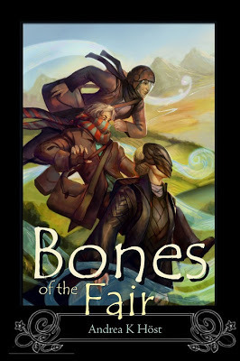
I've been experimenting with cover layouts using the not-quite-final art for
Bones of the Fair (the art is about 90% done, but is still in draft* - it's another of Julie Dillon's pieces). The various textures and fancy-work are all screen grabs of stock art I won't buy until I've decided on a final version, so it's fairly low quality with fragments of watermarks all over the place.


Happy for any recommendations or criticisms!
*Aristide and Aspen's hair colours are currently reversed. The third figure is Gentian, the new palace gardener.
Published on February 02, 2013 00:33
 newest »
 newest »
 newest »
As for criticism, I think having the lower part of the cover free with a contrast colour to highlight the title and your name (don't forget to check if it scales well in small sizes for ebook and Amazon recommendation purposes) is a good idea - but I wouldn't have the other three sides bordered, instead have the art go to the edges. I have the feeling something gets cut off to the left of the uppermost person.
That scarf pattern makes me think old time Doctor Who ^^
Also the feeling is totally different from the Champion of the Rose cover, not sure if that is bad or good, though.