
Formatting Your Manuscript for Print
Happy Thursday, good people of the blogosphere! Since it's so close to Friday
and
Valentine's Day, I thought I'd give you all a little something to look forward to! Let's first discuss that all important thing I like to call formatting a print book then we'll get into the awesome rafflecopter prizes I have up for the winning. So, grab your pens and notebooks and let's get going!
When you format your manuscript for print, there are a lot of things you need to take into account. Just slapping some text into your book works, but it won't wow your readers and make them want to pick up your book for keeping.
In my book, The Indie Author's Guide to: Building a Great Book, I go into how to format your manuscript in MS Word. Why? Because it's a standard item on most computers. I give you the bare bones on how you can produce a legible document for print. Best of all, I made it just $2.99 on Amazon and Smashwords. But what about getting creative?
If I went into designing a book for print in InDesign, many of you would be scratching your heads. I tried to keep it simple and easy to understand. But there's a lot to be said for either hiring someone who knows InDesign to format your book or buying the program and learning how to do it yourself.
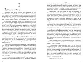
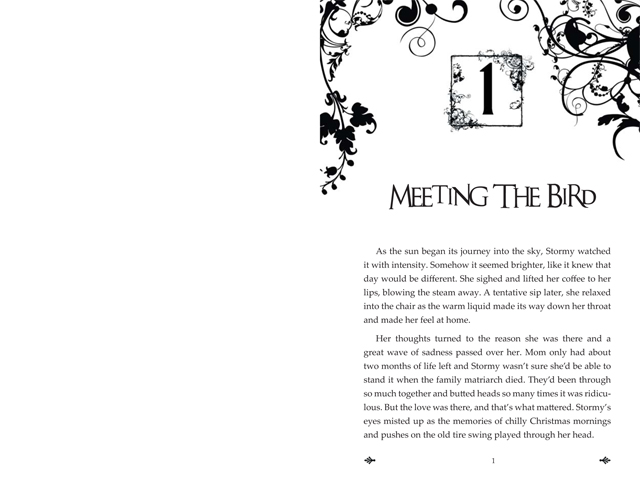
Here are a couple of examples of things that can be done using a program like InDesign to format:
 Chapter 1 Page 1 of The Bird
 Chapter 1 Page 6 & 7 of Yassa
I've applied stylized formatting to the Copyright page and the front matter as well. The interior of The Bird is full bleed so the page you see there will be trimmed .125" all the way around. It'll be beautiful and give my book that little something extra.
A good book designer will know odd pages are always on the right, even pages are always on the left, and front matter gets no numbers (unless roman numerals are used - often for a forward or introduction). Ask these questions of your designer before you hire them!
I talk about all these things and SO much more in my book. I designed the print edition small so you can carry it with you or keep it on your desk and it not take up a ton of space. My first printed edition of Yassa is in a larger typeface for those who would like to read without their glasses. I've gotten a ton of thanks for that. In the Mystic series, every book looks the same. The interior is simple because the subject matter is serious. Above all else, it's consistent.
This all leads me to my point: Think long and hard about your print books. If necessary, talk to a graphic designer or reader and ask them what the most alluring covers and interiors entail. Take copious notes and implement them when designing your book.
Now, on to the giveaway! In keeping with the ideas presented in The Indie Author's Guide, I'm giving one lucky winner either a digital identity package OR a book cover design OR a book formatted for print. Another lucky winner will get an advance printed, signed copy of The Bird, a huge Mystic~Bronya cover poster, three postcards featuring Mystic and Yassa, and a Mystic bookmark.
Without further ado, here's the entry form:
a Rafflecopter giveaway
GOOD LUCK!
Well, that's all for today, folks! Until next time, WRITE ON!
Jo
When you format your manuscript for print, there are a lot of things you need to take into account. Just slapping some text into your book works, but it won't wow your readers and make them want to pick up your book for keeping.
In my book, The Indie Author's Guide to: Building a Great Book, I go into how to format your manuscript in MS Word. Why? Because it's a standard item on most computers. I give you the bare bones on how you can produce a legible document for print. Best of all, I made it just $2.99 on Amazon and Smashwords. But what about getting creative?
If I went into designing a book for print in InDesign, many of you would be scratching your heads. I tried to keep it simple and easy to understand. But there's a lot to be said for either hiring someone who knows InDesign to format your book or buying the program and learning how to do it yourself.
Here are a couple of examples of things that can be done using a program like InDesign to format:
 Chapter 1 Page 1 of The Bird
 Chapter 1 Page 6 & 7 of Yassa
I've applied stylized formatting to the Copyright page and the front matter as well. The interior of The Bird is full bleed so the page you see there will be trimmed .125" all the way around. It'll be beautiful and give my book that little something extra.
A good book designer will know odd pages are always on the right, even pages are always on the left, and front matter gets no numbers (unless roman numerals are used - often for a forward or introduction). Ask these questions of your designer before you hire them!
I talk about all these things and SO much more in my book. I designed the print edition small so you can carry it with you or keep it on your desk and it not take up a ton of space. My first printed edition of Yassa is in a larger typeface for those who would like to read without their glasses. I've gotten a ton of thanks for that. In the Mystic series, every book looks the same. The interior is simple because the subject matter is serious. Above all else, it's consistent.
This all leads me to my point: Think long and hard about your print books. If necessary, talk to a graphic designer or reader and ask them what the most alluring covers and interiors entail. Take copious notes and implement them when designing your book.
Now, on to the giveaway! In keeping with the ideas presented in The Indie Author's Guide, I'm giving one lucky winner either a digital identity package OR a book cover design OR a book formatted for print. Another lucky winner will get an advance printed, signed copy of The Bird, a huge Mystic~Bronya cover poster, three postcards featuring Mystic and Yassa, and a Mystic bookmark.
Without further ado, here's the entry form:
a Rafflecopter giveaway
GOOD LUCK!
Well, that's all for today, folks! Until next time, WRITE ON!
Jo


No comments have been added yet.


