Reformatting a brevet cue sheet—a work in progress
THIS IS A work in progress that I only started because I wanted it, but if you’re a randonneur who wants to use it (or a randonneur who thinks something should be different, or an InDesign person who knows a trick I missed, or an Excel person who could let people do this easily without leaving Excel), please comment!
My bike readers already know this, but if
you’re here from my InDesign or ebook lives:
A brevet is a long-distance self-supported bike ride,
with time limits, and for some unknown reason,
I do them (which makes me a randonneur).

And if you’re here from my bike life:
I’m also an InDesign expert, with a background in
layout and automation of magazines and directories.
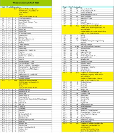
I’LL SOMETIMES REFORMAT a cue sheet when it’s provided in Excel. A cue sheet generally looks something like this:
The route designer added some nice touches you don’t usually see: Yellow backgrounds for the controles (checkpoints), and a two-column design for single-page printout.
The only problem was, in order to print it on one page, the font size was too small for me. Not too small for normal reading environments—say, seated on a bed, in an air-conditioned room, under an overhead light—but certainly when pedaling a bike while mentally and physically fatigued, at the limits of my physical ability, at mile 100, on unevenly paved streets and highways, in all weather conditions, at all times of day and night. On a ride, I want to be able to glance, read, and go, without taking my eyes off the road for too long, and with minimal searching around for the cue I need next. (I want to try one of those little pointer clip things that lawyers use to show you where to sign legal papers, and see if that works, sliding it from each cue to the next to keep track of where I am, but I haven’t gotten around to it.)

ANYWAY, THE ORIGINAL cue sheet for this ride was more usable than most: Usually you’ll just get a plain-vanilla Excel spreadsheet with everything in one font, no colors or background fills. And there’s something to be said for that: If you get used to it, you’re prepared every time you encounter one.
But the font was still too small for me, and I didn’t like how the page breaks fell when I made it bigger in Excel, so I brought it into InDesign and started thinking about what I’d really like from my dream cue sheet:
Don’t make me stop and flip pages when I’m most of the way to a controle
Don’t make me guess how far I have to go to the next controle because it doesn’t appear on the side of the paper I’m looking at
Help me not miss turns that happen immediately after other turns
Help me not miss CAUTION and DANGER notes (usually these have to do with railroad tracks, very bad potholing, extremely steep descents, or all three at the same time)
Help me read more easily when I’m on bouncy road in a downpour at night and can’t afford to stop and study the sheet (these rides have time limits)
To me, that sounds like:
Controles should only fall at the ends of pages (and having them mentioned again at the top of the next page would be a plus)
Small distances—say, 0.0 or 0.1 miles—and distance-related warnings should be highlighted, but probably only when they fall at the beginning of a paragraph (or table cell)
Cautions should be highlighted, regardless of where they fall, and should look different from highlighted distances
Table rows should use alternating fills to help eye tracking when the eye and the table are both jouncing around
Font face, horizontal and vertical text spacing, and font size should help readability—without egregiously increasing the number of page turns. Page turns are lost time, since I have to pull over to do them. If I can limit page turns to moments when I’m off the bike already anyway (which would be at controles), form doesn’t interfere with function.
And while I’m at it:
Have all the magic happen behind the scenes in the paragraph styles, and keep it to basically just one paragraph style, so if anybody else wants to use this for their cue sheets, they’re not overwhelmed with a long list in the STYLES panel.

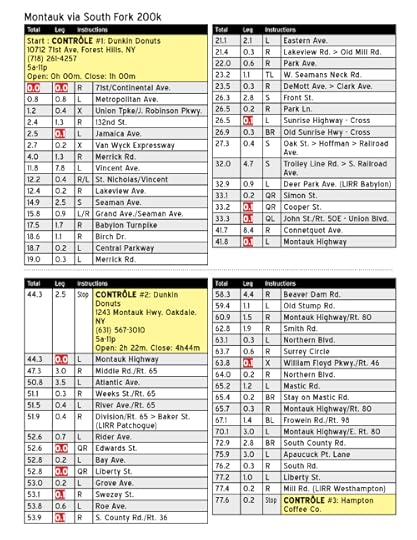
HERE’S THAT EXCEL file, brought into InDesign and reformatted:
The dotted line across the middle is where to fold it so it’ll fit in my map case. That’s also why the mileage goes left/right columns on the top, and then left/right columns on the bottom.
Your map case may vary.

INDESIGN HAS A feature called GREP styling that will automatically apply the various highlightings to whatever text you tell it to:
In GREP (which is a flavor of RegEx), the dot character (.) means “any character,” and the pipe character (|) means “or.” Because people spell “control” differently (control, controle, contrôle), contr.l. should catch all possibilities. (?i) tells it to ignore case. (GREP is case-sensitive.)

AT THIS POINT, the controles require a little manual adjustment so they’ll fall at the top of a page. InDesign does have a feature that forces certain kinds of type to skip to the beginning of the next page (or column), but it doesn’t apply to text inside a table

I’M THINKING THE font should be a sans-serif designed for highway signage—like Clearview, which all federal highway signs are being changed to. It was designed for legibility of short strings of text at a distance in bad conditions. However, it costs $800, so I found something free called “Blue Highways.” I’m not in love with it, but that’s just aesthetic; I haven’t tried it on a brevet. (And my thought of highway signage may or may not be a good one. It seems to make sense, but does it? Not sure.)

October 21: Second pass
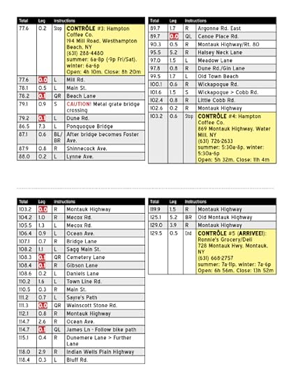
The controles are now blue so the yellow doesn’t detract from the red/yellow CAUTION/DANGER/WARNING style. Quick-turn emphasis (bold type reversed out of background) is now black instead of red for the same reason. Some other changes too, following various personal theories, but I won’t know if they make sense in practice until I use this cue sheet on an actual ride.
Two questions for GREP and InDesign people:
Streets, avenues, etc. are now capitalized and bolded with GREP, but how do I prevent Old Stump from becoming Old STump? (Lower right quadrant, first page). (SOLVED! Thanks, James and Tina.)
See the list of controle mileages at the top right of the page? That’s a master page item. The numbers were typed manually. Is there a way in CS5.5 to make a text variable that automatically grabs them from the table? Do CS6 features let you do that?

Second pass, page 1

Second pass, page 1

The GREP strings in the paragraph style
October 24: Third pass
This is the version I’ll probably test this weekend. (I’m doing this ride on Sunday.)
Patrick, whose route I’m using as a guinea pig, said he likes to highlight every left turn when he gets a cue sheet, to make it easier to find where you are in the cue sheet because you generally remember your last one.
I kept the street-type highlighting, but toned it down to all-caps and removed the bold, and gained a little vertical space by removing the ride name from the top. I figure if you don’t already know what ride you’re on, none of this is going to help you anyway.
I’m also trying to keep in mind that inkjet printing in a rainstorm is no good for your finish time, so all the colors have to be BW/laser-friendly.

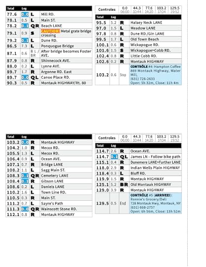
Third pass, page 1 (which is really two pages, since it’s designed to fold into a half-letter horizontal to fit my map case).

Third pass, page 2
November 1: Fourth pass
I used it on the Queens-to-Montauk 200K last weekend, a day before the hurricane hit.
Turn direction and total mileage are much more critical than leg mileage, which the eye shouldn’t track to at all.
The knockout type on blue for quick turns needs a black stroke for legibility.
The little handy-reference controle list at upper right needs times, not just mileages.
In order of importance:
Find the last cue you already did
Read the street name and brief info on the next upcoming cue
Read its turn direction
Read its total mileage
I also increased tracking to help with letterform recognition in vibrating conditions.
…and compressed it horizontally to fit my map case, with a dotted line for cutting or folding
Nothing’s ever “final,” but I think this is pretty good.

Another pass after using that last version on an actual 200K
Filed under: Bicycling, InDesign, Randonneuring, RegEx and GREP


