
The problem of cover copy
I am having difficulty with the cover/catalogue copy for The End of Earth and Sky, which is basically the last thing that needs doing before I can shove it out the door. The obvious thing, of course, would be to do this:
So that would be the obvious thing to do, except that it’s already been done, so I shall have to come up with something else. (I do wish I could use the sentence ‘The con is a con’, though, because that is one of my favourite verbal pretzels of all time.) I will have to come up with some other COPY to lure people to BUY my PRODUCT, so that I can put it on the BOOK COVER.
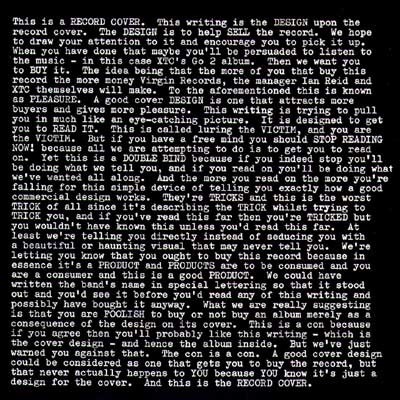
This is a RECORD COVER. This writing is the DESIGN upon the record cover. The DESIGN is to help SELL the record. We hope to draw your attention to it and encourage you to pick it up. When you have done that maybe you’ll be persuaded to listen to the music — in this case XTC’s Go 2 album. Then we want you to BUY it. The idea being that the more of you that buy this record the more money Virgin Records, the manager Ian Reid and XTC themselves will make. To the aforementioned this is known as PLEASURE. A good cover DESIGN is one that attracts more buyers and gives more pleasure. This writing is trying to pull you in much like an eye-catching picture. It is designed to get you to READ IT. This is called luring the VICTIM, and you are the VICTIM. But if you have a free mind you should STOP READING NOW! because all we are attempting to do is to get you to read on. Yet this is a DOUBLE BIND because if you indeed stop you’ll be doing what we tell you, and if you read on you’ll be doing what we’ve wanted all along. And the more you read on the more you’re falling for this simple device of telling you exactly how a good commercial design works. They’re TRICKS and this is the worst TRICK of all since it’s describing the TRICK whilst trying to TRICK you, and if you’ve read this far then you’re TRICKED but you wouldn’t have known this unless you’d read this far. At least we’re telling you directly instead of seducing you with a beautiful or haunting visual that may never tell you. We’re letting you know that you ought to buy this record because in essence it’s a PRODUCT and PRODUCTS are to be consumed and you are a consumer and this is a good PRODUCT. We could have written the band’s name in special lettering so that it stood out and you’d see it before you’d read any of this writing and possibly have bought it anyway. What we are really suggesting is that you are FOOLISH to buy or not buy an album merely as a consequence of the design on its cover. This is a con because if you agree then you’ll probably like this writing — which is the cover design — and hence the album inside. But we’ve just warned you against that. The con is a con. A good cover design could be considered as one that gets you to buy the record, but that never actually happens to YOU because YOU know it’s just a design for the cover. And this is the RECORD COVER.
So that would be the obvious thing to do, except that it’s already been done, so I shall have to come up with something else. (I do wish I could use the sentence ‘The con is a con’, though, because that is one of my favourite verbal pretzels of all time.) I will have to come up with some other COPY to lure people to BUY my PRODUCT, so that I can put it on the BOOK COVER.


No comments have been added yet.
Tom Simon's Blog

- Tom Simon's profile
- 11 followers
Tom Simon isn't a Goodreads Author
(yet),
but they
do have a blog,
so here are some recent posts imported from
their feed.

