Clear Covers: Making Your E-book Identifiable at Thumbnail Size
Designing book covers is a challenge. If you have a print book, there are geniuses out there in the publishing houses, who can bring themes together which make you go “wow.” (Watch this presentation on TED talks to see the “wow” factor come alive. It’s incredible!) Whether you like the book topic or not, you want it for the cover! The advantage they have is, there is much more space to play with. E-book authors don’t have the same space! Covers that look great in a normal size, Photoshop, or on your blog or web site, can come across as totally unfathomable on a mobile device or online e-book catalogue. This is a problem for me when I’ve just bought the book; or forgotten I have bought it and can’t remember what it is about!
Please take these great cover examples from Amazon’s newly released list.
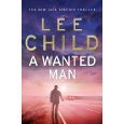

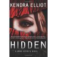
I can see what they are about and the title. Mood enhancing and decorative elements that would only work in print, are not on these covers so they work well as e-book thumbnails.
The worst covers I have ever seen come off DIY sites where they give you a limited selection of backgrounds and fonts. They are just image and text thrown on top. They make you look completely pathetic.
It does pay, as many say on a regular basis, to take the time to ensure your cover is professional. In short, that means:
Cover design is based on the genre of your book. If it is about a cowboy working in the big city, have him in an office wearing boots and a cowboy hat. Don’t get philosophical and put on a picture of a zombie. That will confuse the reader, even if your storyline is about how working in the city destroys you! Readers cannot quickly grasp intricate messages which are contained in the depths of your story.
Cover design is appropriate to the reader; ie. if it is a young adult book on vampires, don’t put the victim in an erotic, gothic outfit or make it too gory. You will be getting letters from parents who aren’t very happy!
Ensure your text is clear, doesn’t disappear into the background image and fits the genre. Beware curly, or antique-type lettering which may be hard to decipher on e-books, or special effects which are lost on e-book covers.
Don’t try and put too many elements or any small details on your covers. Not having
 a back cover makes cover design more limited. When I designed the covers for my Four Dimensional Characterisation Series, I had a lot of trouble getting that logo in. I knew that while I needed it as a series identifier, it would have to either be totally sacrificed, or I would have to allow it to be almost unreadable, thus putting the emphasis on the title. It drove me crazy trying to make it work! In the end, I shrank it smaller than I would have wanted and just had to live with the compromise. I ensure it is legible in promotion on my blog and web site, to make up for that deficit. It’s not easy! You can’t always get what you want.
Remember, you only have a nanosecond to get the reader’s attention. Make it count by being clear.
Take your time when designing, have a good look around and collect a scrapbook of ideas and good luck! Your hard work will pay off.
P.S. If you are interested in presenting your book jacket in a 3D form for promotion, try this web site: http://www.3d-pack.com/ It’s easy to use and you can buy the software. An example is just above.
Books featured in this post:
Hidden (A Bone Secrets Novel) by Kendra Elliot
A Wanted Man (Jack Reacher) by Lee Child
Wheat Belly: Lose the Wheat, Lose the Weight, and Find Your Path Back To Health by William Davis MD

The covers are Copyright the authors of those books. I have and make no claim to them.
This article / blog post is Copyright Cate Russell-Cole 2012. All rights are reserved Internationally. You may not reproduce it in any form, in part of whole, without Cate’s prior written permission. That includes usage in forms such as print, audio and digital imaging including pdf, jpg, png etc. A fee may be requested for re-using her work if it is for a commercial venture. Link sharing and Pinterest pins are most welcome as long as Cate is the attributed Author.
No images on this blog may be copied, captured, or altered for your own purpose without the consent of the originating owner. Where images are marked as being iStockphoto.com images, they are paid for and licenced to Cate for use on this blog. If you take them, iStockphoto.com has the right to take legal action against you for Copyright Infringement.
Please see the Blog Content and Image Copyright page of this blog for further information in regards to Guest Posts, other images, Cate’s checks on infringements and Liability.
Filed under: Writing Tagged: Android, author, Barnes and Noble, books, cover, design, ebook, fiction, iBooks, ideas, Indie publishing, inspiration, iPad, iPhone, Kindle, legible, Lulu, mistakes, print, problem solving, sales, Smashwords, success, writer, writing