Fonts: A world I didn’t know existed . . .
I would read the “Note on the Font” blurb in the back of a novel now and then, and get a glimpse into the craft of the designers; but not until I searched online did I realize what gargantuan icebergs are submerged beneath those outcrops.
From a current post on a font blog:
“With Quiosco, Cyrus Highsmith continues an examination of themes and possibilities which he first explored in Prensa, inspired by the work of W. A. Dwiggins — specifically a dynamic tension between inner and outer contours. However, the crackling, electrical energy of Prensa here gives way to a more fluid, mercurial muscularity in Quiosco.”
http://www.fontbureau.com/newsletters/2012/11/
Fluid, mercurial muscularity — it does remind me of a description of wine.
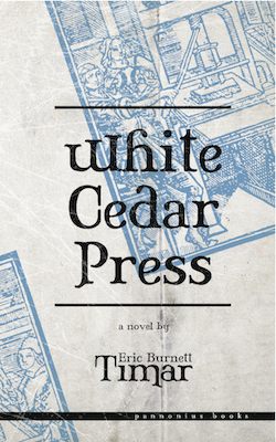
And so Paulo takes his fonts very seriously in White Cedar Press (p. 144):
I read the next description:
Tholian font delivers both clarity and enduring charisma. Efficient weighting and conservative widths highlight the functional ornamentation.
“Tholian. Wasn’t that something in an old Star Trek episode?” I asked.
“I am afraid I have not watched this program, my friend,” Paulo said.
I raise my glass to the toiling font designers out there.


 Thank you, Eric! NowI understand Paulo better. But I will need a magnifier to study all these designs.
 Yep - I guess the differences jump out more to the pros . . .