
How to design a book cover
Just to be clear, this post is about how I design and create my own book covers and is NOT necessarily a lesson in what designs work best and market well. I'm not a marketing expert, just a computer geek. I'm assuming that you have a good graphics program and have some basic knowledge of resolution.
Design your cover at high resolution
I can't stress this enough. Even if you're only planning to sell your book in electronic form (Kindle, Nook, etc), I would strongly advise you to build a high-resolution, print-ready cover. An ebook cover is seen only on a computer screen and is a relatively small image, whereas a paperback book cover is printed and needs to be a much higher resolution (about three or four times bigger than your ebook cover). It's very easy to copy and downsize a cover for use with your ebook, but not the other way around. If you make the mistake of building your cover at ebook size, then decide later you want to print the book as well, you'll have to start over. You can't -- repeat can't -- just enlarge your ebook cover for printing. It will look awful.
Choose a book size and create your working canvas
As a quick guide, and using CreateSpace as our (future) paperbook book printing service, decide what book size you want to use. Two popular choices are 6 x 9" and 5.25" x 8" and whichever size you pick will determine your starting point when creating your canvas. You need to allow "bleed" on a printed book cover, which is where your cover extends slightly beyond the finished size. This is to allow for the tiniest of inaccuracies when the cover is printed and cropped for binding. CreateSpace require that you allow 0.125" on each side. So:
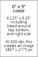
However, since your cover will normally wrap around the book, there's no need to leave a bleed on the left side because it won't actually be cut there. So:
A book cover with a width of 6" will become 6.125" (6" + 0.125" bleed).Clear? We won't go into spines and back covers here. The back cover would of course be the same dimensions, but the spine width depends on the number of pages in your book. If you want to calculate this and a build a complete wraparound cover, use this handy CreateSpace information.
Anyway, you now have a cover size of 6.125" wide x 9.25" high. If you want a different book cover size, you can figure it out using the same formula because the bleed is the same no matter what.
If you go ahead and create a new canvas in your graphics program with the above dimensions, and with the resolution set to 300 dpi, you should find that this equates to about 1837 x 2775 pixels. I'll be using pixel sizes from now on in this post because everything on the internet and on your screen uses pixel dimensions.
Plan your cover layout and allow space for the title and author name
A common mistake I've heard about is finding the "perfect" image for your cover and then finding that there's no good place to put the title and author name -- or adding the title and author name over the top anyway and finding that it's all a little busy and unclear. When looking for your cover image, you need to plan ahead and visualize the text that will go with it.
Normally a printed book cover and an ebook cover will be the same (with a difference in overall size and perhaps a slight variation in ratio). But there's one important thing to remember about your cover, especially with ebooks: when promoting your book on the internet, it will initially be seen by potential readers as a tiny thumbnail. It's worth considering that your title and author name are big and bold enough to be read at such a small size, and your image should ideally be fairly clear and not too busy. Look at this random mix and see which ones work:
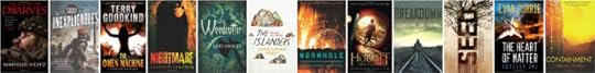
Thumbnails on Amazon and Goodreads are usually bigger than this when you're browsing their categories, but there are plenty of places where your over will be tiny, for example on the "Customers Also Bought..." feature on Amazon. There's no harm in giving it some thought at least.
Finding and editing your cover image
There are a billion alternative ways you can put your cover together. All I can do here is give you a hint about the steps I went through to design Chamber of Ghosts. I started off with a general idea of what I wanted, and went to a couple of royalty-free stock-image websites like BigStockPhotos.com and 123RF. Images only cost a few dollars each and are well worth having. Don't even think about using one from Google's image library. If you're going to spend any money, spend a few dollars on a good high-resolution image that you know you're allowed to use.
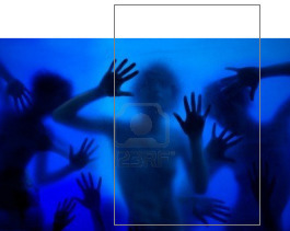
Here's the one I bought shown with the book cover guide outline. Remember the book cover size I mentioned above? Bear that in mind when you buy your image. It will probably come in different sizes, and you DON'T want to enlarge it after you've bought it. Make sure to pick one that is big enough to use. Downsizing is fine and most likely necessary.
The one I bought was 3831 x 2554 pixels and I knew that, once cropped to fit a portrait-orientation book cover, I would need to add a bit to the top. I could have bought a bigger image to fit the full height, but I didn't want the title text running over the ghostly faces. Best to leave some clean, empty space for that.
Then the fun started. This is where spent a few hours editing. I adjusted its color, brightness and contrast. Then I added a layer image of solid rock and deleted the bit in the center (with some heavy feathering all around) so that the main image showed through. This started to give it the effect that these ghosts are in fact within/behind a solid rock wall. I then added some smaller details like a crack across the front, a bit more feathered rock here and there, and some "noise" to the whole thing to give it a more grainy effect. Basically I messed with it until I was happy. A final touch was darkening the top corners.

All this gave me a bright, vibrant image but with a big, clear space for the title text.
Adding your title and author text

Don't use standard computer fonts. I did this on the first three books in the series and have regretted it ever since. Fonts that are too "familiar" scream amateur. Go and find yourself a really nice rare, stylish, but clear font. There are plenty of free font sites including Google web fonts.
I made my text nice and big. Normally on a dark background I would use light-colored text with black drop-shadow to make it stand out, but in this case I used black with a white glow. It's more ghost-like.
Remember that little extra bleed to the right edge of the canvas? I used to debate over whether to center my text INSIDE the bleed or go all the way to the outside edge. Honestly, it doesn't seem to matter one way or another. When producing book cover images for use on the internet, then I make sure it's centered. But for your print copy, you can't control it as much as you'd like. The cover is cut where it's cut, and it wraps around the spine imperfectly, so your text will never be absolutely centered whatever you do. But it's usually close enough.
Create your ebook cover
Finally, the last piece of the puzzle. This is the fun and easy part. Just downsize the entire thing. But to what size, I hear you ask? Well, I have multiple images for different reasons. A bigger question is not the size but the proportion of the image you use for your ebook. Many say that ebook covers should perfectly fit the screen of a Kindle or Nook, and for that your image will need to be a little more square...
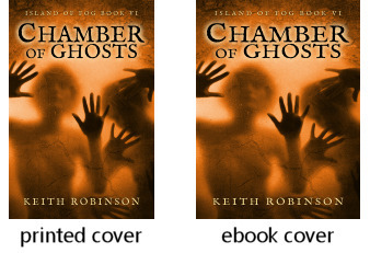
Something like 600 x 800 should work -- or 800 x 1066, which is the same ratio but (apparently) the "perfect" resolution to fill most device screens. Personally, I still use the printed book proportions so my covers are slightly slimmer/taller. Just look around on Amazon and see which you prefer. Look on your Kindle and see how those fill the screen -- or not.
At the end of the day, readers really just want to read the book and probably won't care if the cover fills the screen or not. Even big-name authors, backed by giant publishing houses, vary on this subject; there seems to be no set-in-stone standard. So don't lose too much sleep over it.


