"You're coming with me?" "Yes. Apparently it's illegal to chin the chief super inspector."
Well, I FINALLY did it. Yes, FINALLY. I watched Sherlock die. (I know, took me long enough, right?)
I had a good reason for my delay. After watching Adler I was so mad I couldn't go on for awhile, and then they shows were taken off line after I watched the Hounds. They were finally put on Netflix, so I spent an hour and a half last night trying to find the obvious clue as to how Sherlock survived the fall. I had some theories...such as the tea, the man on the bike who hit Watson, some kind of illusion, Molly, and I think the ball Sherlock was fiddling with might be a clue. Also, his scarf. His scarf must be a clue. MUST! Either that or someone in filming went blind.
I didn't find Sherlock's actual death sad, because I knew he wasn't dead, but poor Watson! His reaction teared me up, yes I confess, I teared up. But I don't get why everyone got upset after the fall. I mean, when Doyle killed him it was for real - so I can get why they were mad at him - but when he died this time, it showed him still alive. (And with the wrong scarf...what is it with that scarf?) So, even if one hadn't read the books, at least they were reassured he wasn't dead. They should be glad they weren't alive during Doyle's day.
But I'm curious now. Do any of you have any theories on how he lived?
Okay, Sherlock aside...for the time being.
Today, I am going to show you the complete cover process I went through.
All of this was done on Photoshop, Picmonkey, and Paint (the program on most computers.)
Photo copyright to William Knisley. If you wish to ask him about his photos, or see his other work, you can find him here http://wpkphotography.blogspot.com/ or contact him at WPKPhotography@gmail.com
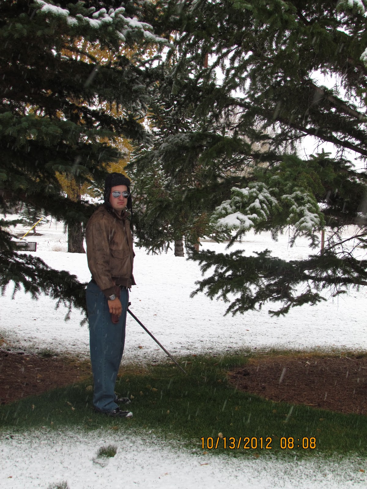 Our first attempt at trying out poses. The first, and last, with aviator sunglasses. Too WWII, not enough Steampunk
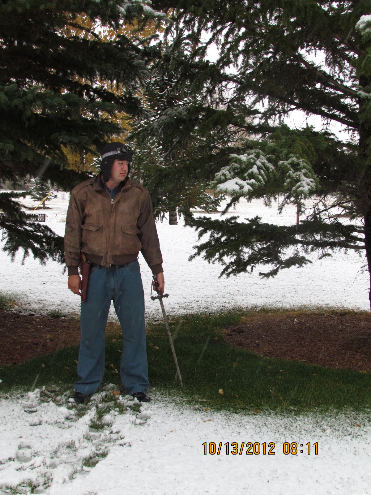 Homemade goggles took their place and we tried a new pose
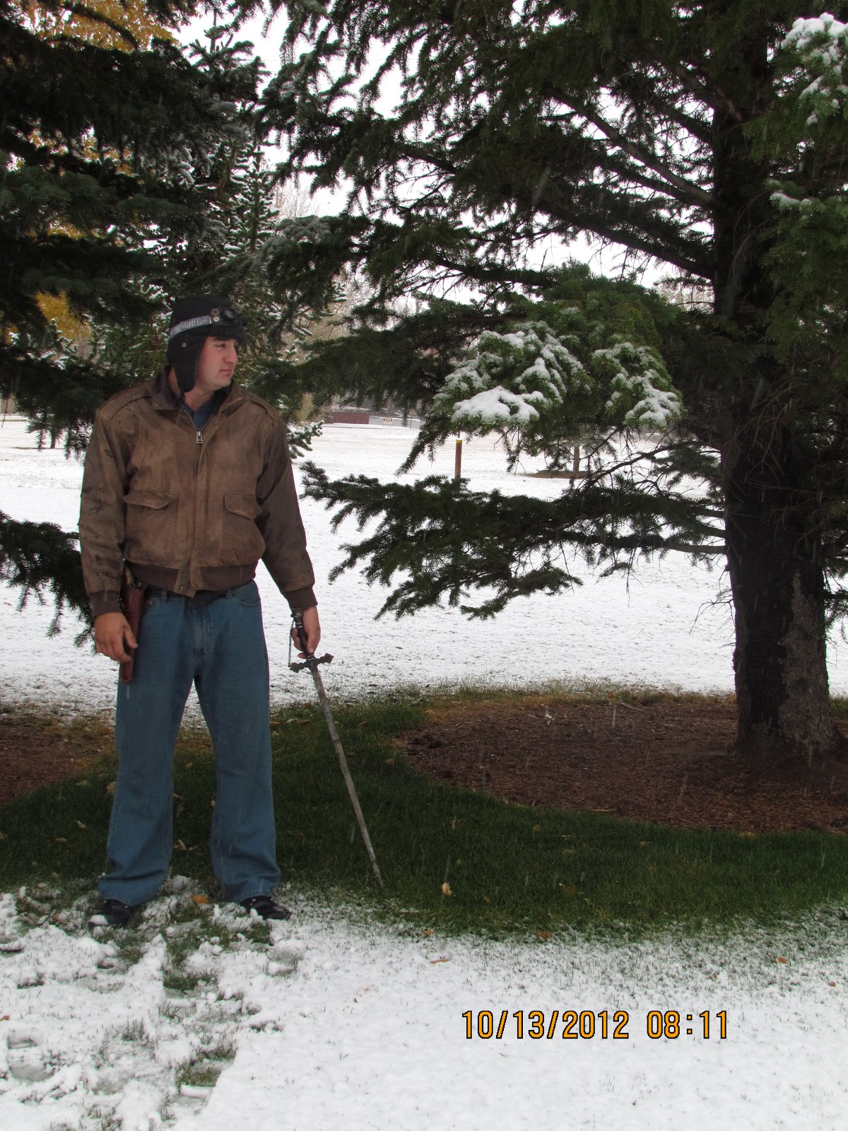 And another pose
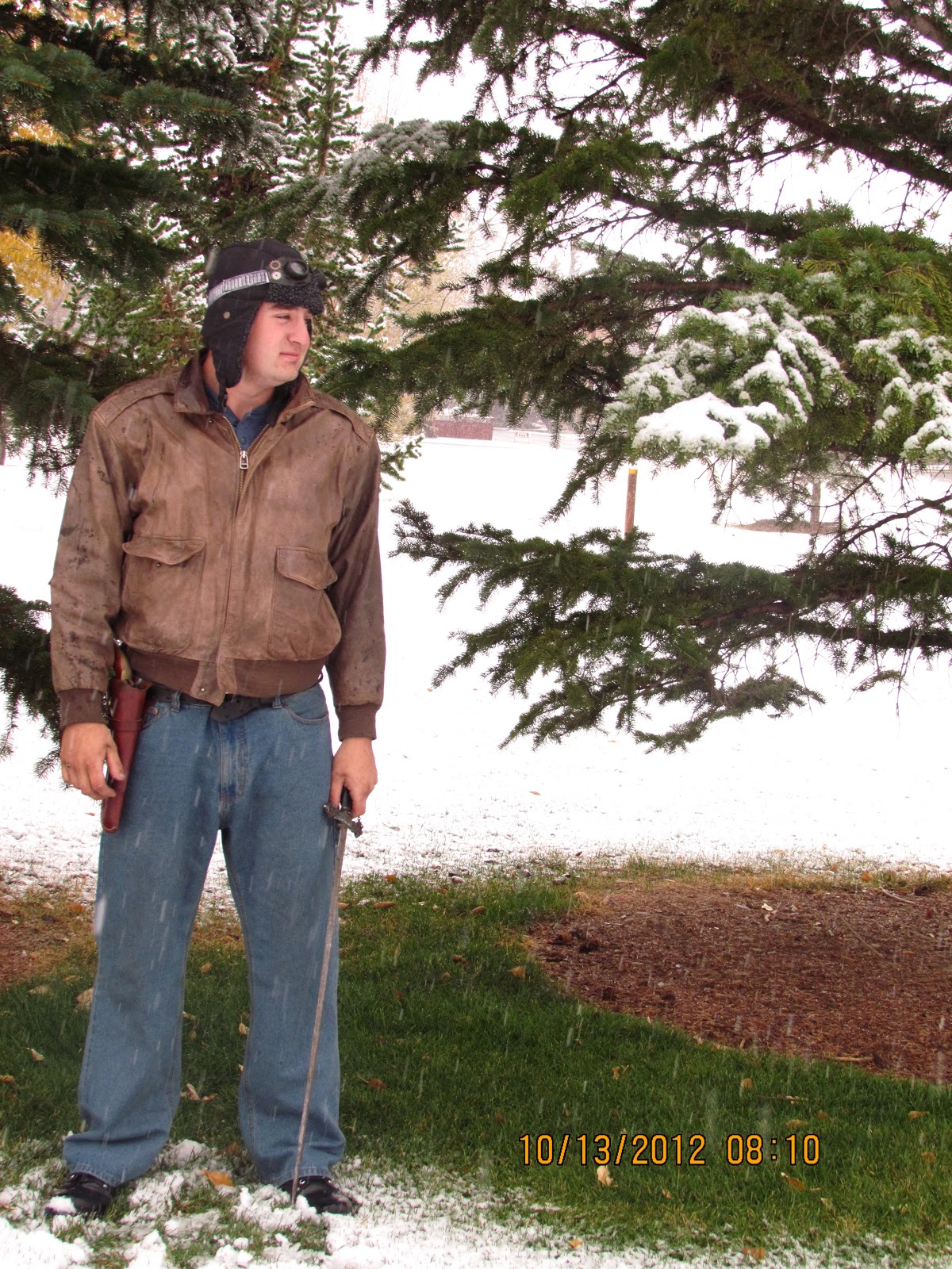 And...oh yes, another. (Did I mention it was COLD out?)
 Coming home, I attempted to lighten and crop the picture.
 And add words. Incert first problem. With the different colourings in the back and fore ground I had trouble placing the words. I couldn't use all black, because you couldn't see it in the shaded areas. Nor could I use all white because of...well...the snow. Also, I couldn't get the lettering right on my first attempt, so I pulled up almost every Steampunk book known to man and did more research.
 And asked for help. This is where I learned of grain. Wonderful stuff, grain. It works like that old photo covering thing...only, you get to keep more colour.
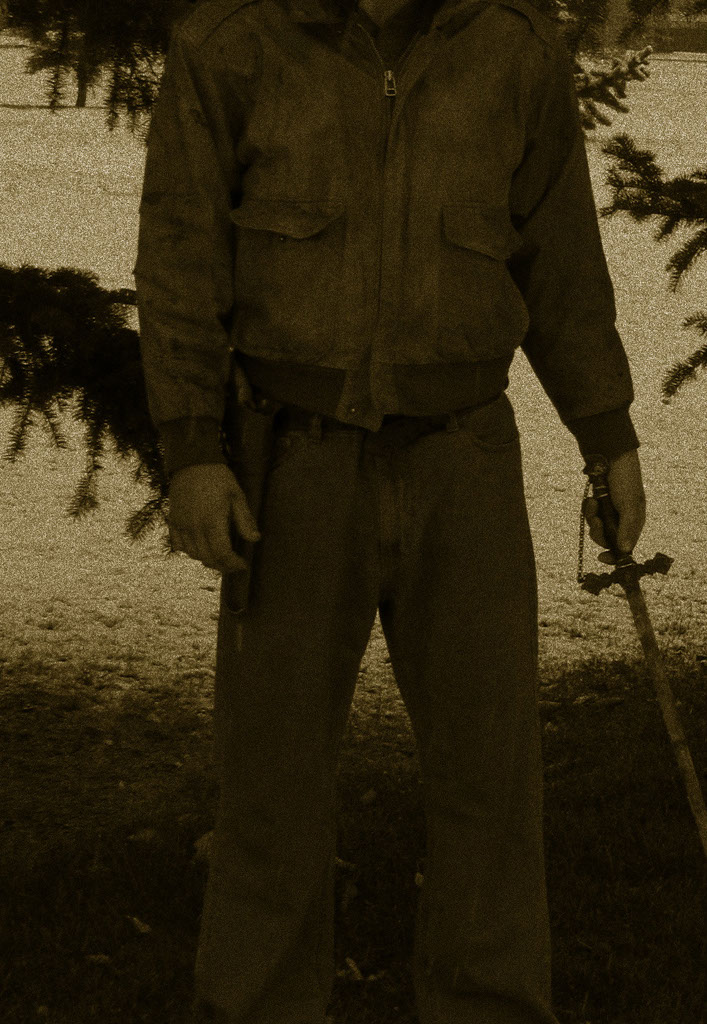 Unless you add too much.
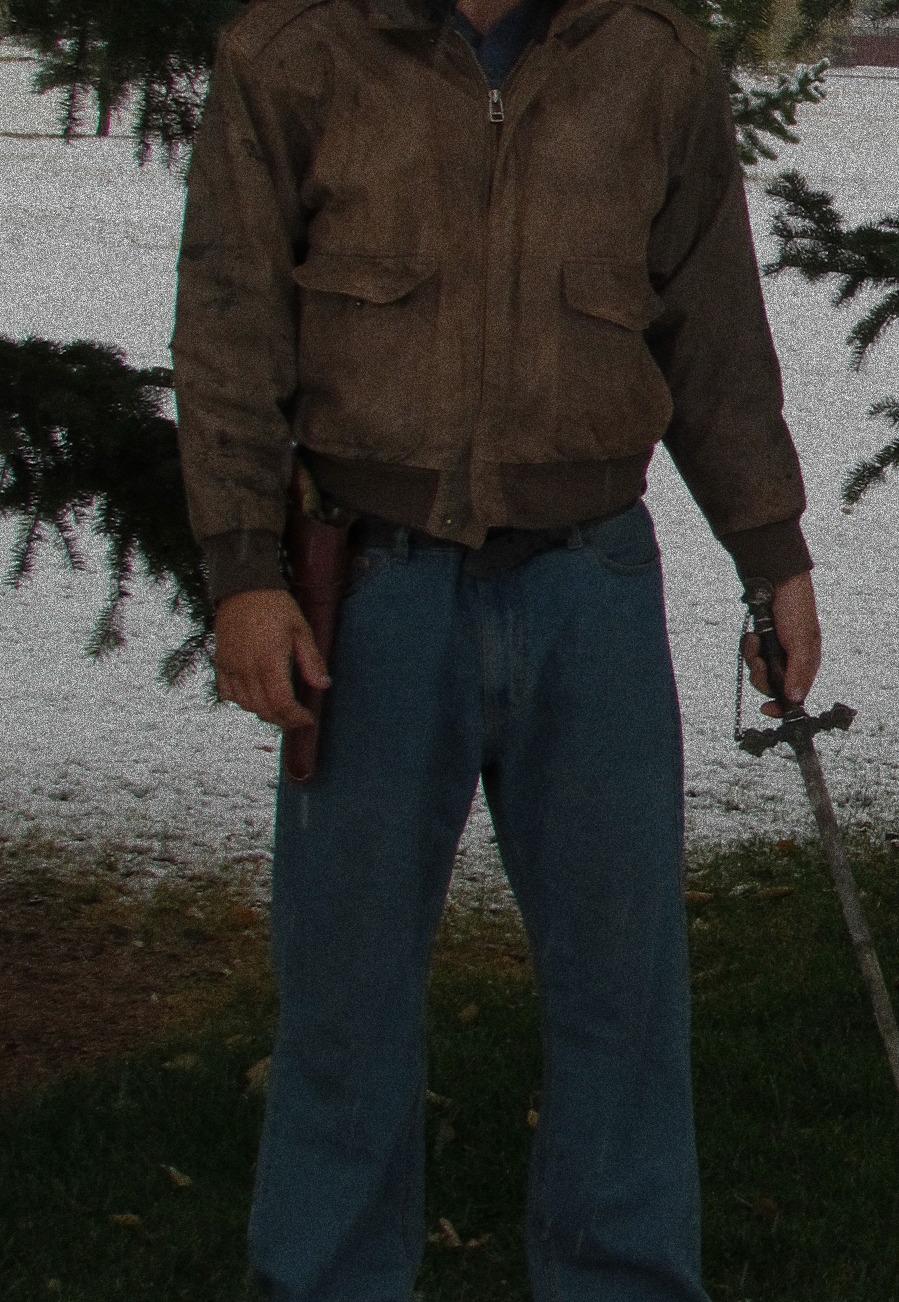 Grain Exhibit B.Still not right. Made it look like it was twenty below out...which wasn't far off. But it isn't twenty below in the book. *Peter sighs with relief.* That is book two. *Peter frowns*
After my failed attempts with these pictures I pitched them in and got a new model. Now, let me explain something. I don't dislike William posing for my covers. Just, I have something else I needed his help with which hindered him posing for this cover. (Spoilers). Also, I'm soddy with his camera. Don't believe me. Keep an eye on the pictures I took, and compare them with his. There is a reason I'm an author and he's a photographer.
So, I scrapped these pictures, called them a test run, and we went into the city with an old sword, a new model, and William behind the camera. (And the author with a clearer idea in her head as to what she wanted.)
More reviews.
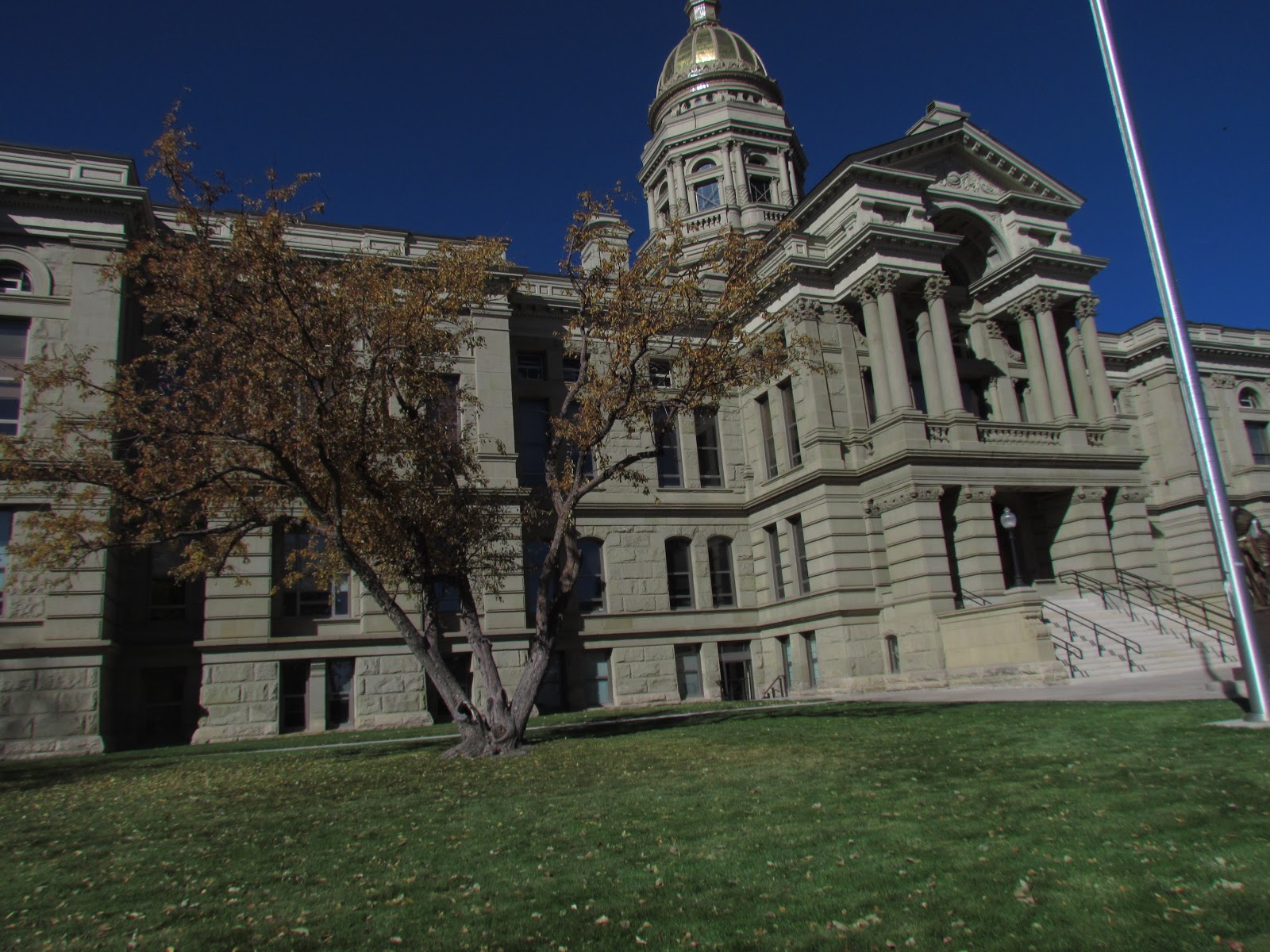 May I present to you, the capitol of Wyoming!
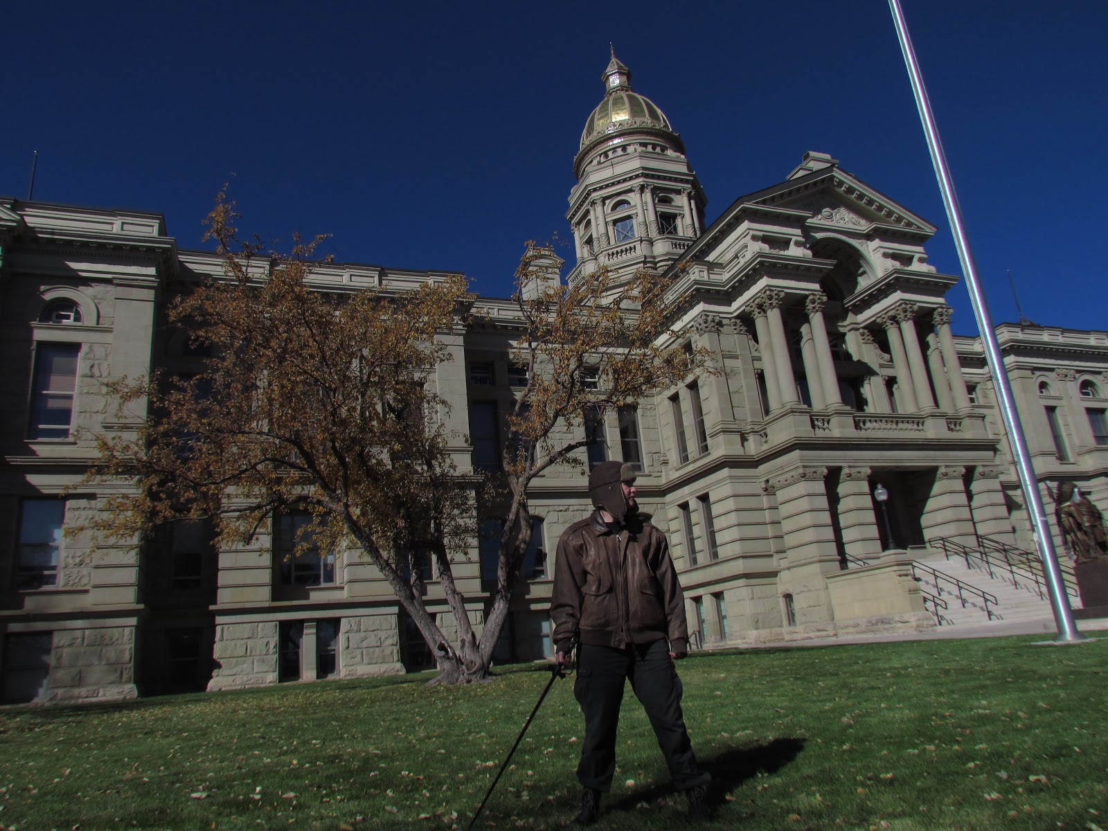 My I present to you my model, standing outside the capitol of Wyoming, holding a sword!
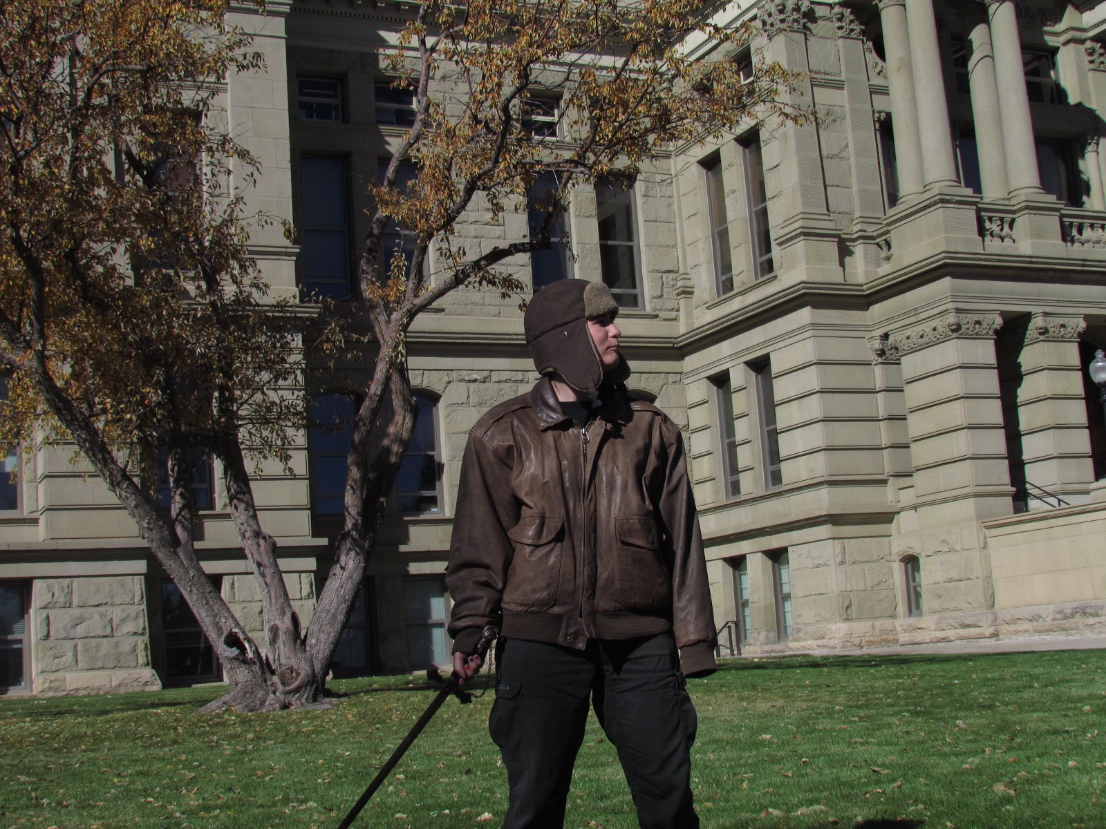 May I present to you my model standing outside the capitol, holding a sword, and getting slightly nervous.
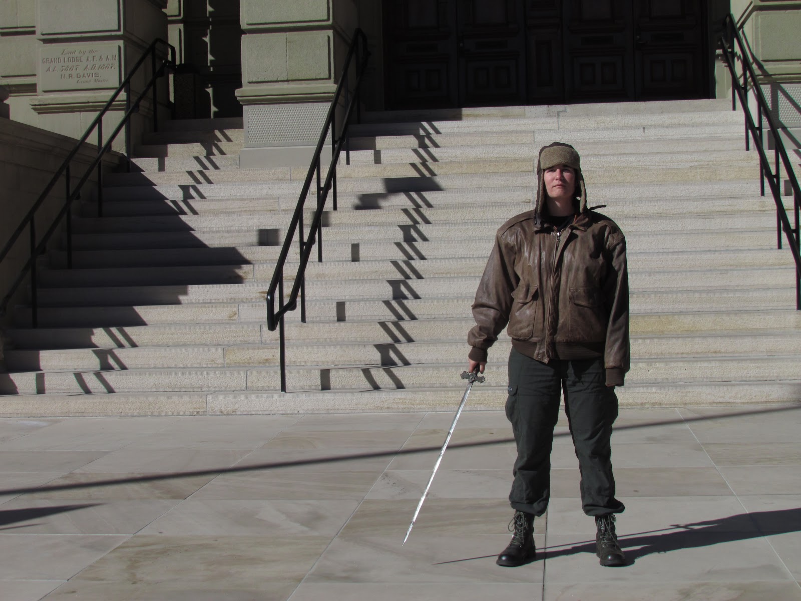 May I present to you my model, in front of the capitol steps, holding a sword, and hoping none of the people driving by feel like calling the police.
 My model smirking while watching said people drive by
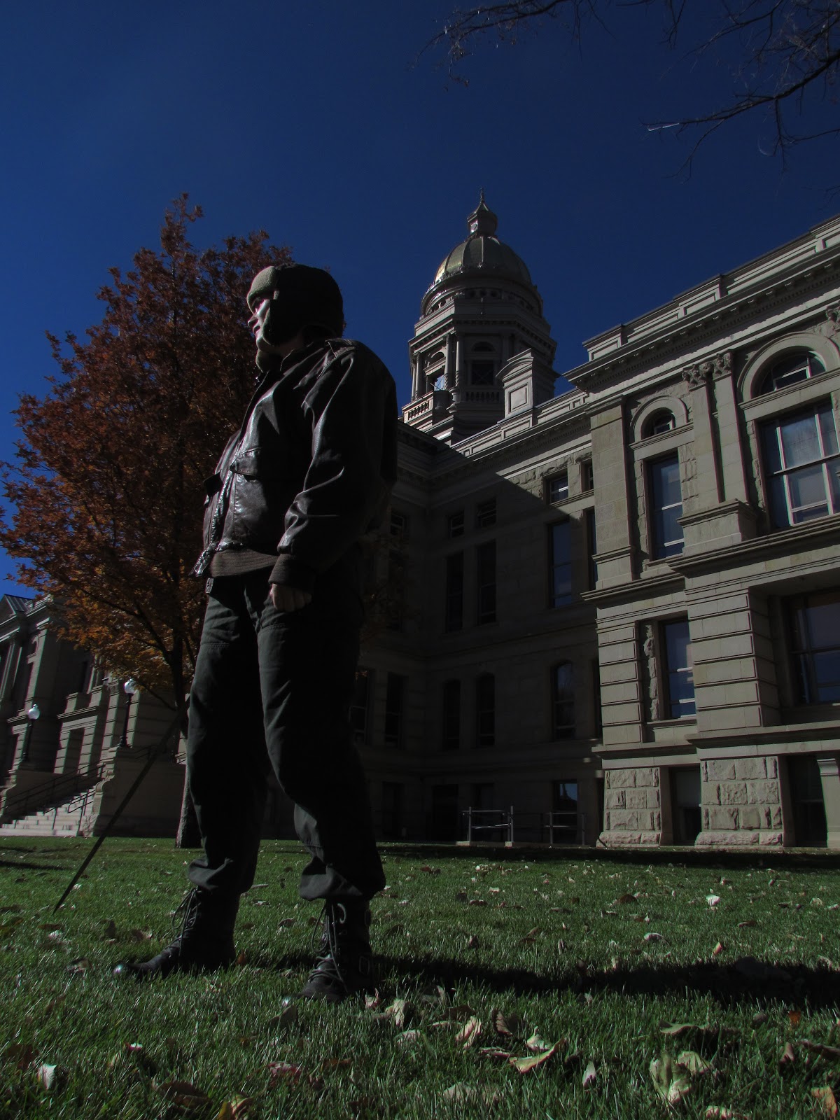 My model now worried the sword might appear like an assassin weapon
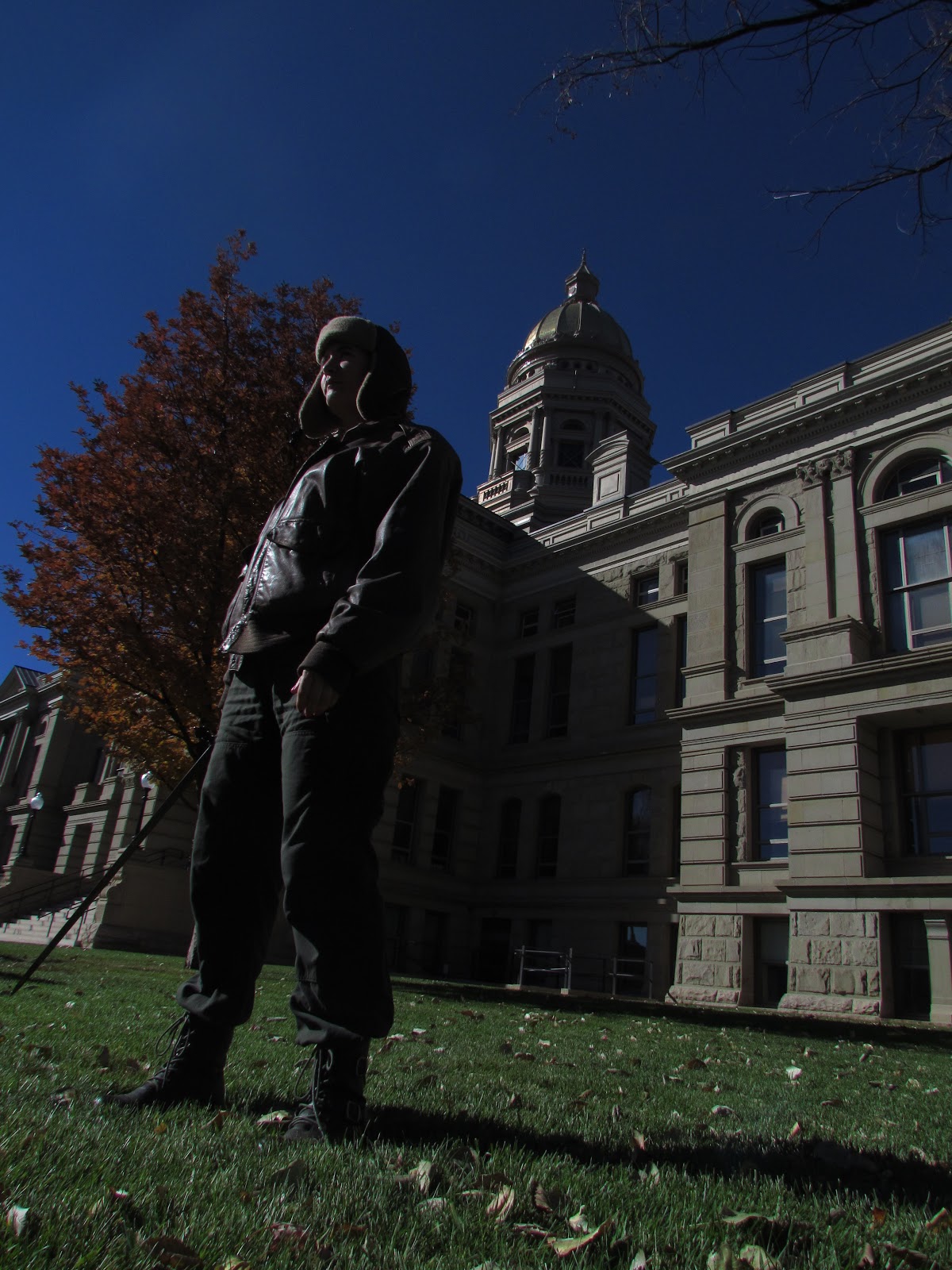 My model hoping no important people show up for debates
 Or children on school field trips
 My model getting very warm in the heavy aviator jacket
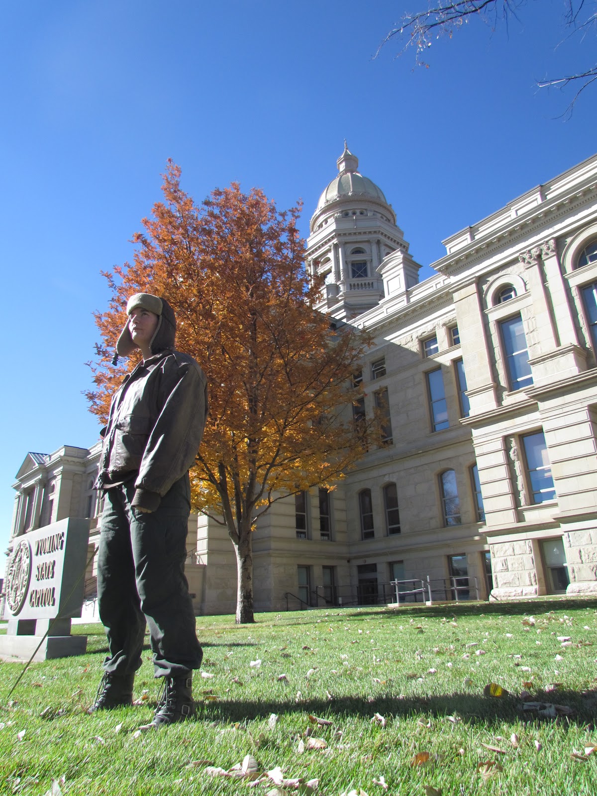 My model glad I said to take off the other leather jacket under the heavy leather jacket (I was trying for broader shoulders, but it didn't work. Also, Peter isn't very broad in the shoulders.)
And now, the actual shots I ended up using
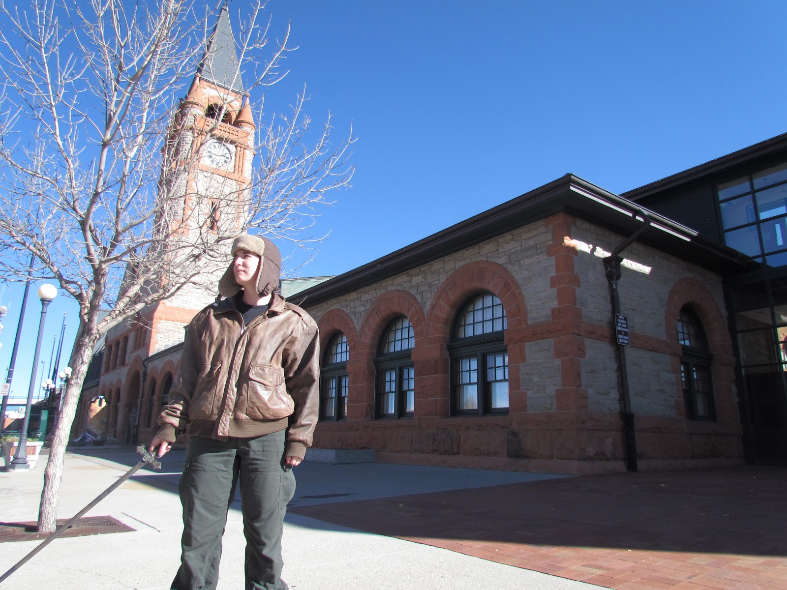
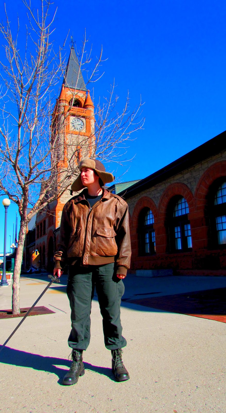
 Deciding to ditch the capitol before we were arrested, we moved to an old train station. I liked the poses where the camera is looking up at the model, so William tried a few more, but again, I didn't like these angles as much. I liked more of the side shots then the front shots.
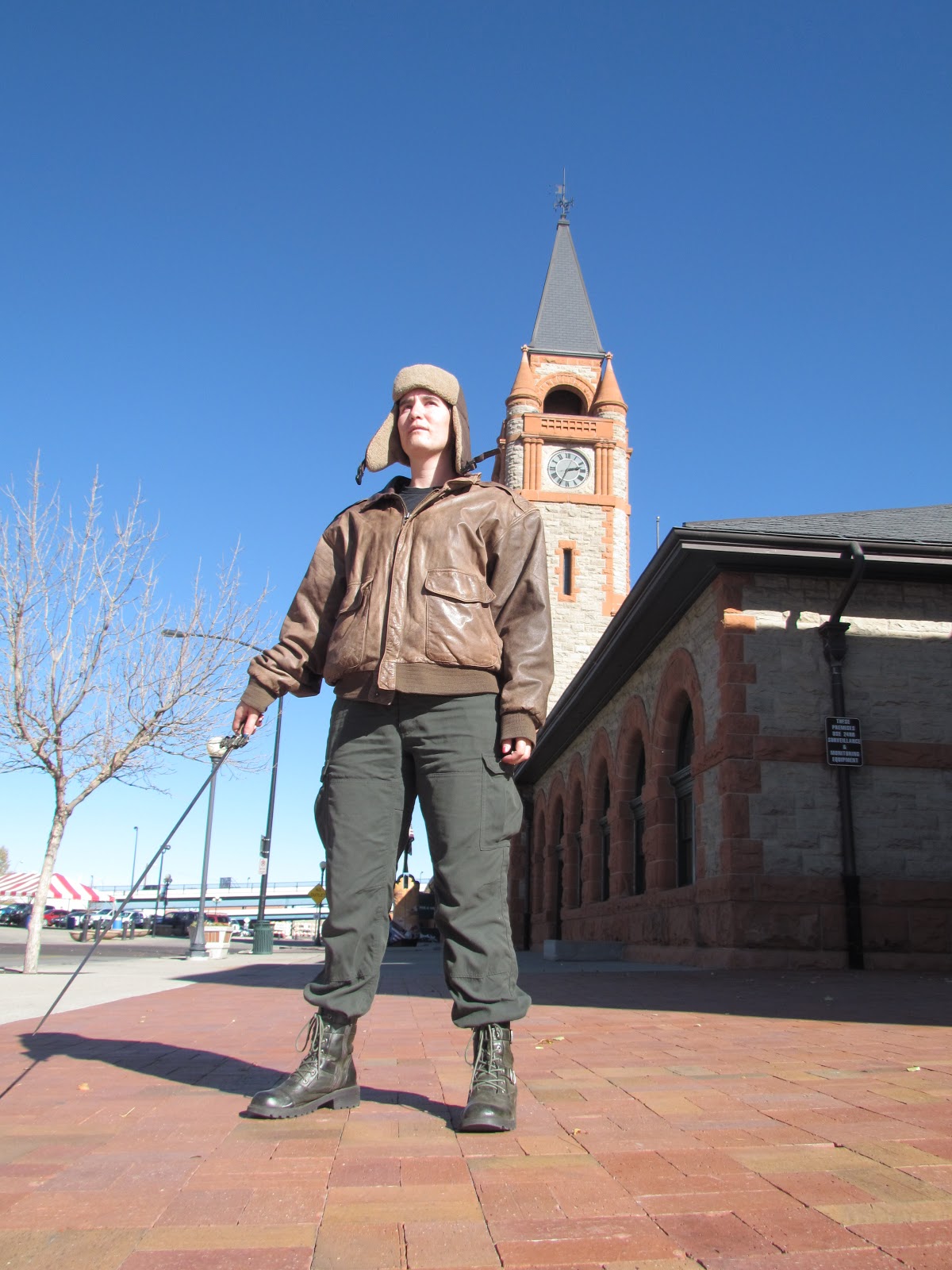 Also, you can see a street lamp and a circus looking tent in the background. We were attempting England...and, well, those just don't fit. And my Model was looking into the sun, which meant squinting
 Nevertheless, I tried a cover with this pose and angle. As you can see, it is far too bright. With Steampunk covers, the background is faded while the person stands out clearly in the front. The person usually is the only thing in full, bright, or catch your eye colours. In this one, the first to grab you is the bright blue of the sky - though I did like the shadows. I did not, however, like the street lamp but sadly, no one would let me cut it down.
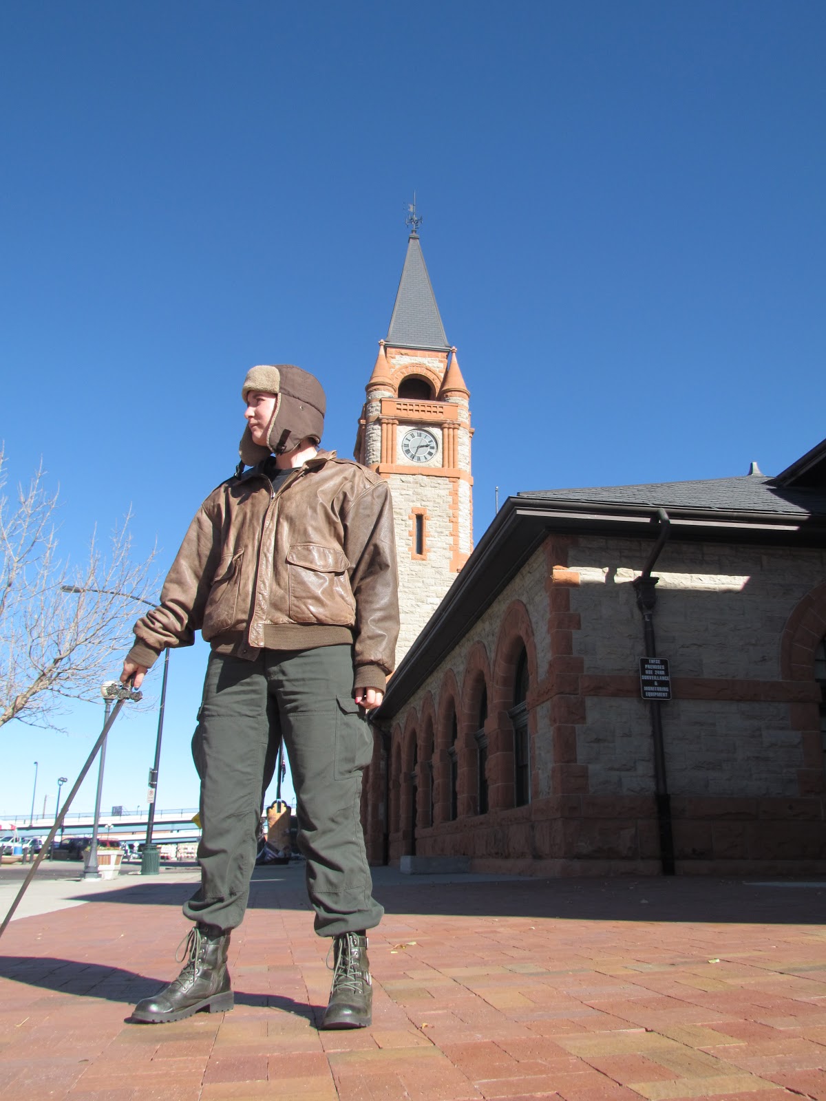 I liked this one more, but as in others, you couldn't see the model's face very well.
New position.
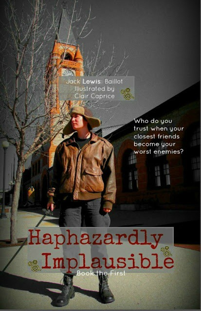
 William is a daring photographer. He willingly stood in the street to get this one. I liked these angles much better, no street lamp, so we moved to this position. (And he moved out of the street.)
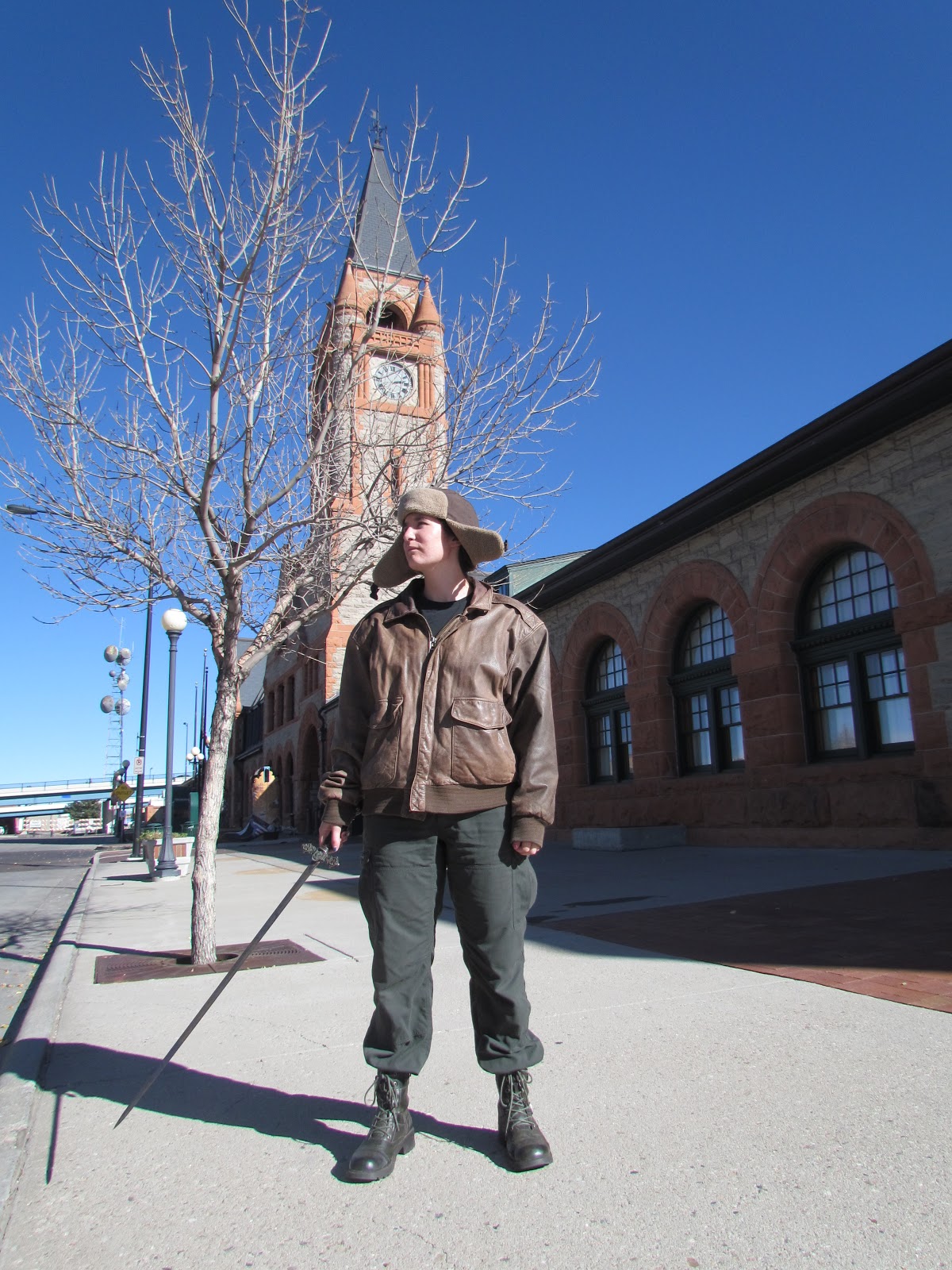 I liked this one best out of them all, but the hat started to flap in the breeze and I feared it would look too silly. "I don't mean to say your wife was being silly, but one of us was very silly, and it wasn't me."
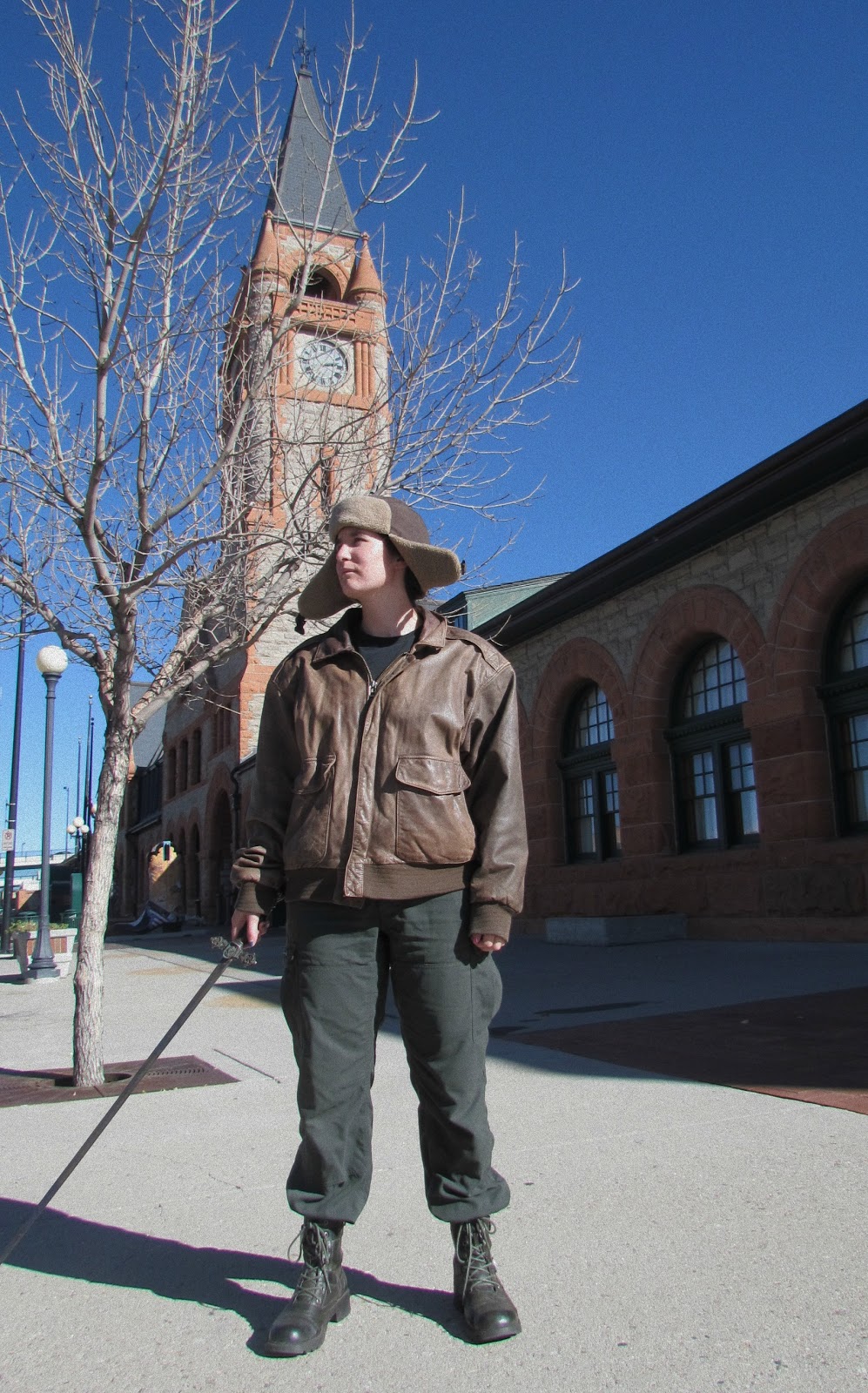 I decided to try it anyways so cropped it down. After all, if I didn't like it, I had plenty more to try out.
 And, I cropped out the street lamp. Next best thing to hacking it down with the sword, I suppose.
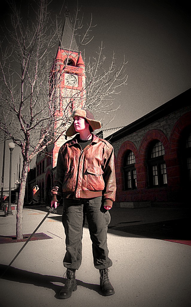
 Once cropped, I tried different shadings and colourings to give it an older look. However, the first few tries blended the colours all together so nothing stood out. (Well, the clock did a little.)
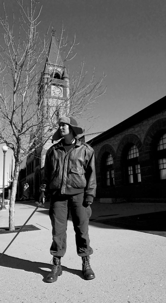 Black and white, nope.
 This is an overlay to give it an old photo look. I didn't like how it brought out the blue in the sky while making everything else drab.
And I made many more attempts, most of which didn't save, until I came up with this.
 This really brought out the blue in the photo, but it also gave a nice effect to the browns, which is what I wanted. So even though it made the blue pop, it heightened the other things I wanted - such as the clock, the model, and the tree, as well as the model's shadow.
This is where I began to shift back and forth between Photoshop and Picmonkey. All the others were done on Picmonkey alone and the one's of William done only on Photoshop.
 Moving to Picmonkey, I found a way to darken the blue. I then added grain, but again, it was too much and dulled everything.
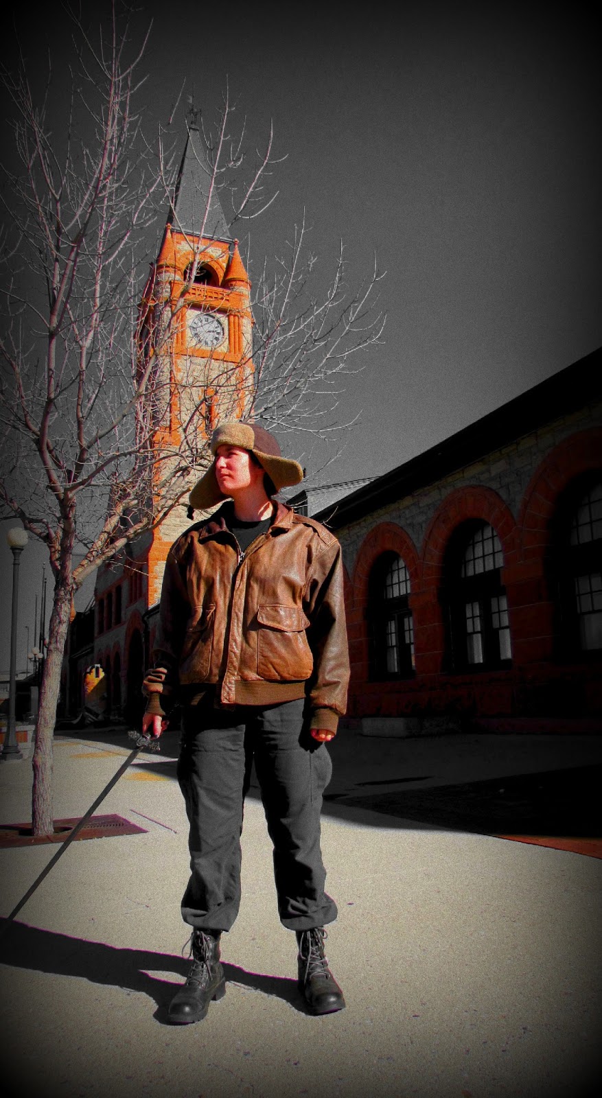 This is with less grainI was very very pleased with this one, as it did all I wished. Before, when I brightened the browns it gave my model a sunburn, but with this one, the jacket, the clock, the bit of brown in the building, and the model's face are nicely and clearly seen. Deciding I liked this well enough to add words, I moved on but ran into trouble again. Different colouring. The blacks and whites blended into the shades and the sidewalk. So I decided to try what someone suggested and make a kind of overlay for the words. This, at long last, took me to Paint.
 The overlay took a lot of work because it had to be centered.
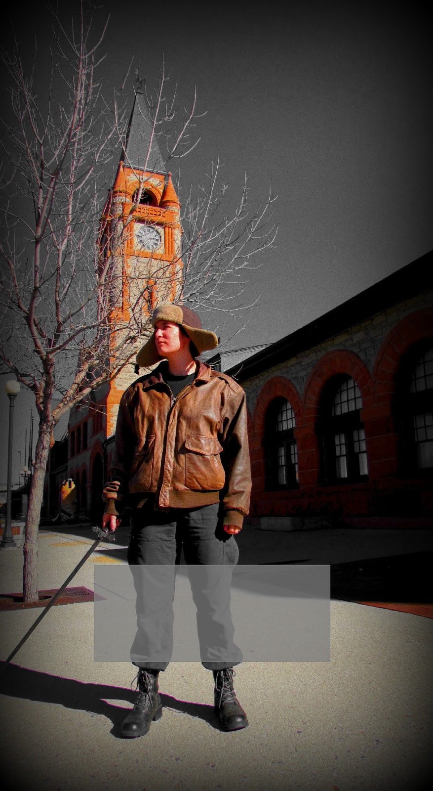 Even though it didn't look centered when it was.
 And it had to be the right size.
 And centered
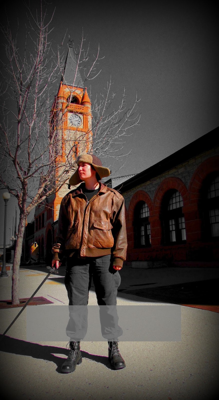 And not too close to the ground as it would push the title down to far. By this point I was ready to kill someone.
 I also had to decide on the shape and the colour.
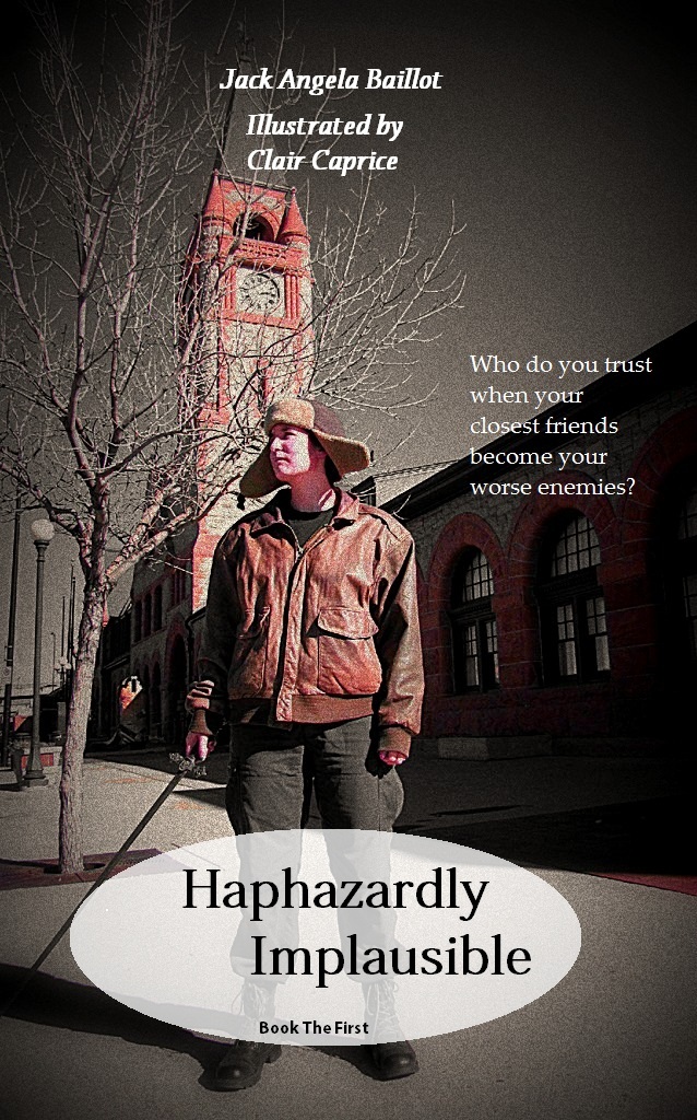 Oh yes, and fonts
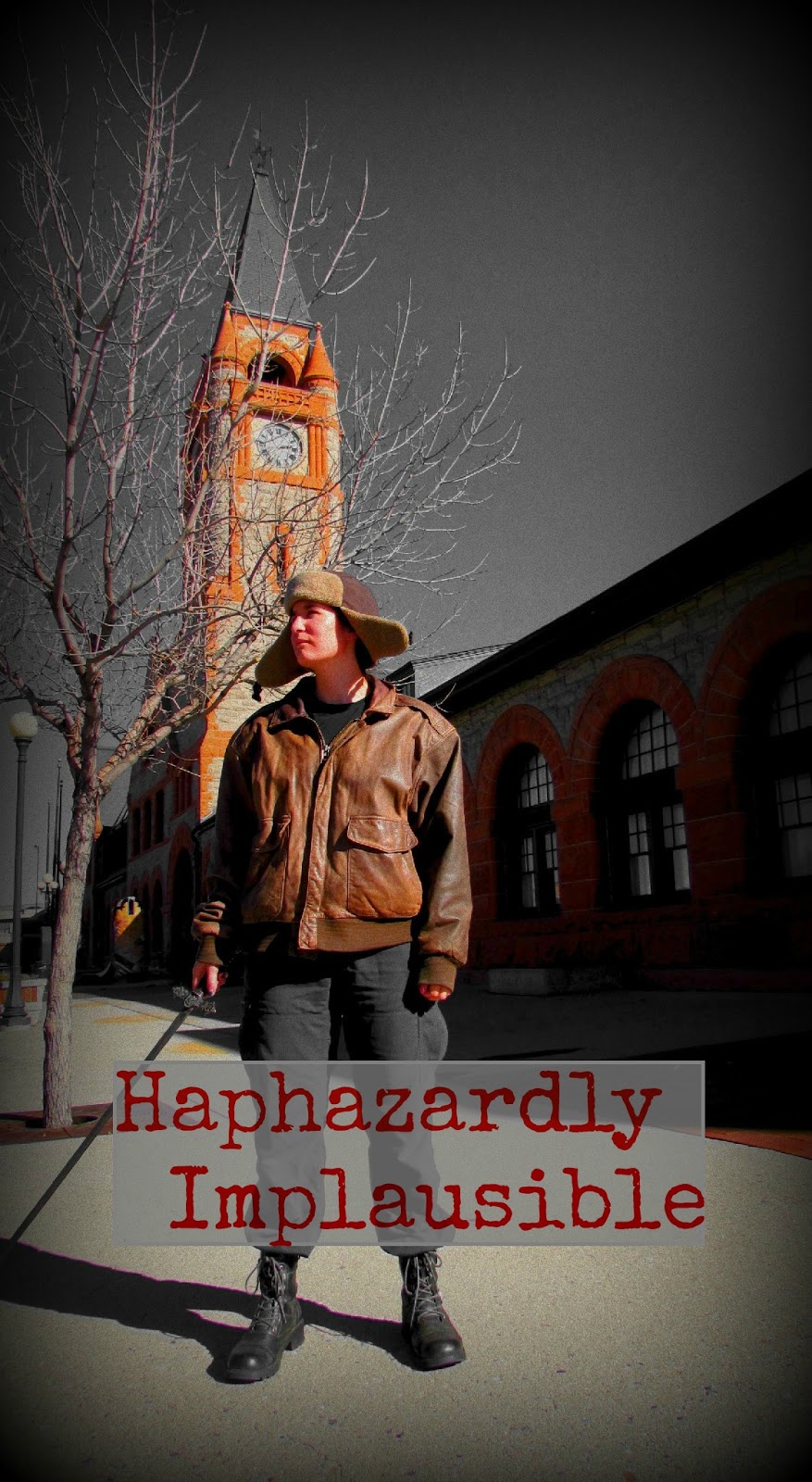 Giving up on Paint, which is annoying when one wishes to add lettering, I moved back to Picmonkey
 And more font testing...and size...(As you can see, the book one is far too large)
 More testing
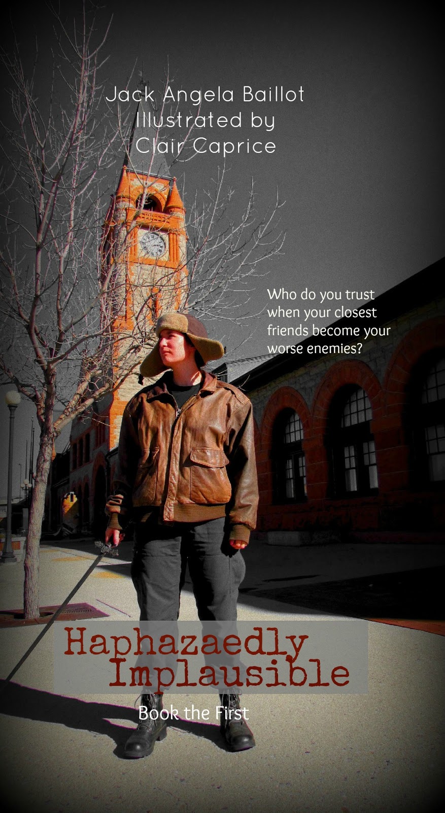 Perfect, or so I thought
 And then I added some gears, to the wrong one
And then came a new problem. The publishing company I thought I was going to use, wanted to charge all of you $27.00 to buy my book, and I kind of figured none of you liked me that much. I mean, I don't like me that much.
So I moved publishers...and the cover no longer fit. AND I had to make my own back cover AND attach to the front. This is when I closed my computer, pulled out my book, crawled into bed, and forgot about the world till I feel asleep. Then, Friday morning I woke, and set to work once again.
 For the new publishers I had to move the names down. But, colouring problems. So, it was back to Paint.
 And I did about as many of these as I did with the bottom.
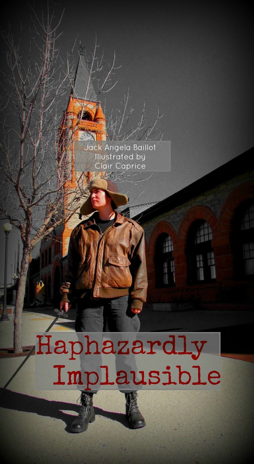 And, add author and artist names.
 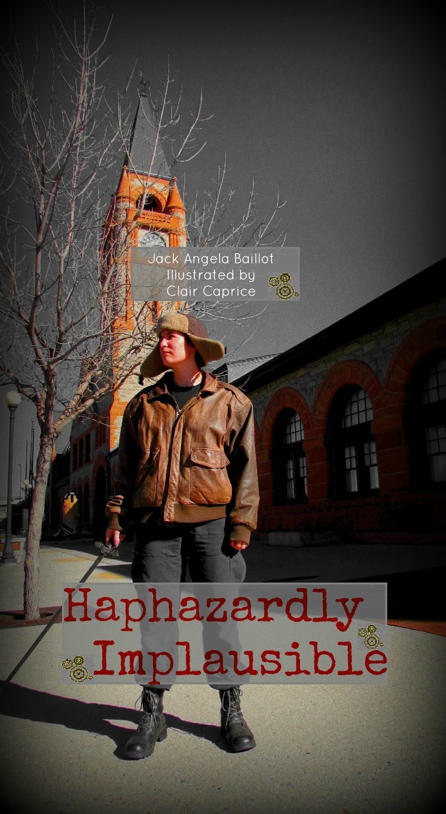 And gearsRealize I forgot the side note thing. Start to get worn out. I had to save every step of my work as I went so that, when I made a mistake I wouldn't have to start completely over, I could back up to the last step.
Add side note
 Start on adding the back cover. Thinking, "Hey! This is easy! I love Picmonkey!" Upload to see how it will look....and almost stab something when I see the picture is COMPLETELY blurry and up close and personal with the cover. Almost all the lettering was hidden because the model's face was zoomed up.Decide to retire from writing and spend part of the day with my mum
 Come back, tell myself I've come to far to quit and show my mum my covers. Mum, like all mum's, loves them and tells me to keep at it. She also informs me the side note should say Worst, and not Worse. At this point I decide to hate the English Language and give the cover one last try.
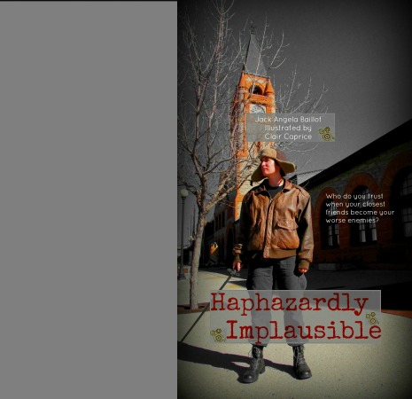 Add side note, realize I miss spelled it yet again. Try not to shoot anything.
 Begin to adjust cover so the Model will stop slapping people in the face.
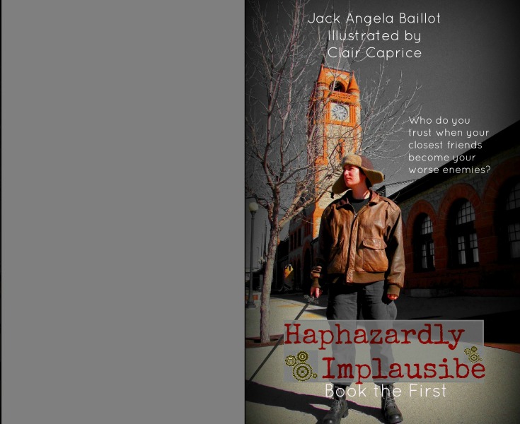 "This is a close up?"
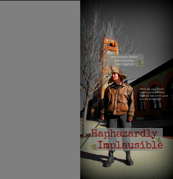 Decide I hate re-sizing and it should be taken out and hanged.
 Or poisoned.
 Attempt to add words to the back cover all while hoping they will not shoot off the cover I will be uploading it to
 Threaten the internet when it tells me my picture doesn't have the right pixels and might be blurry. NAW! You think?! Even I can see that and I've no clue what pixels are!
 Consider becoming a Lama herder
 Wonder if there are any positions open in the Foreign Legion
  Think about how nice a desk job would be
 Decide desk jobs are worse then this
 But how this equals walking over hot coals
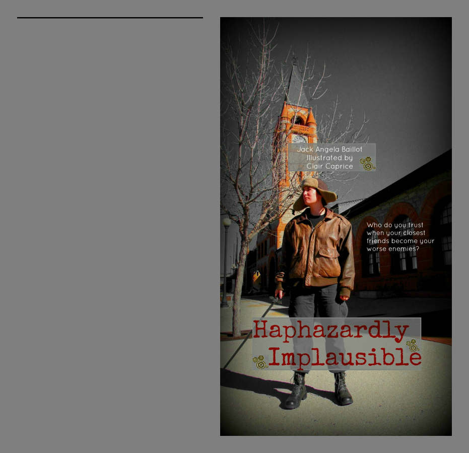 Realize there is a black mark on the page
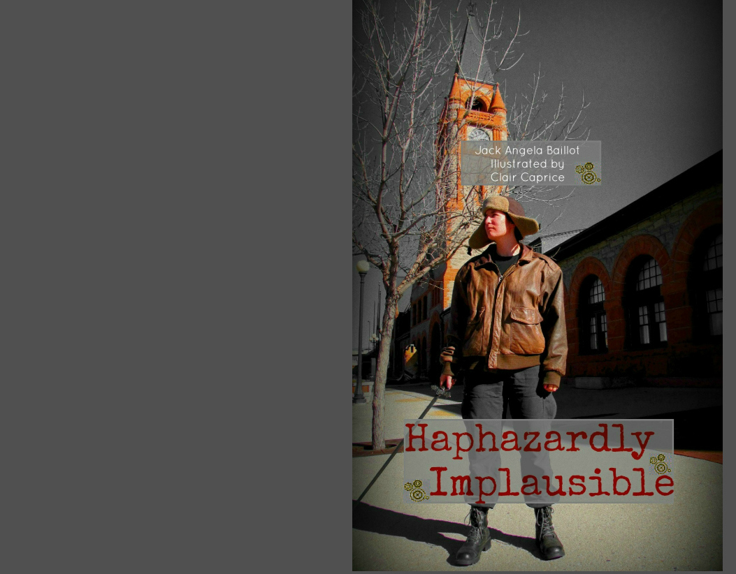 Play around with colours
 And size some more
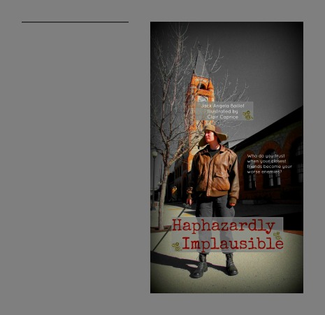 This is where I glared long and hard at the gray lining around the photo and determined to end its life.
Then, at LONG last...I had it. I uploaded it. I sat back...and I grinned. Then I fell over and tried not to think about book two.
Once all that was done I took the words off the original back cover
 But to get this, I first had to overlay the photo with gray. This was before I changed publishers.
 Then I had to solid it for the new publisher
 And attempt to add words. Do not try with Paint, it eats most of them
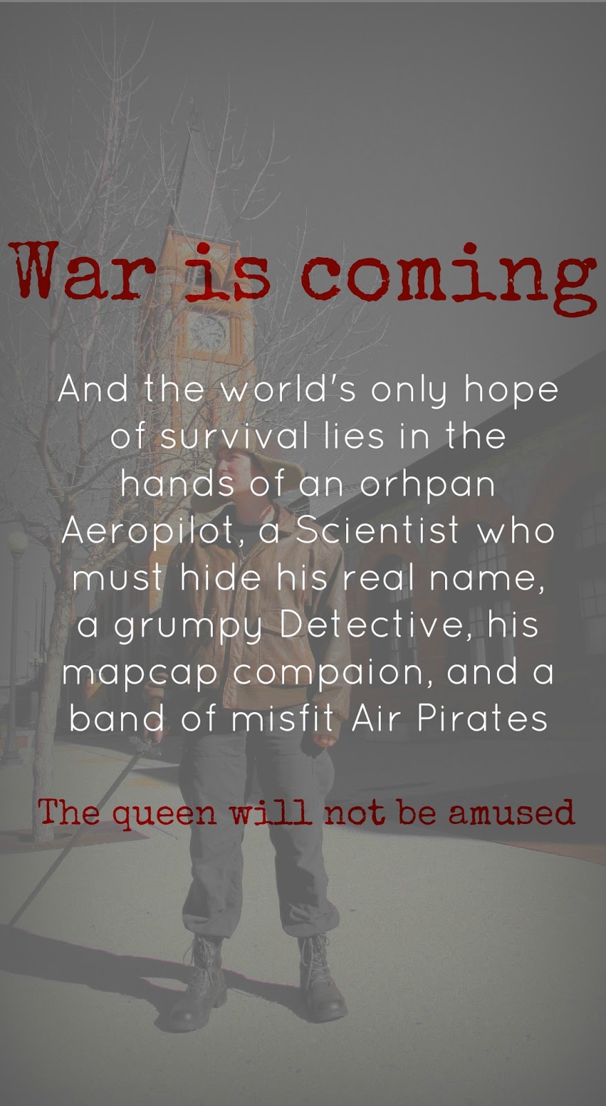 And, back to Picmonkey
And, here it is!
First, the whole thing which doesn't look very nice because it is all flattened but should look very nice on the actual book when it is in its proper shape.

And just the front, which looks better since it is not yet on a book.
And, since I finally own a copy of Mark of Athena - and shall have new quotes from it soon enough, I am breaking off my Percy quote - for today at least - and am using a Sherlock quote in honour of his death.
Any thoughts on the cover progress? Word count updates? How did Sherlock live, theories?
Allons-y!


No comments have been added yet.