Is the New LinkedIn Layout a Success?

 It has officially been a little over one month since the launch of the new LinkedIn design, so naturally it’s time to do what business loves most: analyze. Although none of the changes were too dramatic, they were distinct enough that people noticed and had to stop and do a little bit of troubleshooting. We’ve seen many different social networks change their layouts and the way things work, so it’s natural to ask that inevitable question: Were the LinkedIn changes really for the better, or was this just another social network trying to keep things fresh?
The LinkedIn Changes Explained
If you haven’t seen the changes or haven’t bothered to figure them out over the last month, don’t sweat it. You’re missing just a few major differences from the old LinkedIn:
Relevant articles to the top. In the past your articles came up to the top of your feed as they came through, but now LinkedIn will help determine what is the most relevant to you. By looking at your connections and the content that you’re sharing on the network, they do a pretty good job.
Feeds help you stay informed. In a Facebook-like fashion, the network now has a feed that will show you each time someone updates his/her LinkedIn page.
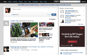
Although the changes might not seem overly dramatic, it’s really the look of the page that has changed more than anything. Below is a screenshot of the new layout:
As of now, all old LinkedIn profiles should be changed to the new layout.
The Pros of the New LinkedIn Layout
The overall consensus online seems to be positive amongst individuals as well as business. Below are a few of the benefits of the new layout:
News is more accessible and relevant. Because the network decided to place relevant news results on top and feature them at the top of the screen, users are more likely to want to click and read.
The layout is modernized. This means that things such as the profile photo as well as a more prominent summary section. Both of these aspects are usually important to employers, so the changes make sense.
Notifications. LinkedIn will now send you little blue flags to notify you if someone does something that affects you (accepts a connection, sends you a message, etc.).
Event Recommendations. You can actually type in a city into the search bar and a list of events going on in that city will come up. Great for travelers, giving LinkedIn yet another use.
Endorsements. This new feature is a great way for your connections to vouch for you without having to create a long and involved recommendation. Once you update the skills that you have, your connections can endorse you, putting their picture right next to the skill you posses.
In terms of things that were taken away to benefit the network—the Twitter feed. Everyone wanted Twitter to be Twitter and LinkedIn to be LinkedIn, and now it finally is.
Where the New LinkedIn Layout Didn’t Deliver
Many of the negatives to the new layout occur in the profile section. Point blank, there isn’t quite as much on the top of the page as their used to be. Although the summary section and profile picture are larger, information such as past work experiences and web addresses are now hidden.
The biggest issue, however, that individuals have with the new LinkedIn is the thought that it is looking more and more like Facebook—and I have to say I agree. With the whole idea of a “feed” and always knowing when there is a change in someone’s life (professional life in the case), this really is extremely similar to our social networking giant. This type of layout only seems to add to what many their “obsession” with any given website, whereas in the past LinkedIn was one social network that allowed users to bypass the obsessive and move straight to the productive.
Are you a fan of the new layout? What do you think still needs improvement (or should have never been changed in the first place)? Let us know your thoughts in the comments below.
Photo Credit: articles.timesofindia.indiatimes.com
[image error]


